The Top Angular Chart Types for Web Reports
| Quick Start Guide | |
|---|---|
| What You Will Need |
ActiveReportsJS |
| Controls Referenced | |
| Tutorial Concept | Create visually compelling web reports in Angular using ActiveReportsJS’s powerful charting engine, which includes a user-friendly Chart Wizard and extensive customization options. This tutorial explores how to choose the right chart type, such as line, bar, pie, or radar, to highlight data relationships, comparisons, and compositions effectively. |
With data at the core of innovation today, effective web reporting is essential for making informed decisions. Visualizing data through charts not only makes complex information more digestible but also uncovers trends and insights that might otherwise go unnoticed. The Angular framework, with its dynamic and component-based architecture, is great for building interactive and responsive reporting interfaces.
To further streamline this process, ActiveReportsJS offers a comprehensive charting solution tailored for Angular environments. It simplifies the integration of charts into web reports with an intuitive Chart Wizard, extensive configuration options, and a visual designer, allowing developers and analysts to focus on insights rather than implementation details.
In this blog, we will explore:
- Visualization Categories, including:
- Other Chart Types
Ready to get started? Download ActiveReportsJS Today!
Visualization Categories
When choosing a chart type, it's essential to align it with the kind of insight you want to communicate. Let's take a look at several charting categories that are offered by ActiveReportsJS:
- Relationship — The relationship between two or more data values. For example, a chart could display the relationship between weather conditions and the number of customers who visit an establishment. Looking at such a chart, a report reader could quickly realize if there is any correlation between data values, the nature of this correlation, and so on.
- Composition — The composition reveals how parts of the whole compare in size. A composition can be static or change over a period of time. For example, a chart could display winter coat sales in California and Alaska over the course of a year.
- Comparison — The comparison shows how data values compare to each other. This is similar to composition, but the comparison could be applied to data values that are not parts of a whole. For example, this could be a chart displaying the average temperature for each month of the year in California versus Alaska.
Next, we'll look at these categories in more detail and suggest specific chart types for different scenarios.
Visualization of Relationships
These charts are great for discovering connections between data points, usually across two or more variables.
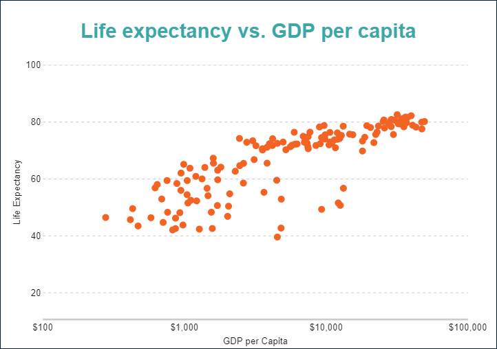
Scatter Charts
Scatter plots display values along two axes, showing how one variable is affected by another. They are ideal for visualizing distribution and correlation.
Bubble Charts
Bubble charts extend scatter plots by adding a third variable—often represented by the size or shape of the bubble—giving the analysis more dimensionality.
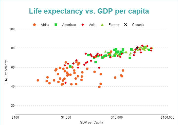
In ActiveReportsJS: Both scatter and bubble plots are easily configurable with plot type selections in the Chart Wizard and support customizing axes, legends, and data bindings.
Visualization of Composition
These charts help reveal how different parts contribute to a whole, either at a single point or over time.
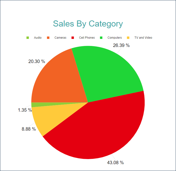
Pie and Doughnut Charts
These circular charts are best for visualizing percentage breakdowns such as market shares or budget allocations.
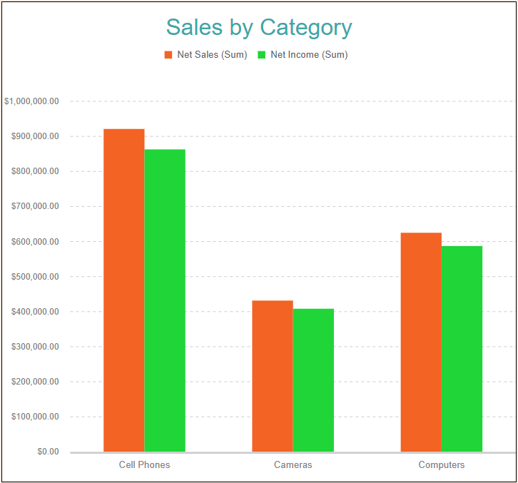
Column and Bar Charts
Used for category-wise comparisons, these charts work well for showing quantities like sales, inventory levels, or user counts.
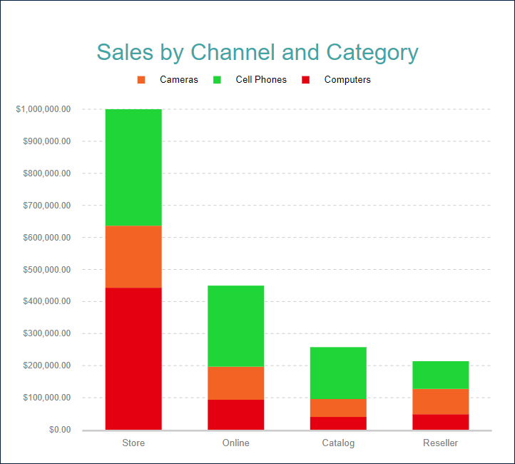
Stacked Charts
Stacked versions of column and bar charts show composition within categories and are perfect for visualizing part-to-whole relationships over time.
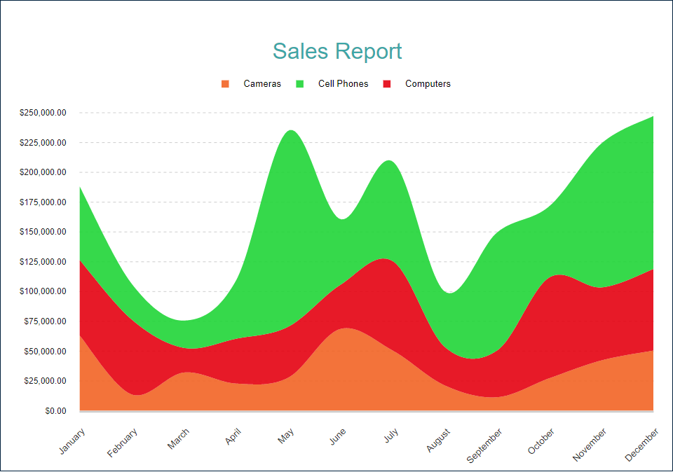
Area Charts
Like line charts but with shaded areas under the lines, these charts emphasize volume and are suitable for showing cumulative trends.
In ActiveReportsJS: The chart editor supports all these variations with multiple stacking and percentage options, and each chart can be themed using custom palettes for brand consistency.
Visualization of Comparison
Comparison charts are perfect for tracking data trends and performance across categories or time.
Line Charts
Line charts are among the most commonly used to show data progression over intervals. ActiveReportsJS offers multiple variants, including smooth and stepped lines, enhancing the readability of long-term trends or subtle fluctuations.
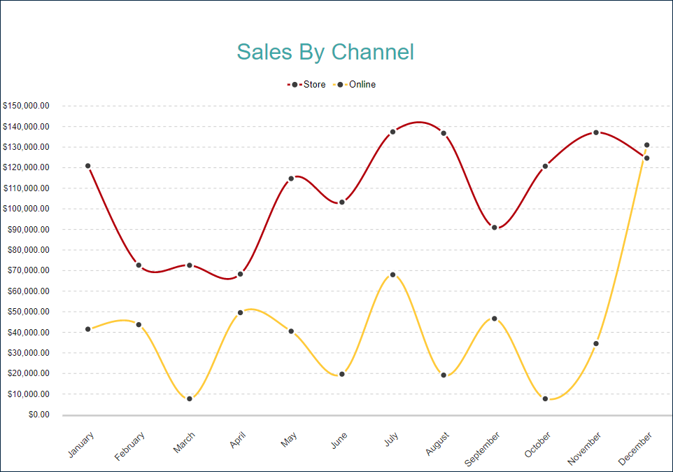
In ActiveReportsJS: Line plots can be quickly configured in the Chart Wizard, which offers rich axis and marker customization options.
Other Chart Types
Beyond the foundational categories, ActiveReportsJS supports a wide range of advanced visualizations for niche use cases:
- Financial Charts: Includes candlestick, high-low-close, and high-low-open-close plots—ideal for stock price or trading volume reports.
- Radar Charts: Available in line, area, bubble, and scatter variants; best suited for comparing multiple variables, like performance metrics.
- Spiral and Polar Charts: Great for cyclical or rotational data, such as seasonal trends or circular timelines.
- Gauge Charts: Used for displaying single values, like KPIs or sensor readings, in a dashboard-style interface.
Each of these can be created and configured visually using the ActiveReportsJS designer, with full access to plot area settings, legends, axes, and more.
Conclusion
Web reports are only as effective as the clarity of their visualizations. From revealing relationships and distributions to highlighting comparisons and compositions, the right chart type can turn raw data into actionable insights. Angular provides a solid foundation for building modern web apps, while ActiveReportsJS enhances it by offering a robust, user-friendly charting engine tailored for web reporting.
Whether you're building dashboards, financial reports, or data monitoring tools, ActiveReportsJS allows you to easily create, customize, and deploy professional-grade charts—all directly within your Angular environment.
Check out ActiveReportsJS to implement its reporting chart functionality in your application.
Ready to try it out? Download ActiveReportsJS Today!
Happy coding!
Tags:
Related Blogs
Try Our JavaScript Reporting Tool
ActiveReportsJS Resources
