Chart
Introduction
A chart is a graphical report item that enables report authors to visualize data trends over time, compare groups or categories, analyze parts of a whole, and identify relationships between variables.
In ActiveReportsJS, you can use the following chart types to design such data visualizations:
Column Charts
Column
Stacked Column
Stacked Percentage Column
Range Column
Bar Charts
Bar
Stacked Bar
Stacked Percentage Bar
Range Bar
Line Charts
Line
Smooth Line
Stepped Line
Area Charts
Area
Stacked Area
Stacked Percentage Area
Circular Charts
Pie
Doughnut
Circular Bar
Special Charts
Spiral
Stacked Spiral
Stacked Percentage Spiral
Polar
Stacked Polar
Stacked Percentage Polar
Scatter
Bubble
Financial Charts
Candlestick
High Low Close
High Low Open Close
Gauge Charts
Gauge
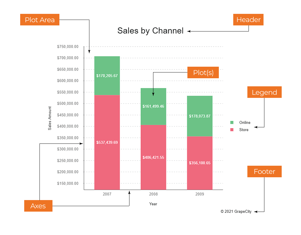
Charts in ActiveReportsJS are highly customizable and consist of multiple components, such as header, legend, axes, and plot area. These components define the chart’s structure and enhance data presentation.
The diagram below illustrates the anatomy of a typical chart:

Adding a Chart
Adding a chart to your report in ActiveReportsJS is simple and intuitive. You can insert a Chart by either double-clicking the corresponding item in the toolbox or by dragging and dropping it directly onto the report design surface.
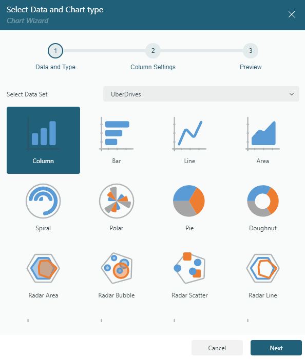
If data binding has already been configured for the report, the Chart Wizard will automatically launch. This wizard streamlines the setup process, allowing you to quickly configure your chart.
On the first page of the Chart Wizard, you can:
Select the dataset you want to visualize.
Choose the appropriate plot type to represent your data effectively.

Configuring the Chart Plot
On the second page of the Chart Wizard, you can configure the chart plot based on the selected plot type. This step allows you to customize the appearance and behavior of the chart for optimal data visualization.
Refer to the following pages for detailed configuration instructions for each chart type:
Preview and Final Adjustments
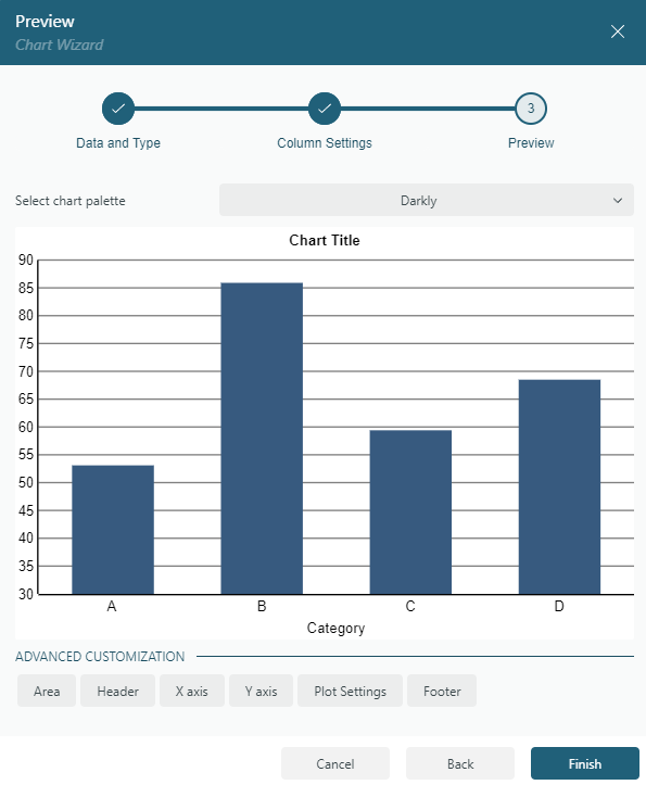
On the final page of the Chart Wizard, you can:
Select a color palette for the chart.
Preview the chart output to ensure it meets your requirements.
Finalize the configuration by clicking Finish.
Alternatively, you can make further adjustments by selecting specific chart components in the Advanced Customization section, such as:
Selecting any of these components opens their configuration options in the Properties panel.

Chart Designer
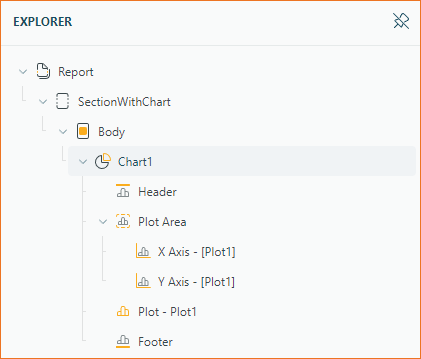
The Chart Designer in ActiveReportsJS allows you to modify and fine-tune chart properties. You can use the report explorer to configure various chart components, such as plot, axes, and legend.

Selecting a component in the report explorer loads its configuration options in the Properties panel.
General Chart Configuration
When you select the root node of a chart, such as Chart1, the properties panel displays the general chart configuration. This includes:
Additionally, it provides the following specific properties:
Plots: A collection of chart plots.Palette: Pre-defined or custom color collections used to style plots.Custom Palette Colors: A user-defined colors collection for the Custom Palette.
Header and Footer
Header and Footer elements let you add text above and below the chart's plot area. These elements can be customized with:
A subset of Text Properties
Specific properties include:
Caption: A String Expression to define the text displayed in the header or footer.Height: A Number representing the height as a percentage of the chart's total height.
Plot Area
The plot area displays the charted data and contains the axes and legend. Configuration options for the plot area include:
A collection of axes.
Plot, Axes, and Legend
For more detailed configurations, refer to the following sections:


