Chart Overlays
Overview
In addition to geometrical shapes such as columns, bars, or lines that visually represent data, a plot can include additional elements known as overlays. Overlays provide supplementary information or context to enhance the understanding of the data.
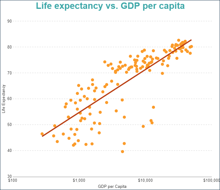
A common example is a trend line, which represents the linear regression of the data, as shown in the image below:
To add an overlay, select a plot and edit its Overlays collection in the Property Inspector.
All overlays share the following common properties:
Name– The name of the overlay.Type– The type of the overlay.Display– Determines whether the overlay appears in front of or behind the plot. UseFrontto display it on the front side of the plot andBackto display it on the back side.
ActiveReportsJS charts support several types of overlays, which are described in detail below.
Reference Lines
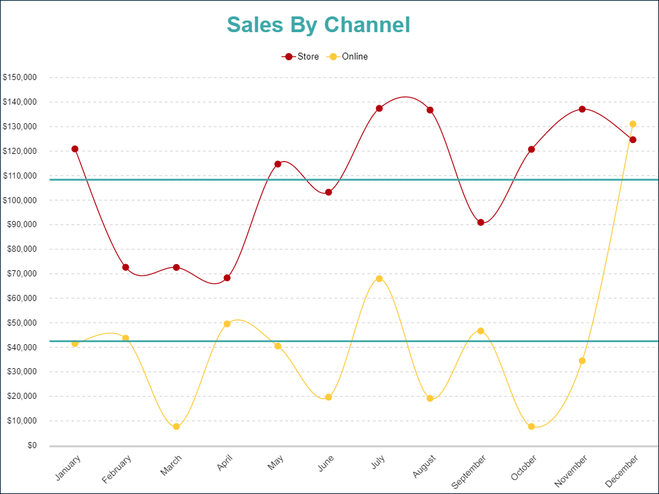
You can use Reference lines to highlight specific data values on a chart. For example, the chart below includes reference lines on the y-axis, representing the average sales amount for each sales channel.
A Reference line overlay includes the following specific properties:
Line Properties – Define the appearance of the reference line.
Axis– Specifies the axis the reference line is associated with.Value– Specifies the value of the reference line on the selected axis. Use this for static values.Field– Defines thedata valueon the selected axis that the reference line corresponds to.Aggregate Type– Determines the aggregation type applied to theFieldto calculate the value of the reference line.Legend Label– Specifies the text displayed in the legend, associated with the reference line.Detail Level– Specifies whether the reference line appears once per plot (Total) or once perdetail encodinginstance (Group).
Reference Bands
You can use Reference bands to display a range of data values between specified points.
A Reference band overlay includes the following specific properties:
Line Properties and
Background Color– Define the appearance of the reference band.Axis– Specifies the axis the reference band is associated with.StartandEnd– Define the start and end values of the reference band on the selected axis. These can be static values.
Linear Trendlines
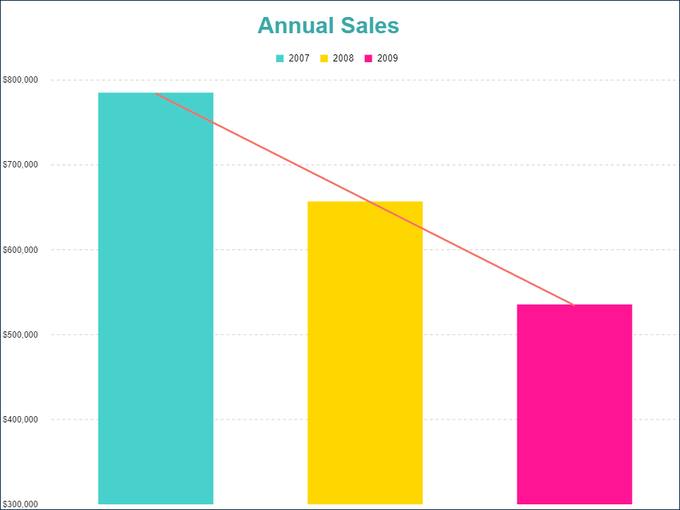
You can use Linear trendlines to display the best-fit straight line that shows how data values increase or decrease at a steady rate. For example, the chart below includes a linear trendline that highlights the trend of the sales amount over three consecutive years.
A Linear trendline overlay includes the following specific properties:
Line Properties – Define the appearance of the trendline.
Intercept– Specifies the point where the trendline crosses theYaxis. This can be a static value.Forward Forecast PeriodandBackward Forecast Period– Specify the number of data points the trendline extends forward and backward relative to the last and firstdata values, respectively.Field– Defines thedata valuethe trendline is associated with.Legend Label– Specifies the text displayed in the legend, associated with the trendline.Detail Level– Determines whether the trendline appears once per plot (Total) or once perdetail encodinginstance (Group).
Exponential Trendlines
You can use Exponential trendlines to display the best-fit exponential curve that illustrates how data values increase or decrease and then level out. This trendline can only be applied to data values greater than zero.
An Exponential trendline overlay includes the same properties as the Linear trendline overlay.
Power Trendlines
You can use Power trendlines to display the best-fit curved line for comparing measurements that increase at a specific rate. This trendline can only be applied to data values greater than zero.
A Power trendline overlay includes the same properties as the Linear trendline overlay, except for the Intercept property.
Logarithmic Trendlines
You can use Logarithmic trendlines to display the best-fit logarithmic curve that illustrates how data values increase or decrease and then level out.
A Logarithmic trendline overlay includes the same properties as the Linear trendline overlay, except for the Intercept property.
Polynomial Trendlines
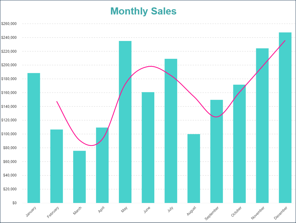
You can use Polynomial trendlines to display a best-fit curved line that illustrates fluctuations in data values. For example, the chart below includes a polynomial trendline that highlights the trend of the sales amount over months.
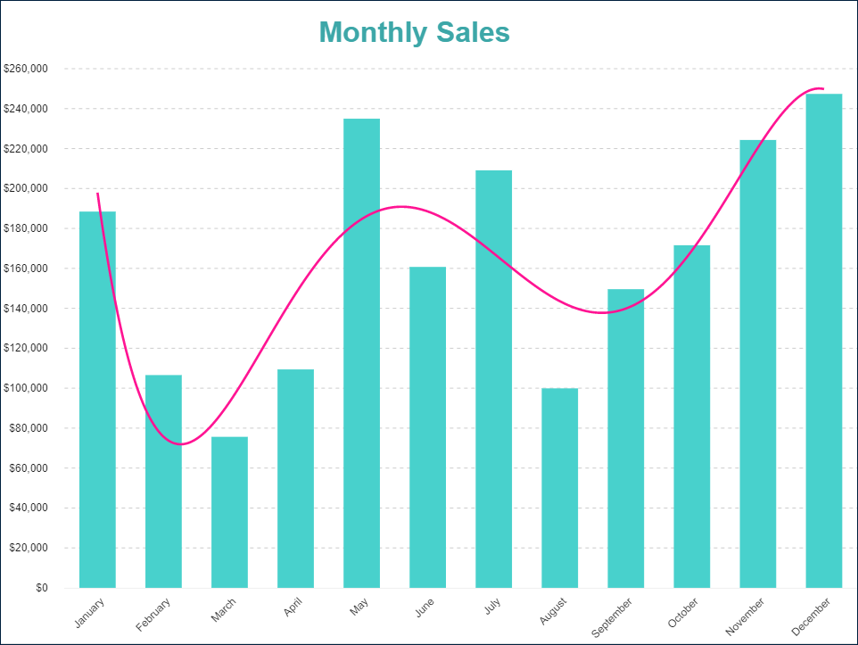
A Polynomial trendline overlay includes the same properties as the Linear trendline overlay. Additionally, it exposes the Order property, which determines the complexity of the equation defining the polynomial trendline. The Order property accepts valid values from 2 to 6.
Fourier Series Trendlines
You can use Fourier series trendlines to display a best-fit Fourier Series line that illustrates fluctuations in data values.
A Fourier series trendline overlay includes the same properties as the Linear trendline overlay. Additionally, it exposes the Order property, which determines the complexity of the equation defining the Fourier Series trendline. The Order property accepts valid values from 2 to 6.
Moving Average Trendlines
You can use Moving average trendlines to display a line that smooths out fluctuations in data values, making patterns or trends more apparent.
ActiveReportsJS supports the following types of moving average trendlines:
Moving annual total average – This trendline consists of data points that represent the totals of the previous
Ndata points. TheNvalue is specified by thePeriodproperty.
A Moving average trendline overlay includes the following properties:
Line Properties – Define the appearance of the trendline.
Field– Specifies thedata valuethe trendline is associated with.Legend Label– Specifies the text displayed in the legend, associated with the trendline.Detail Level– Determines whether the trendline appears once per plot (Total) or once perdetail encodinginstance (Group).Period– Indicates the number of data points used to calculate the moving average. Accepts valid values from2to the total number of data points.
For example, the chart below includes a simple moving average trendline with Period = 2, illustrating the trend of the sales amount over months.