
- Getting Started
- Developer Guides
-
Report Author Guides
- Quick Start
- Report Designer Interface
- Report Viewer Interface
- Data Binding
- Report Configuration
- Report Themes
- Report Stylesheets
- Report Layers
- Report Parameters
- Interactive Reports
-
Report Items
- Common Properties
-
Data Regions
- Table
- Banded List
- List
- Tablix
-
Chart
- Plot
- Axes
- Legend
- Overlays
- Sparkline
- Bullet Chart
- Data Visualizers
- Supplemental report items
- Expressions
- Report Parts
- Master Reports
- Tutorials
Column, Bar, Polar, & Spiral Plots
Overview
Column, Bar, Polar, and Spiral plots are effective for comparing multiple Data Values within a Category or across multiple Categories. These plot types share similar configuration options but differ in how they visualize data:
Column Plots display categories along the horizontal axis, with data values represented as vertical columns.
Bar Plots display categories along the vertical axis, with data values represented as horizontal bars.
Polar Plots arrange categories along the circumference of a circle and encode data values into circular sectors, providing an alternative way to compare values in a radial layout.
Spiral Plots distribute categories along a radial path, encoding data values into curved bars that expand outward, effectively highlighting trends and progressive changes over multiple categories.
Each of these plot types provides a structured way to visualize trends, patterns, and comparisons. Additionally, you can choose how to organize Data Values within a containing Category. The examples below emphasize Data Values in bold and Categories in italics.
Clustered Column and Bar
A Clustered Plot is used to compare multiple Data Values within each Category by displaying them side-by-side. Depending on the configuration, it can also show how Data Values are broken down into Subcategories.
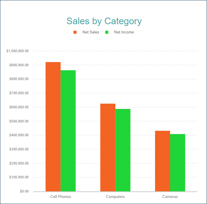
The Clustered Column Demo compares Two Data Values (Net Sales and Net Income) for each Product Category. Each Data Value is represented by a separate vertical column, making it easy to see differences within the same category.
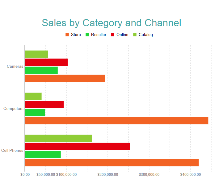
The Clustered Bar Demo compares One Data Value (Net Sales) for each Product Category but further breaks it down into Subcategories (sales channels). Each bar represents a subgroup (e.g., Store, Reseller, Online), allowing you to analyze variations within each category.
Stacked Column and Bar
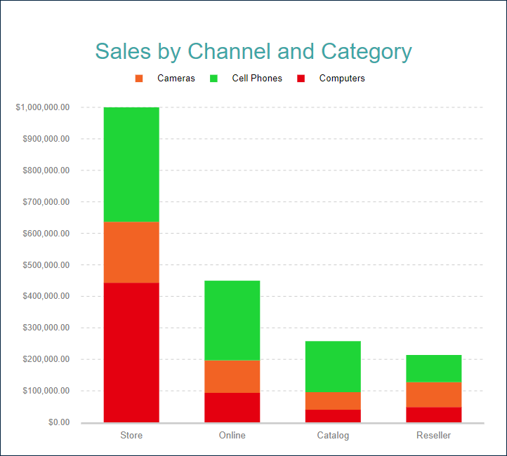
A Stacked Plot is another way to break down Data Values into Subcategories by placing corresponding column or bar subsections on top of each other (stacked vertically) or next to each other (stacked horizontally) within the containing category.
The Stacked Column Demo shows the Net Sales for each Product Category per Sales Channel.
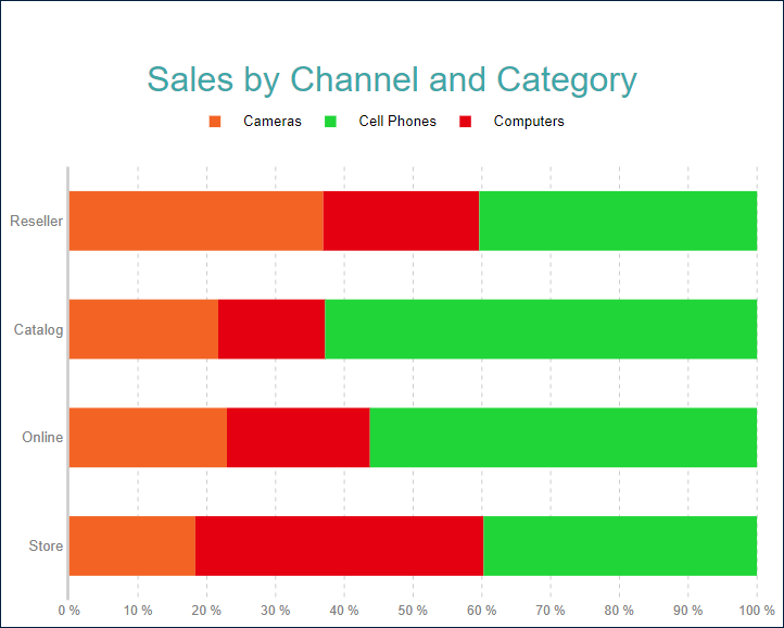
Percentage Stacked Column and Bar
A percentage stacked plot combines the stacked plot and the Percentage axis scale. It indicates the contribution of each data values' sub-category to a containing category's total. For instance, the Percentage Stacked Bar Demo shows the percentage share of the product categories' Net Sales per Sales Channel.
Range Column and Bar
Range Column and Range Bar plots are used to display the range or difference between two sets of values across categories or time periods. Both plot types consist of vertical or horizontal bars, with each bar representing the range between a pair of data points.
For example, the Range Column Demo displays the range of temperatures (in Celsius) over a year in a given location.
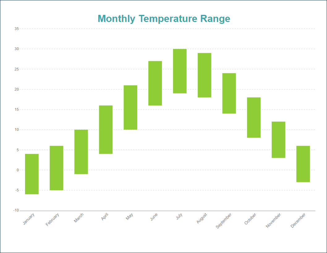
Range column and bar plots can compare ranges across categories by displaying multiple ranges side-by-side (clustered). For example, they can show temperature ranges in different cities for each month, making it easy to compare fluctuations. However, stacking ranges does not work well because it hides the actual differences between the minimum and maximum values.
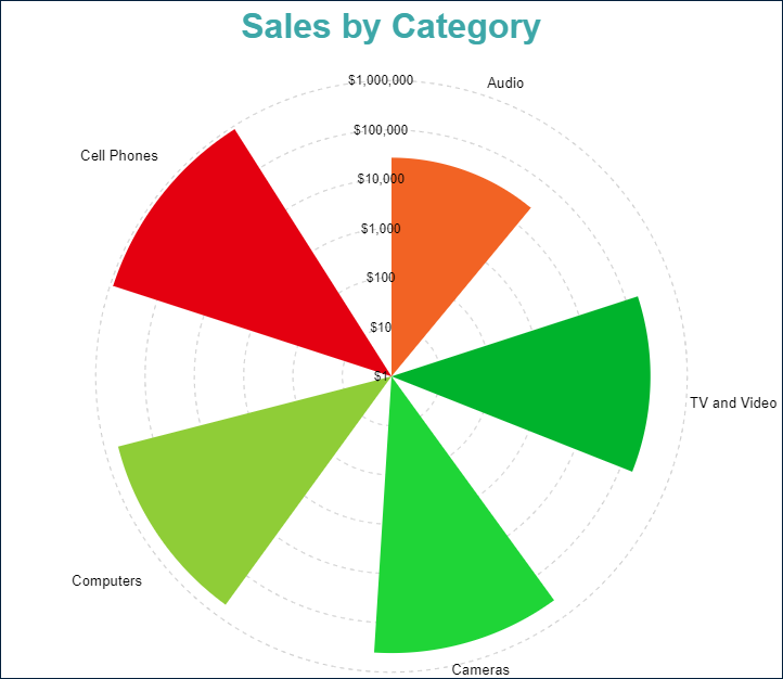
Simple Polar
In its simplest form, a polar plot represents a single data value for each category using a radial layout. The Simple Polar Demo visualizes Sales Amount per Product Category, with each category positioned around the circle and its corresponding value displayed as a sector extending outward. This layout makes it easy to compare sales distribution across different product categories in a visually intuitive way.
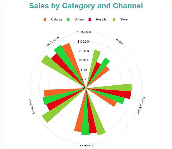
Clustered Polar
A clustered polar plot breaks down Data Values into subcategories by placing corresponding circular sectors next to each other within the containing Category. The Clustered Polar Demo visualizes the Sales Amount for each sales channel within each Product Category, allowing for easy comparison of sales performance across different distribution channels.
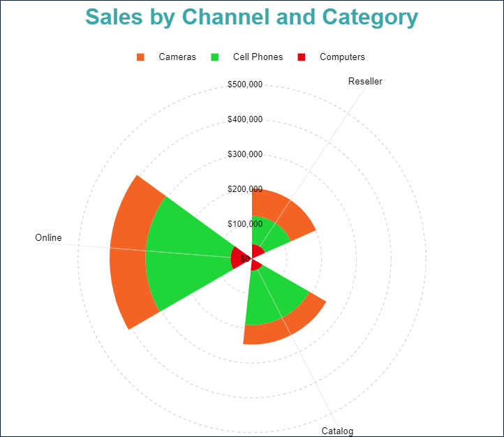
Stacked Polar
A stacked polar plot provides a way to break down Data Values into subcategories by dividing corresponding circular sectors into stacked subsections. The Stacked Polar Demo visualizes the Sales Amount for each Product Category within each Sales Channel, making it easy to compare the composition of total sales across different channels.
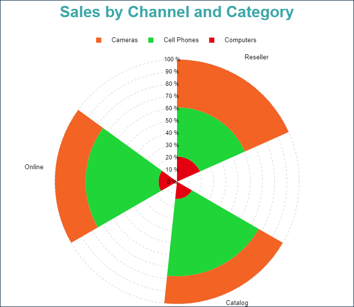
Percentage Stacked Polar
A percentage stacked polar plot combines the stacked polar plot with the Percentage axis scale. It represents the proportional contribution of each Data Value subcategory to the total of its containing Category.
For instance, the Percentage Stacked Polar Demo visualizes the percentage share of Sales Amount for each Product Category within a Sales Channel, providing an intuitive way to compare category distributions across different sales channels.
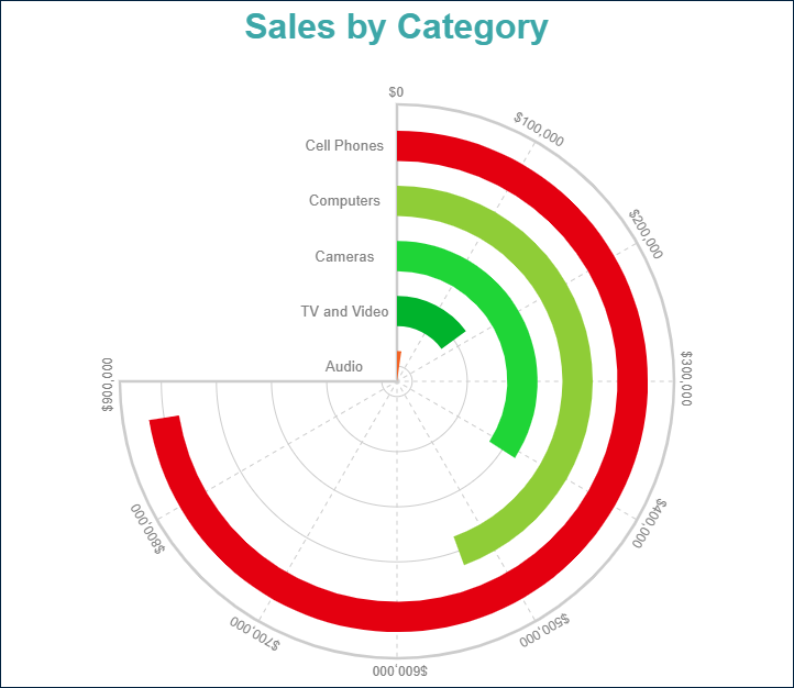
Simple Spiral
In its simplest form, a spiral plot closely resembles a Bar Plot but is displayed on a polar coordinate system. Instead of aligning bars along a straight axis, it arranges them along a radial path, creating a spiraling effect.
For example, the Simple Spiral Demo visualizes the Sales Amount per Product Category, demonstrating how data can be effectively presented in a curved, space-efficient format.
Stacked Spiral
A stacked spiral plot breaks down Data Values into subcategories by stacking corresponding circular segments within the containing Category. This layout helps compare the contribution of different subcategories while maintaining the space-efficient and visually appealing spiral format.For example, the Stacked Spiral Demo visualizes the Sales Amount for each Sales Channel within each Product Category, making it easy to analyze sales distribution across multiple channels.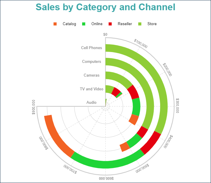
Percentage Stacked Spiral
A percentage stacked spiral plot combines the stacked spiral plot with the Percentage axis scale. Instead of displaying absolute values, it represents the proportional contribution of each Data Value subcategory to the total of its containing Category.For instance, the Percentage Stacked Spiral Demo visualizes the percentage share of Sales Amount for each Sales Channel within a Product Category, making it easier to compare category distributions across different channels.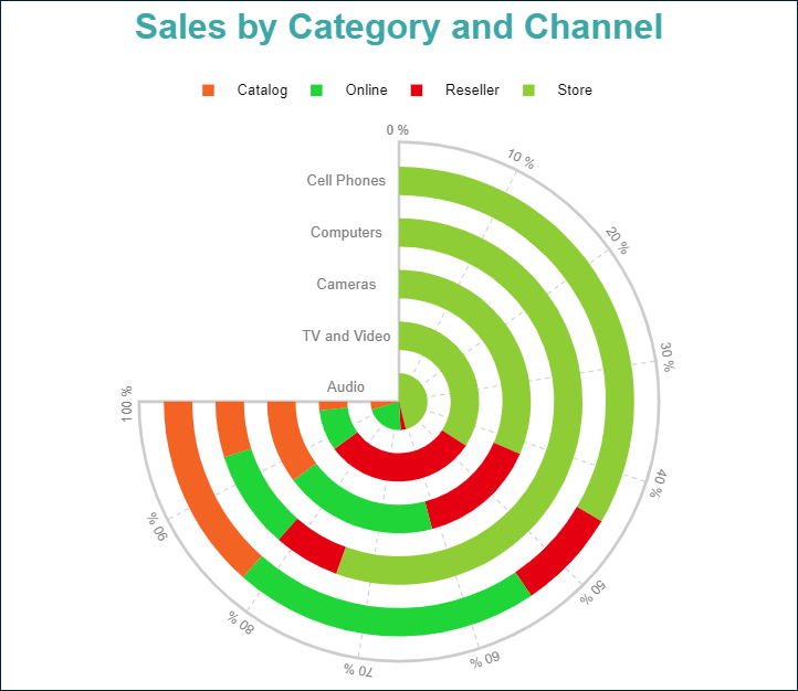
Explore and Configure Plot Properties
You can use the following demos to explore plot properties. Open a link, toggle the Report explorer, select the Plot - Plot 1 node, and use the Properties panel to modify the configuration.
You can also download the report files below and open them in the Standalone Report Designer:
Next Steps
For more detailed information about Column, Bar, Polar, and Spiral Plots, refer to the following pages: