- Getting Started
- Developer Guides
-
Report Author Guides
- Quick Start
- Report Designer Interface
- Report Viewer Interface
- Data Binding
- Report Configuration
- Report Themes
- Report Stylesheets
- Report Layers
- Report Parameters
- Interactive Reports
-
Report Items
- Common Properties
-
Data Regions
- Table
- Banded List
- List
- Tablix
-
Chart
- Plot
- Axes
- Legend
- Overlays
- Sparkline
- Bullet Chart
- Data Visualizers
- Supplemental report items
- Expressions
- Report Parts
- Master Reports
Customizing Column, Bar, Polar, & Spiral Plots
Introduction
Once you have created a Column, Bar, Polar, or Spiral plot, you may want to customize its appearance to match your reporting needs.
Plot Items Appearance
The visual elements of these plots vary based on their geometric representation:
Column and Bar plots consist of rectangles.
Polar plots consist of circular sectors.
Spiral plots consist of curved bars.
For all these shapes, you can configure the following visual properties by selecting the Data Series item, either through the chart designer's top handle or in the Plot Properties panel:
Line Color,Line Style, andLine Width– Style Expressions that define the border appearance of the shape.Background Color– An Style Expression that determines the fill color of the shape.Opacity– A percentage value controlling transparency.100%= Fully opaque0%= Fully transparent
type=info
You can use expressions to dynamically set fill and border colors based on field values or report parameters.
Column and Bar Shape
You can modify the dimensions and form of the rectangles in Column and Bar plots using the following percentage-based properties in the plot settings:
Width– Adjusts the column width (for Column plots) or bar height (for Bar plots) relative to the allocated category space.The axis is divided evenly among all categories, and this property determines the percentage of each category's allocated space occupied by the shape.
Default:
55%Example: Setting
90%in the Stacked Column Demo reduces the gap between columns.
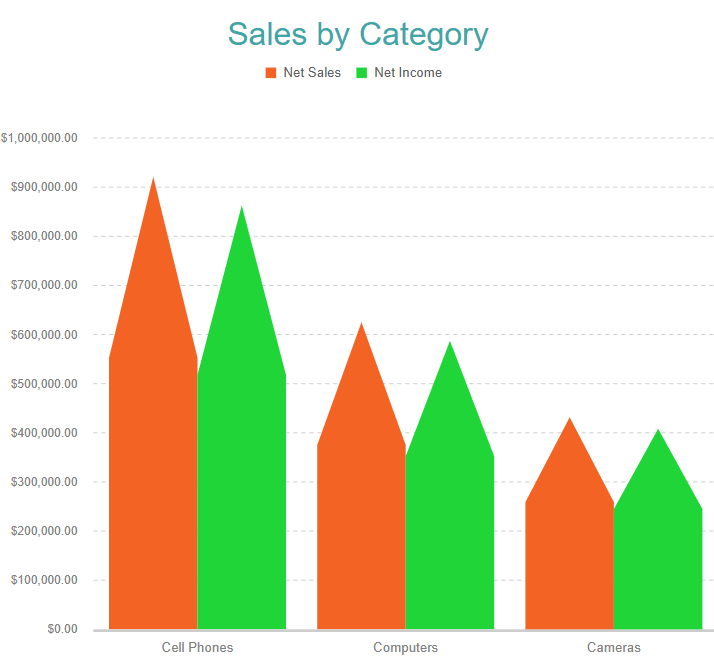
Overlap– Specifies the gap between adjacent columns or bars, relative to the category size.Neck Height– Splits a column or bar into two sections with different widths or heights, adjustable using:Top Width– Sets the width/height of the upper section.Bottom Width– Sets the width/height of the lower section.Example:
Set Neck Height = 60%, Bottom Width = 85%, Top Width = 0%
Creates a bullet-like shape, as demonstrated in the Clustered Column Demo.


