
- Getting Started
- Developer Guides
-
Report Author Guides
- Quick Start
- Report Designer Interface
- Report Viewer Interface
- Data Binding
- Report Configuration
- Report Themes
- Report Stylesheets
- Report Layers
- Report Parameters
- Interactive Reports
-
Report Items
- Common Properties
-
Data Regions
- Table
- Banded List
- List
- Tablix
-
Chart
- Plot
- Axes
- Legend
- Overlays
- Sparkline
- Bullet Chart
- Data Visualizers
- Supplemental report items
- Expressions
- Report Parts
- Master Reports
- Tutorials
Creating Column, Bar, Polar, & Spiral Plots
Introduction
Before configuring Column, Bar, Polar, and Spiral plots, make sure you've added a chart to your report. For instructions on adding a chart and launching the Chart Wizard, see Adding a Chart. Once the Chart Wizard is open, select the Bar, Column, Range Bar, Range Column, Polar, or Spiral plot type, choose the dataset to visualize, and proceed to the next page.
Plot Settings
The Settings page of the Chart Wizard for Column, Bar, Polar, and Spiral plot types looks like the following: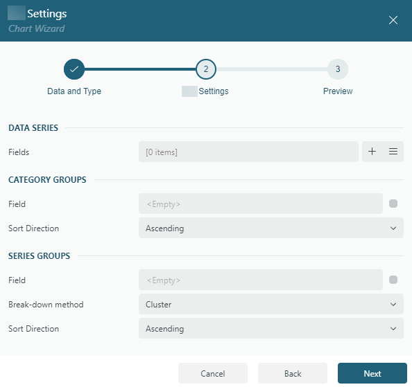
It is divided into three sections:
Data Series
The Fields collection defines the Data Values you want to visualize. These values determine the following visual properties:
the column height for
Columnplotsthe bar length for
Barplotsthe sector length (radial extent) for
Polarplotsthe arc length along the spiral for
Spiralplots
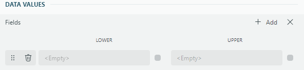
Typically, each value is an aggregate expression, such as {Sum(SalesAmount)}.Adding multiple data values creates a clustered plot, as demonstrated in the Clustered Column Demo.To enhance clarity, you can set the Legend Mode property of the Color Legend to Data Values. This option provides a legend that matches the column or bar colors with the corresponding data value names.Additionally, you can customize the displayed names using the Caption property for each data value item.For Range Bar and Range Column plots, data values are defined as pairs—Lower and Upper bounds—because these plots require a range. A single pre-filled value pair is provided by default, and you can add more pairs if needed. Each pair determines the starting and ending positions of the plot elements. This configuration is useful for visualizing ranges, such as temperature fluctuations or revenue intervals, across categories.
Category Groups
Field: Choose the field, or specify an expression, used to group the data into categories. For example, categories could represent months, regions, or product types. Data values are displayed for each distinct category.
Sort Direction: Specify whether categories are sorted in
AscendingorDescendingorder.
Series Groups
Field: Select the field, or specify an expression, used to create subgroups within each category, such as breaking sales data into product types.
Break-down Method: Choose how to display subgroups:
Cluster:
For
ColumnandBarplots: Displays subgroups side-by-side within each category.For
Polarplots: Places subgroups adjacent to each other along the same radial axis.For
Spiralplots: Arranges subgroups sequentially along the spiral path, maintaining distinct arcs.
Stack:
For
ColumnandBarplots: Stacks subgroups vertically (columns) or horizontally (bars).For
Polarplots: Stacks subgroups radially outward, extending from the center.For
Spiralplots: Stacks subgroups along the spiral path, layering arcs in sequence.
Once you have configured the Data Values, Category Groups, and Series Groups, click Next to proceed to the Preview and Final Adjustments page to complete the chart creation.