Ribbon for WinForms - An Overview and Application Usage
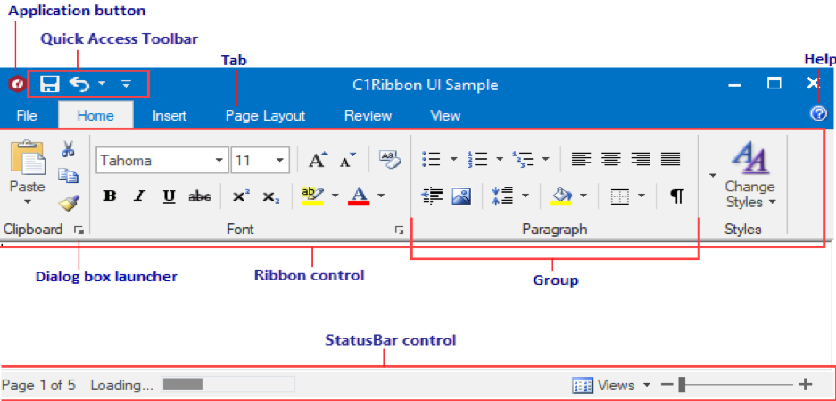
With the release of Microsoft Office 2007, the ‘Fluent User Interface’ (or Fluent UI) replaced multiple menus with a single miniature toolbar (Quick Access Toolbar) called Ribbon. A Ribbon is a concept introduced by Microsoft to refer to its implementation of tabbed toolbars containing heterogeneous controls. It merges toolbars and menus into an area docked at the top of the application window. The toolbars are logically grouped, arranged under various tabs.
Inspired by the Fluent UI, GrapeCity offers C1Ribbon: Ribbon control for WinForms Edition. Like other GrapeCity components, C1Ribbon is highly customizable, lightweight to use, and supports the latest Microsoft Visual Styles. Also, C1Ribbon allows hosting any WinForms control using RibbonControlHost element.

Why Ribbon control?
Using Ribbon for WinForms, you can enhance user productivity by alleviating the problem of not finding/knowing about the existence of available features in your application. This can be done by replacing numerous parallel toolbars that consume all screen space with a single element ‘C1Ribbon’ presenting organized commands. In addition, with the assistance of customizable icon-based visualization of commands, the commands are available at user tips and they can understand the functionalities in a easy way.

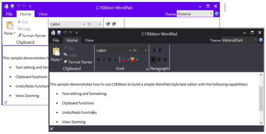
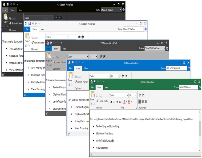
Ribbon for WinForms allows the customization of the look and feel of an application. This can be done by using the Themes for WinForms component: C1ThemeController. Using this component’s easy to use Theme Designer, you can customize the Ribbon with many built-in themes, like the examples below:


Guidelines to using Ribbon
The Ribbon control is useful in making an application more efficient. It simplifies the user interface by properly designing and effectively combining the commands.
To make the most of your application using Ribbon, follow these guidelines:
Do not make Ribbon simply a container of your existing menu and tool bars: To use Ribbon effectively, you will need to perform extensive command redesigning. Be sure to devote some time to it in advance.
Design the layout properly, making commands discoverable: Choose a design that suites your application and relates your command and tabs properly. Use descriptive tabs that helps customers understand the location of a certain command.
Make commands self-explanatory: End-users should be able to understand the command operation in advance. Users should not feel the need to navigate to help, or perform trial-and-error in order to check the operation. Utilize icon, label, tooltip, and preview properly.
Make the layout efficient: To perform an operation, don't make a user click multiple times. Commands should be categorized in a way where most used operations are present on the Home tab (where the end-user should spend most of their time).
Make sure to test your ribbon layout and verify that it scales correctly from the smallest window sizes to the largest.
Where is Ribbon used?
After being introduced by Microsoft in Office 2007, Ribbon became an instant hit and its popularity spread across domains where people used it in many types of applications. Apart from MS-Office (Word, Excel, PowerPoint, Access, Outlook), Ribbon is used in image editors like MS-Paint, coding platforms like Visual Studio, Eclipse for Java etc., and PDF viewers like Adobe Reader. The Windows Explorer (the most used screen in Windows Operating System) also uses Ribbon.


Updates to Office 365 user experience
Having stayed in the Microsoft Office family for over 11 years, Ribbon has grown from a simple toolbar to a much more complex element supporting lots of functionality. With limited amount of space, especially with touch devices, this was becoming problematic.
To cater to this, Microsoft recently announced that they would be streamlining and simplifying the Ribbon in next version of Office.
With this feature, Ribbon now supports two views: a classic three-line grouped view and a new, minimized single-line view.
By collapsing/expanding the control with a simple drop-down button, you can toggle between the views. Using this feature, you can now dedicate more vertical space to your work without compromising the main features of your application.


What kind of app have you created using Ribbon? Please share in the comments!
