New Chart Features - Range Area, Multiple Pie Charts, and Customized Series
The Wijmo 2019 v1 release includes several new features for FlexChart and FlexPie. This update adds a new chart type and several data visualization improvements enabling enhanced chart customization capabilities.
With FlexChart you can:
- Visualize range-based data over time with the new range area charts.
- Customize the tooltips and appearance of data points for specific series in charts that contain multiple series
With FlexPie you can:
- Visualize more series from your data set in a single pie chart.
Read the full 2019 v1 release.
Range Area Charts
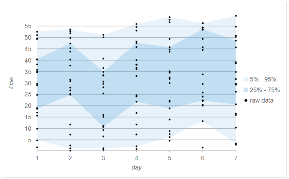
Range area charts plot two values on the Y axis for each data point and fill the area between. This is like the range bar and column charts that plot a range of two values for each data point. This new chart type is enabled by setting the chart type as 'Area' and then setting the upper and lower range values in the series binding.
Check out the Range Area Chart Demo

Multiple Pie Chart Series
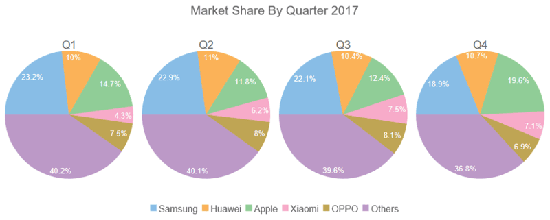
You can now use FlexPie to visualize more of your data in a single chart by creating multiple pie chart "series" using the same data source. It works by setting the binding property to a comma delimited string containing each field name you wish to visualize as a pie chart.
Check out the Multiple Pie Chart Demo

Custom Series Tooltips and ItemFormatter
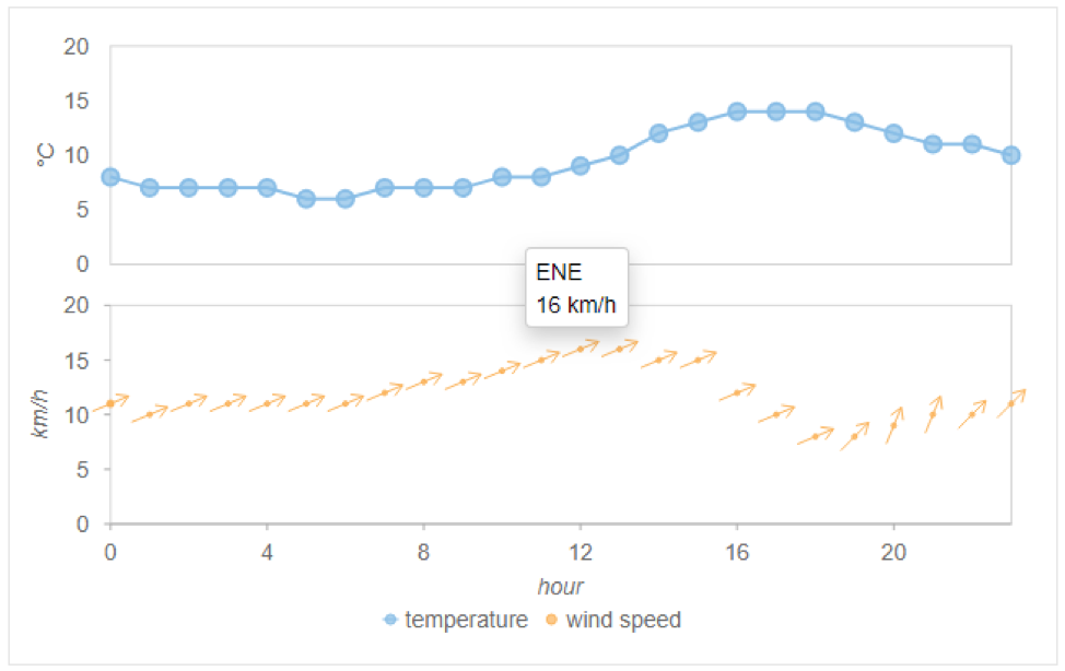
We’ve added two new features for FlexChart that make it easier to customize specific series. The Series.tooltipContent property allows you to customize the tooltips and the Series.itemFormatter property allows you to customize the appearance of the data points in a specific series. Prior to this release, these properties were set at the control level, so they applied to all series in the chart.
By duplicating these properties at the series level, we’ve added more flexibility and customization options to charts with multiple series.
Check out the Custom Series Demo

