How to Improve Chart Readability and Data Analysis with Axis Groups
An integral element of a chart, an axis is comprised of multiple sub-elements -- axis lines, tick marks, grid lines, and axis labels. The purpose of each sub-element is to display data in different ways to make the chart easier to read and understand for better analysis.
Extending the capabilities of a chart's axis, we have added support for grouping the axis labels in FlexChart for WinForms, WPF and UWP with the 2018 v1 release of ComponentOne Studio.
In this blog we will cover:
- The need for the axis groups in charts
- Types of data that can be plotted on an axis
- Adding axis groups for different data on axis
- Customizing the appearance of axis groups
The need for axis groups
Often, we come across data where we observe some sort of repetition or a hierarchy (departments within an organization, states within a country, months within a quarter, quarters within a year, etc.).
This grouping or hierarchy of data can be at single or multiple levels based on the needs and the usage of the application. Setting up an arrangement in a tabular form to present this data is simple enough, but getting the same result when plotted on a chart may not be as easy to understand. The hierarchy or grouping associated with the data is not evident. Also, the axis can get crowded with labels (as shown in the image below where the year values are repeating in each label).

The problem could be resolved if the chart could have the labels split (for each data point) into multiple parts, displaying them as multiple rows of labels on the axis.
FlexChart provides this solution by offering the ability to group the axis labels (a.k.a axis grouping). This increases the readability of chart, making it easier for the end-users to analyze the hierarchical data from various levels.
Types of data plotted on an axis
The mechanism for creating axis groups in FlexChart varies depending on the type of data that the axis represents. Before we create an axis group, let’s identify the axis types based on the underlying data:
a. Categorical axis: An axis displaying string values that are categorical in nature, usually referring to the name of different categories in data (product names, name of countries, etc.). Categorical data is normally plotted on the horizontal axis of a chart (with Bar chart being an exception where the vertical axis represents the categories).
b. Numerical axis: An axis displaying values that are numeric in nature, referring to the value for a given variable (temperature, sales amount, etc.). Data plotted on both the horizontal and vertical axis of a chart can be numeric.
c. DateTime axis: An axis displaying DateTime values represent the occurrence of data on a given timeline -- such as a fiscal year. DateTime data is more meaningful when plotted on horizontal axis of a chart.
Adding axis groups
Now that we understand the classification of the data plotted on the axis, it will be easier to relate to how axis groups can be added for each type of data displayed on the axis.
Categorical axis grouping
For adding groups to the categorical axis, we need to make use of the GroupNames and GroupItemsPath properties of the Axis.
If your data is organized in a flat structure, you'll only need to use the GroupNames property.
For example, we need to set the AxisX.GroupNames property to Country for the following class to group the axis as it pertains to each country.
class Unit
{
public string Continent { get; set; }
public string Country { get; set; }
public string Name { get; set; }
public double Size { get; set; }
}
flexChart1.AxisX.GroupNames = "Country";
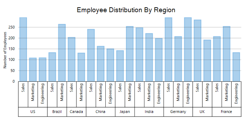
You can also display more than one group level on this axis by specifying a comma-separated string to the GroupNames property. In the following example, the axis is grouped by both Year and Country:
flexChart1.AxisX.GroupNames = "Year,Country";
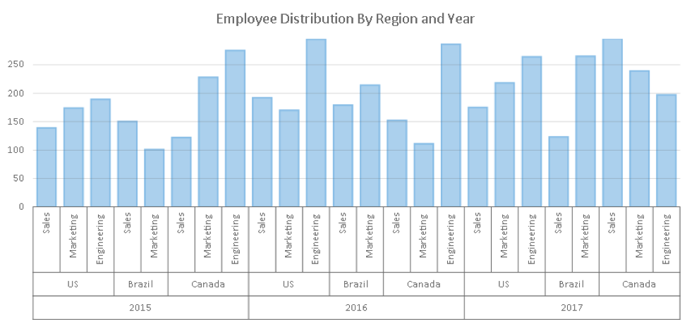
In the example above, we are showing year-wise employee distribution in different departments for an organization, across the different countries (where the organization has its branches). Let’s say you want to see country-wise employee distribution in different departments for the same organization over several years.
In that case, you'll need to change the order in which these axis groups are created by changing the GroupNames value from Year,Country to Country,Year like in the example below:
flexChart1.AxisX.GroupNames = "Country,Year";

In case your data is organized in a hierarchical structure already, then you also need to set the GroupItemsPath property of the axis.
For example, we need to set both the GroupNames and GroupItemsPath properties for the following class to get country-wise grouping on the axis:
class HierarchicalUnit
{
public string Continent { get; set; }
public string Country { get; set; }
public string Name { get; set; }
public double Size { get; set; }
public List<HierarchicalUnit> Items { get; set; }
}

flexChart1.AxisX.GroupNames = "Country";
flexChart1.AxisX.GroupItemsPath = "Items";
Note: The GroupNames and GroupItemsPath properties are not applicable for y-axis of the chart as the notion of categorical data is applicable only for the x-axis (with Bar chart being an exception).
Numerical axis grouping
Although values on a numeric axis do not have any hierarchy available for grouping, there might be requirements of categorizing numeric data into distinct groups. This can be done by grouping these values based on certain factors.
For example, temperature can be categorized as Low, Medium or High. FlexChart comes with the concept of GroupProvider, to give you the flexibility to define such categorization for numerical axis based on the range of values.
The GroupProvider contains all the relevant information (as listed below) that is needed by the chart for the creation of groups, by implementing the IAxisGroupProvider interface.
- The number of levels that the axis is to be grouped into
- The groups for a given group level
Note: The GroupNames and GroupItemsPath properties have no effect in case of Numerical axis.
The following is an example of a GroupProvider for Numerical axis:
    public class NumericGroupProvider : IAxisGroupProvider
    {
        public int Levels { get; set; }

        public NumericGroupProvider()
        {
            Levels = 1;
        }

        public int GetLevels(IRange range)
        {
            return Levels;
        }

        public IList<IRange> GetRanges(IRange range, int level)
        {
            var ranges = new List<IRange>();
            if (level == 1)
            {
                    ranges.Add(new DoubleRange("Good", 0, 54));
                    ranges.Add(new DoubleRange("Moderate", 55, 154));
                    ranges.Add(new DoubleRange("Unhealthy", 155, 354));
                    ranges.Add(new DoubleRange("Very Unhealthy", 355, 424));
                    ranges.Add(new DoubleRange("Hazardous", 425, double.PositiveInfinity));
            }
            return ranges;
        }
    }
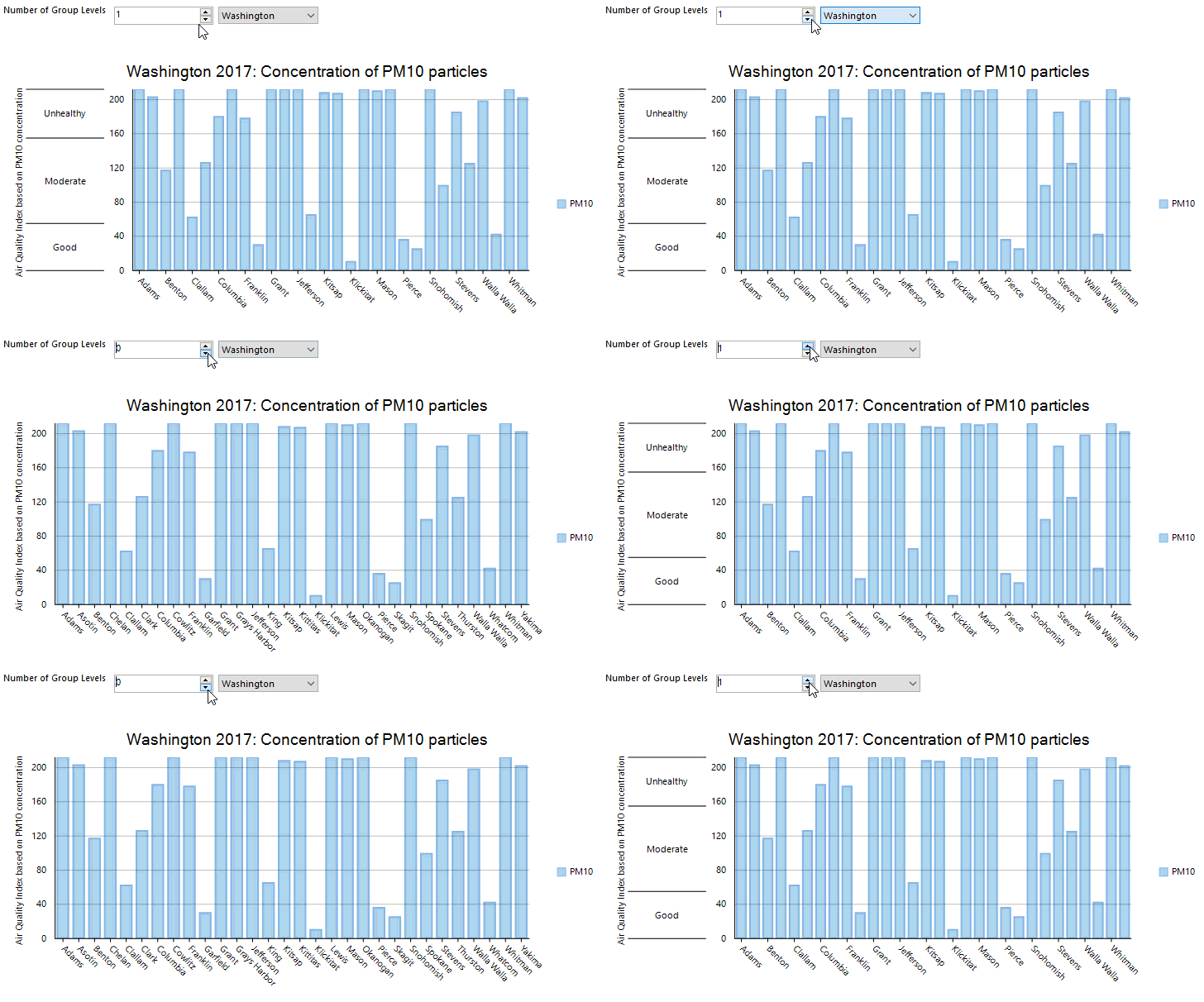
The following shows how the GroupProvider is to be associated with an axis and the resultant chart is shown in the image below:
flexChart1.AxisY.GroupProvider = new NumericGroupProvider();
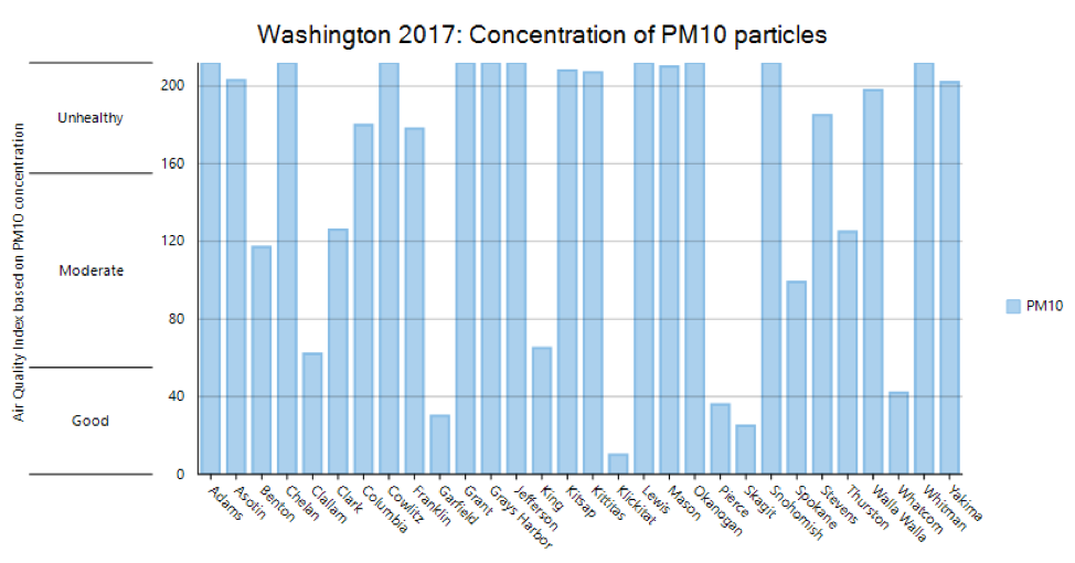
This approach gives you complete flexibility in defining the groups for Numerical axis. For example, we can change the NumericGroupProvider.Levels defined in the above code snippet to remove the Axis Groups at runtime. The code for this is available in the sample attached to this blog.
DateTime axis grouping
DateTime axis are somewhat similar to numerical axis in nature as they are used to represent continuous data. For the grouping of DateTime axis in FlexChart, you need to implement the GroupProvider in the similar manner. The difference is the use of TimeRange objects instead of DoubleRange method’s implementation.
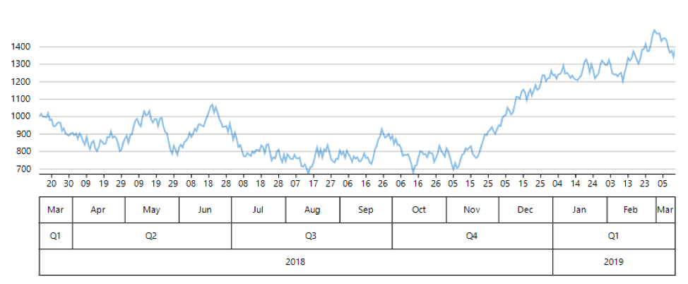
The following image shows a chart that is using a DateTimeGroupProvider where the axis has been grouped into 3 levels – Months, Quarters and Years with the flexibility to hide any of the group levels at run time.
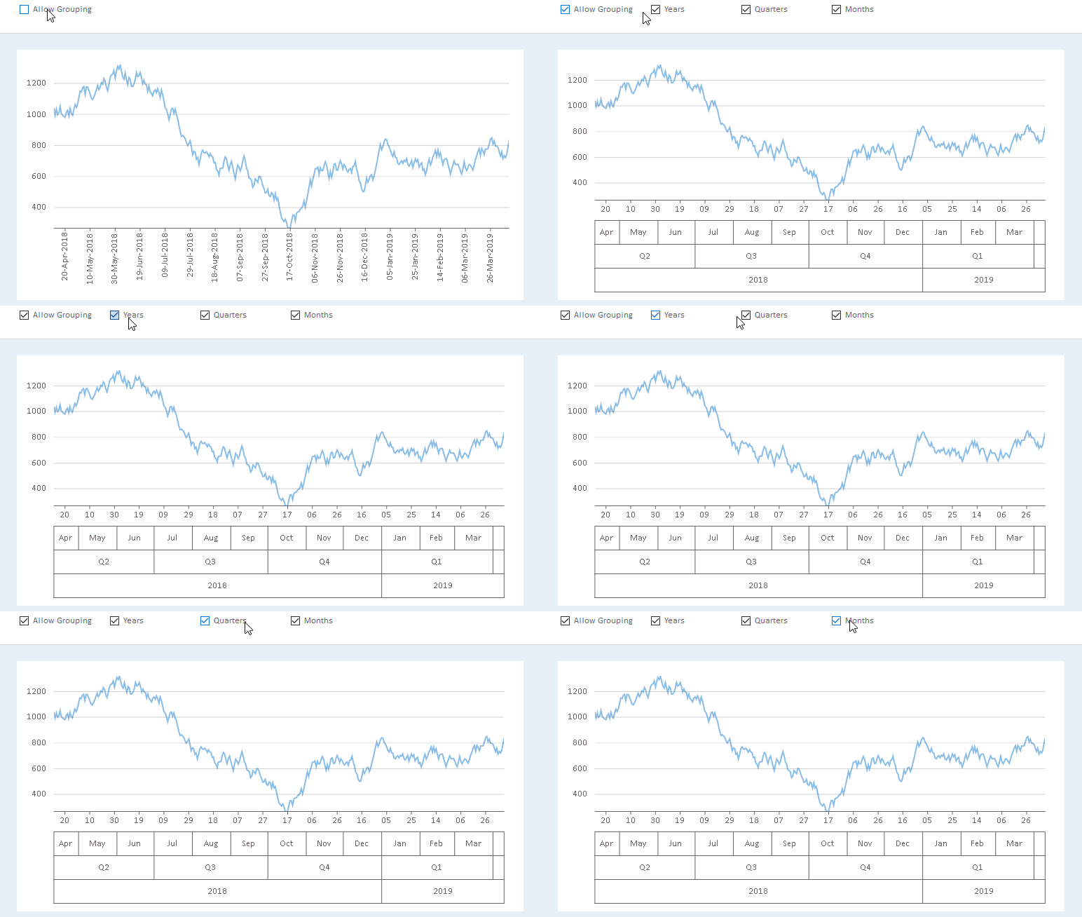
The implementation for this DateTimeGroupProvider is available in the sample attached to this blog.
Customizing the appearance of axis groups
A feature itself is not enough for a developer unless they get the flexibility for customizing the appearance. The appearance of axis groups can be customized in 3 different aspects:
1. Separate the groups: Group Separator are the combinations of vertical/horizontal lines that are used to separate groups at a given level. You can choose to display Horizontal, Vertical or Grid lines as group separators by specifying the respective options using the Axis.GroupSeparator property.
2. Alignment of text: You can choose the horizontal/vertical alignment for your axis group labels by specifying the respective options using the Axis.GroupTitleAlignment property.
3. Styling of Group: Similar to Axis.Style or Axis.TitleStyle, the GroupStyle property allows you to configure viewable properties for the Axis Groups (such as strokecolor, strokewidth, font, etc.).
The following shows an example of customization of axis groups in all these 3 aspects:
flexChart1.AxisX.GroupSeparator = AxisGroupSeparator.Grid;
flexChart1.AxisX.GroupTitleAlignment = AxisLabelAlignment.Left;
flexChart1.AxisX.GroupStyle.StrokeColor = Color.CadetBlue;

