| Quick Start Guide | |
|---|---|
| What You Will Need |
|
| Controls Referenced | |
| Tutorial Concept | Build a dynamic React sales dashboard with our JavaScript UI suite—streamline data visualization, track performance, and empower developers to deliver modern, interactive web applications. |
There are many things to consider when creating a dashboard. How do you take a massive amount of information and visualize it in a way that helps your managers and executives make important decisions?
As a React developer, you may find that building dashboards is one of your more difficult responsibilities. NPM is full of charting and graphing libraries that might help you deliver a dashboard by your deadline. However, finding what you need by trial-and-error is a huge time sink.
Fortunately, there's a better way. When it comes to the enterprise-grade charting and graphing components that can help you create an excellent dashboard, Wijmo has you covered.
In this blog, we'll review:
Ready to get started? Download Wijmo Today!
Creating a Sales Dashboard
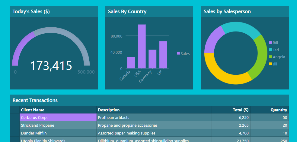
Let's start with a definition. When we say dashboard, what exactly do we mean? Something like this:
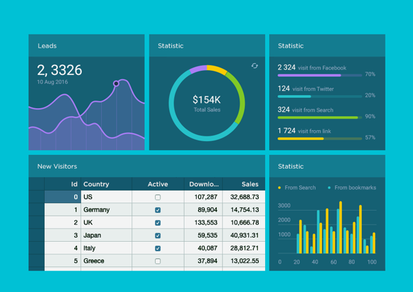
This is what your manager has in mind when they ask you to quickly whip up a dashboard for them. If you're reading this, you're probably a developer, not a graphic designer. The question is: As developers, how close can we get to this example of a dashboard on our own?
Using Wijmo, it turns out we can get close. Very close. Let's look at the tools and widgets we'll be using.
Bootstrap
In a world with Flexbox and CSS Grid, the programming pundits and self-styled experts on Reddit will tell you that you no longer need a CSS framework like Bootstrap. And they're technically correct.
But Bootstrap makes it very easy to set up a responsive grid-based application and includes a bunch of extra niceties that will save us time. Since we're developers with deadlines, we're going to use Bootstrap.
When making your own amazing dashboard, feel free to use Bootstrap, Bulma, Tachyons, or anything else you like.
This article assumes you're familiar with Bootstrap basics, but you'll be fine if you've never used it. When you see CSS class names like col-sm-4, mt-1, and card, just keep in mind that those are part of Bootstrap's CSS.
React
If you're reading this article, you're probably already familiar with React. But if you aren't, it's an excellent JavaScript UI construction library created by Facebook.
It has taken the world by storm since it was released in 2013. It's used everywhere, by companies large and small.
It has even branched out from the web as React Native. Using React Native, you can create great, fast mobile apps with React and JavaScript.
The rest of this article will assume you're already familiar with basic React concepts, including purely functional components. If you're not yet a React whiz, that's okay! But you may need to refer to the React documentation if you run into any React-related bits of code you're unsure of as we progress.
Wijmo
Wijmo is a terrific set of enterprise-ready JavaScript UI controls.
It's a one-stop shop for everything you'll need to create amazing dashboards, reporting tools, and line-of-business apps that dazzle your managers, co-workers, and end users, leaving them amazed at how you can get so much done so quickly.
Even better, Wijmo has built-in wrappers for React, Angular, and Vue. Since we'll be building our dashboard with React, this is great news. Many charting libraries require us to use DOM refs and mess around for hours to get charts to work properly. With Wijmo, once we've imported the components we want, we can use them immediately.
Wijmo UI Components - The All-Star Lineup
There are a few specific Wijmo components we're going to use to construct our dashboard. Since they will be the stars of the show, let's take a quick look at them before we dive into the code needed to create them.
FlexGrid
If you've got tabular data to display, but don't want to drop it into a boring, ugly HTML table, Wijmo's React DataGrid, FlexGrid, can help. The FlexGrid comes complete with automatic column generation, column sorting and reordering, editing, and clipboard support.
FlexChart
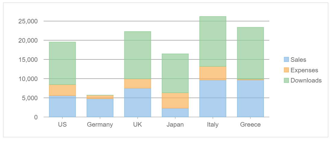
The FlexChart is a multi-talented magician that can display many types of charts—column, bar, scatter, line, area, and spline—as well as several combinations of these types at once!
We will use a FlexChart to add a great-looking bar chart to our dashboard.
FlexPie
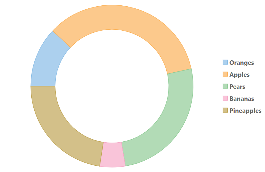
Who do you call when you want to show the relative sizes of several categories of data? You would dial up FlexPie.
You can use the FlexPie anywhere you'd use an ordinary pie chart, but FlexPie has a few nice extras that help it stand out from the pie chart crowd.
RadialGauge
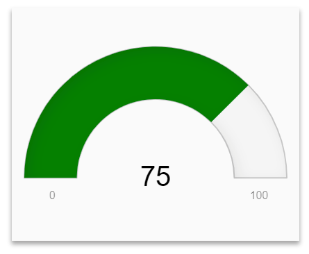
When a manager looks at a sales dashboard, they want to see if this week's sales are great, acceptable, or terrible at a glance. The RadialGauge gives us this ability and looks great while doing it!
The Code
To keep things simple, we will use StackBlitz to host and run our dashboard. You can find all of the required code here. In a production app, you'd want to pull out all of your components into separate files. We've defined them all in index.js, so you can take everything in quickly without jumping around.
We'll walk through all the critical code sections one at a time, but we'll skip discussing boilerplate that's not directly relevant to our app. Since we're developers with deadlines, this article isn't going to explore every possible configuration of the Wijmo components we're using. If we tried to do that, every component would need its own article!
Instead, after we walk through the code for each component, we'll show you where you can explore the component in more depth.
Now, let's get started.
After all of the imports at the top of index.js, you'll see two purely functional components:
const ChartPanel = ({title, children}) => {
  return (
    <div className="col-lg-4 col-md-6 col-sm-12 mt-1">
        <div className="card dashboardPanel">
            <div className="card-body">
          <h5 className="card-title">{title}</h5>
            {children}
            </div>
        </div>
    </div>
  );
}

const DataPanel = ({title, children}) => {
  return (
    <div className="col-sm-12">
        <div className="card dashboardRow">
            <div className="card-body">
          <h5 className="card-title">{title}</h5>
          {children}
            </div>
        </div>
    </div>
  )
}
These are just wrappers that keep most of our Bootstrap-related boilerplate in one place. They will come in handy if you decide to customize the dashboard for your own needs and add additional panels. As you'll see, using these wrapper classes makes it easy to create dashboard panels with Wijmo controls inside!
Next, we create a panel with a RadialGauge showing how much our company has sold today:
const Gauge = ({data}) => {
  return (
    <ChartPanel title="Today's Sales ($)">
        <div className="gauge">
            <RadialGauge
            min={ 0 } max={ 500000 }
            isReadOnly={ true }
            thickness={0.15}
            value={ data }
          />
        </div>
    </ChartPanel>
  );
}
Our gauge component is simple: it takes the ChartPanel we defined above, and wraps it around a Wijmo RadialGauge. We pass in a few props to customize it to our needs; we set minimum and maximum values that make sense for our dashboard, make the gauge read-only, and set its thickness.
You'll notice that our Gauge component takes one parameter named data, and passes it to the RadialGauge's value prop. This value should always be set to a number that represents the current value the gauge is set to. This number should always be between the gauge's min and max properties.
We've only used a few of RadialGauge's many options. For a more in-depth look at its capabilities, see our Wijmo Gauge 101.
Next, we're going to add a bar chart that breaks down sales by country:
const SalesChart = ({salesData}) => {
  return (
    <ChartPanel title="Sales By Country">
        <FlexChart itemsSource={salesData}
                     bindingX="country"
                     style={ { height: "290px" } }>
            <FlexChartSeries name="Sales" binding="sales" />
        </FlexChart>
    </ChartPanel>
  );
}
Just like we did with the gauge, we're wrapping everything in our custom ChartPanel. Inside that, we're adding a Wijmo FlexChart. You'll notice that we pass it a few props: itemsSource, bindingX, and style.
style is straightforward: it's just an object full of CSS properties that get passed along to the Wijmo chart. In this case, we're just setting the chart's height to ensure it fits neatly inside our chart panel.
itemsSource, as its name implies, contains a list of data items that will be used to construct the chart. The prop should be passed a JavaScript array containing objects that have at least one string property for x-axis labels and one numeric property containing y-axis values that FlexChart will use to draw the chart bars, points, or lines, depending on which chart type you choose. In this case, for our dashboard, the itemsSource for the chart looks like this:
 const salesByCountry = [
 { country: "Canada", sales: 27250 },
 { country: "USA", sales: 107340},
 { country: "Germany", sales: 45360 },
 { country: "UK", sales: 66250}
]
Next, we see bindingX is set to"country." This just tells Wijmo that, as it goes through the itemsSource we provided and constructs the chart, it should use the country property of each object as the x-axis label for that data point.
Inside the FlexChart, you'll notice a FlexChartSeries element. It receives two props: name and binding. name tells Wijmo what to label this data series in the chart legend, and binding tells Wijmo which property of each data item to use to render this data series.
Although we only use a single data series in our dashboard chart, FlexChart will happily render multiple data series on a single chart. For a deeper look at everything FlexChart can do for you, take a look at FlexChart 101.
const SalesPie = ({salesData}) => {
  return (
    <ChartPanel title="Sales by Salesperson">
          <FlexPie itemsSource={salesData}
                 binding="sales"
                 bindingName="name"
                 innerRadius={0.70}
                 style=\{{ height: "290px" } }/>
    </ChartPanel>
  );
}
Next, we have FlexPie. Since FlexPie is a close cousin of FlexChart, it accepts a similar set of props. There's one crucial difference: FlexPie can only display a single data series, since multiple series on a pie chart wouldn't make much sense!
As a result, instead of adding a series separately, we provide the data binding property directly to FlexPie. Let's take a look at all of the props we have used:
itemsSource works the same way as it does in FlexChart. You should pass it an array of JavaScript objects containing a string property to label the data point in the chart legend, and a numeric property that is used to render the pie wedge for the data point. The data our FlexPie is using looks like this:
export const salesByPerson = [
 { name: "Bill", sales: 5500},
 { name: "Ted", sales: 7250},
 { name: "Angela", sales: 8500},
 { name: "Jill", sales: 10750}
]
Next up, bindingName tells which property of each data object should be used to label the data point on the chart. In our case, we're binding to the name property.
binding tells Wijmo which property of each data object contains the numeric value it should use to calculate each of the pie wedges.
innerRadius is a fun one: if you set it to a value between 0 and 1, it will hollow out the center of the pie and turn your pie chart into a donut chart! Not that there's anything wrong with plain old pie charts. They're great! Turning our chart into a donut just gives it a hipster, 21st-century sort of look.
style works the same way it did for our FlexChart. We're just adding it to make sure our donut chart fits neatly inside its dashboard box. For a deep dive into everything FlexPie can do for you, check out FlexPie 101.
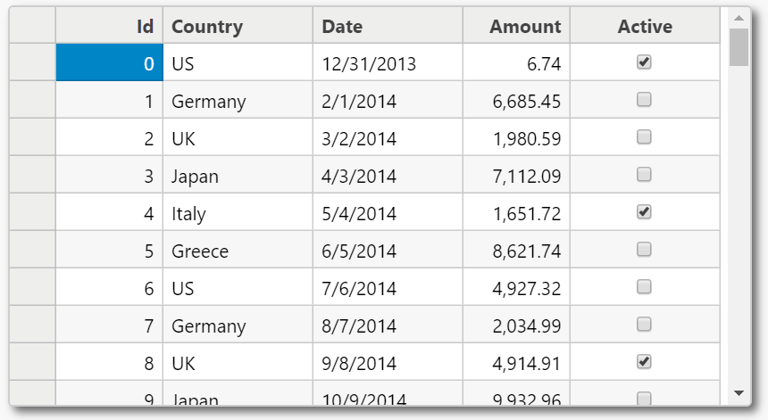
Finally, let's look at the table showing a list of recent transactions. Instead of a boring old HTML table, we're using a Wijmo React DataGrid:
const TransactionList = ({transactions}) => {
  return (
    <DataPanel title="Recent Transactions">
      <FlexGrid style=\{{width: "100%" }}
                    itemsSource={transactions}>
          <FlexGridColumn header="Client Name"
                        binding="client" width="2*" />
          <FlexGridColumn header="Description"
                        binding="description" width="3*" />
          <FlexGridColumn header="Total ($)"
                        binding="value" width="1*" />
          <FlexGridColumn header="Quantity"
                        binding="itemCount" width="1*" />
        </FlexGrid>
    </DataPanel>
  );
}
Wow! There's a lot more going on here than in our previous components. Let's break it down one piece at a time to see what's going on.
First, we're wrapping the grid in a DataPanel, one of our custom Bootstrap-ified container components.
Next, we create the FlexGrid. Notice that we pass it two props: style and itemsSource. We've seen both of these before, and they serve the same purpose here. One thing to note is that the shape of the data passed to itemsSource looks a bit different from what we've been seeing up to this point:
const recentSales = [
 { client: "Dunder Mifflin",
   description: "Assorted paper-making supplies",
   value: 4700, itemCount: 10},
 { client: "Utopia Planitia Shipyards",
   description: "Dilithium, duranium, assorted shipbuilding supplies",
   value: 21750, itemCount: 250}
];
As we see, we have an array of objects containing a mix of string and numeric properties. Each object property can be bound to a chart column. If you don't manually specify any columns, FlexGrid will intelligently come up with a set of columns and column headings for you.
Since we want maximum control over the look of our data, you'll notice that we've added several FlexGridColumns to our React DataGrid. We're passing three props to each FlexGridColumn: header, binding, and width.
header tells Wijmo what header text to use to label this column.
binding tells Wijmo which property of each data object it should bind to this column. We've intentionally set it up so our column headings don't completely match the names of the properties in our data objects. For instance, our Quantity column is being bound to the itemCount data property.
We chose to do this because it's extremely common to receive data from an API or back-end system containing data with labels that don't make a lot of sense. Thanks to Wijmo allowing you to add custom column bindings, you won't need to do a ton of data-preprocessing before handing your data off to Wijmo. Just tell Wijmo what to expect, and it'll do all the heavy lifting.
Finally, we're passing each column a width prop. The widths we're passing in might look a bit funny: they contain values like 2 and 3. Star sizing is a powerful way to define dynamic sizing for FlexGrids. Wijmo's documentation provides a great explanation of how this works, and how you can use it to ensure your data grids render exactly how you'd like them to.
For a complete look at FlexGrid's capabilities, see FlexGrid 101.
Let's finish up with a look at our final dashboard app component:
class App extends Component {
 constructor() {
   super();
   this.state = {
     recentSales: recentSales,
     salesByCountry: salesByCountry,
     salesByPerson: salesByPerson
   };
 }

 calculateSales () {
   let totalSales = 0;
   this.state.recentSales.forEach(sale => totalSales += sale.value);
   return totalSales;
 }

 render() {
   return (
     <>
      <NavBar title="Sales Dashboard" />
      <div className="container">
        <div className="row">
         <Gauge data={ this.calculateSales() } />
         <SalesChart salesData={this.state.salesByCountry} />
         <SalesPie salesData={this.state.salesByPerson} />
        </div>
        <div className="row">
         <TransactionList transactions={this.state.recentSales} />
        </div>
      </div>
      </>
   );
 }
}
Since we've wrapped our custom code in its own components, our App component is 100% standard React. We import and use our dummy data to set our initial app state, add a method to dynamically calculate the sales figure for our radial gauge, and then render all of our custom components—nice and simple!
The Final Sales Dashboard
After going through all that code, it's time to see the end result! You can see it running live on StackBlitz. The net result is a dashboard that looks like this:
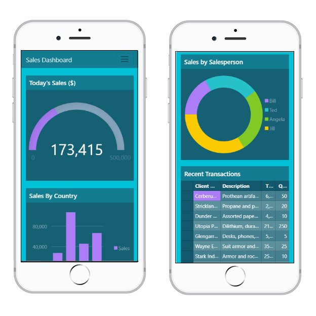
We're developers working all by ourselves, and we've quickly assembled a great dashboard! Thanks to Bootstrap's responsive CSS, it looks great on mobile, too:
This is just the beginning. Why not start with the code we've built here and use it as the foundation for your own dazzling Wijmo dashboard?
Ready to try it out? Download Wijmo Today!
Try Out Wijmo UI Components
As we've seen, you can use Wijmo components to create a production-ready dashboard quickly and easily. Just think of how much time you'd spend creating your own grid view with built-in sorting and filtering.
Wijmo's components help you innovate by giving you the tools to create great-looking enterprise dashboards right away—there's no need to spend hours trying to cobble together open-source toolkits or roll your own solutions. In another article, we discuss how to create a dynamic dashboard in React.
With that in mind, remember that the dashboard we've created is just a starting point. A single article doesn't give us nearly enough space to explore the entire Wijmo toolset; we've just scratched the surface of what Wijmo can do for you. To better understand what Wijmo can help you accomplish, start by reading about all of Wijmo's controls, then see the controls live in the Wijmo Component Explorer.
Happy coding!
Tags:
Related Blogs
Try Our JavaScript UI Components & Datagrid
