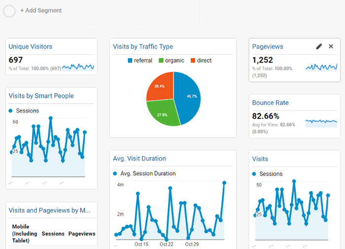
A while back, one of our customers asked for a demonstration of creating a dynamic dashboard like those made with the Google Analytics app. The image below shows an example of one of these applications:
The following are some key features of interest to the customer:
- A catalog of pre-defined configurable tile types
- Tiles featuring arbitrary UI elements such as rich text, charts, grids, and gauges
- Customizable dashboards that let users add, remove, reorder, and configure tiles
- Touch screen, drag and drop functionality for mobile users
We created Wijmo’s Dynamic Dashboard and made it available to all our users. The sample was implemented using Wijmo and Angular 1.x. When we released the Wijmo React interop, we decided to create a React-based version. Since then, we have updated our sample to work with the latest React updates, including functional components and hooks.
Below, we outline the steps for porting the dynamic dashboard sample to React. The React version of the sample looks exactly like the original, but the implementation is quite different. The Data Visualization is achieved using powerful components from Wijmo, like our React DataGrid and Chart. In this article, we will cover:
You can also follow along in the video below:
Ready to Create Custom Dashboards? Download Wijmo Today!
Application Architecture
The dynamic dashboard app has two components: the frame and the tiles. The dashboard frame is a stateful component. It defines a catalog of tile types available and a list of the tiles that make up the current dashboard. It also provides logic for adding, removing, and reordering the tiles.
The tiles are stateless (in the React sense). They receive data from the frame via properties (passed in as element attributes). The app defines nine types of tiles, including various charts, gauges, graphs, and a grid.
In a traditional OOP application, all tiles extend a base tile class. In React (and many other JavaScript frameworks), you are encouraged to use composition instead of inheritance. This is a limitation. Composition and inheritance are different mechanisms; each has its uses, and one does not fully replace the other.
In our app, we follow the React team’s advice and implement our tiles using composition rather than inheritance. We define a Tile component that provides the tile border (with a header and buttons). The Tile component has a “content” property that defines the actual tile content.
Dashboard Frame Component
The app component implements our dashboard frame. It is instantiated with the following code snippets from the index.html and index.jsx files:
<body>
    <div id="app"></div>
</body>
const container = document.getElementById('app');
if (container) {
const root = ReactDOM.createRoot(container);
root.render(<App />);
}The app parameter in the call to React.createElement is our dashboard frame component. It is implemented as follows:
export function App() {
    const [isWideMenu, setIsWideMenu] = useState(false);
    const [tiles, setTiles] = useState([
        { name: tileCatalog.items[1].name, key: key += 1 },
        { name: tileCatalog.items[2].name, key: key += 1 },
        { name: tileCatalog.items[5].name, key: key += 1 },
        { name: tileCatalog.items[7].name, key: key += 1 },
        { name: tileCatalog.items[0].name, key: key += 1 },
    ]); // tiles in the dashboard
    const [data] = useState(getData()); // data shown in the tiles
    // gets a tile content by name
    const getTileContent = (name) => {
        const arr = tileCatalog.items;
        for (let i = 0; i < arr.length; i++) {
            if (arr[i].name == name) {
                return React.createElement(arr[i].tile, {
                    data: new wjcCore.CollectionView(data),
                    palette: palette
                });
            }
        }
        throw '*** tile not found: ' + name;
    };
    ...
}
The app component’s state has five elements:
- isWideMenu: determines whether the tile menu displays the entire side menu or only the icons
- tileCatalog: the list of available tile types that can be added to the dashboard
- tiles: a list of the tiles currently on the dashboard
- key: the identifier used when creating the next tile
- data: data shown on the dashboard and passed as a prop to all tiles
Below, the component’s App function shows how the state generates the customizable dashboard.
Create a return statement that will render all our elements:
export function App() {
    ...
    return (<div className="container">
      <div className={`menu ${isWideMenu ? 'menu--open' : ''}`}>
        {renderMenuToggle}
        {renderMenuItems}
      </div>
      <div className="hr"/>
      <div className="content">
        <div className="dashboard">{tiles.length ? renderTiles : renderBlankTile}</div>
      </div>
    </div>);
}
JSX syntax looks a lot like HTML, but there are some minor differences. Instead of “class,” for example, we must use “className.” That is because although it looks like HTML, this is really JavaScript code, and the DOM element’s property is called “className,” not “class.”
Next, create the renderMenuToggle and renderMenuItems objects that allow users to select tiles and add them to the dynamic dashboard, as well as shrink and expand the menu:
export function App() {
    ...
    // animated toggle menu
    const renderMenuToggle = (<div className={'menu-toggle' + (isWideMenu ? ' menu--open' : '')} onClick={() => setIsWideMenu(!isWideMenu)}>
      <svg width="30" height="20" viewBox="0 0 30 20" fill={palette[2]}>
        <rect x="10" y="5" width="11" height="1"/>
        <rect x="10" y="15" width="11" height="1"/>
        <polygon points="29.48 10.27 24.23 5.03 23.52 5.73 27.79 10 10 10 10 11 27.79 11 23.52 15.27 24.23 15.97 29.48 10.73 29.7 10.5 29.48 10.27"/>
      </svg>
    </div>);
    // menu items
    const renderMenuItems = (<React.Fragment>
      {tileCatalog.items.map((item) => (<div key={`Menu ${item.name}`} className="menu-item" title={item.name} onClick={() => addTile(item.name)}>
          <svg width="64" height="64" viewBox="0 0 64 64">
            {item.icon.map((entity, key) => (<React.Fragment key={`Menu Item ${key}`}>{entity}</React.Fragment>))}
          </svg>
          <div className="menu-item-name">{item.name}</div>
        </div>))}
    </React.Fragment>);
    ...
}
When the user clicks on one of the icons, the addTile method is called and implemented as follows:
export function App() {
    ...
    // adds a tile to the dashboard
    const addTile = (name) => {
        key += 1;
        setTiles([{ name, key }, ...tiles]);
    };
    ...
}
First, the method copies the current tiles array and increments the key that uniquely identifies tile instances.
Then, it adds a new item to the tiles array with the name specified by the catalog’s currentItem and calls setTiles to update the state with the new tiles array.
When setTiles is called, React updates the UI to show the updated tiles array.
The code used by these items to render the dashboard tiles is typical React. It uses the array.map method to generate a list of components that make up the UI. In this case, the components are instances of Tile’s following properties:
- header: the tile name displayed in the tile header
- content: a component that represents the tile content
- onRemove: callback invoked when the user clicks the “delete” button on the tile header
- index: the index of the tiles within the tile array
- key: the item identifier React uses to optimize rendering
Note: The key and index parameters are used for different purposes. The app component uses the index parameter to identify tiles in the tiles array, specifically when deleting tiles. The index of a tile may change if tiles are removed or reordered.
The React framework uses the key parameter to establish a mapping between array elements and components. The key does not change when tiles are removed or reordered.
export function App() {
    ...
    // displayed when the dashboard is empty
    const renderBlankTile = (<div className="blank">
      <svg width="24" height="24" viewBox="0 0 24 24" fill={palette[0]}>
        <path d="M4,2H20A2,2 0 0,1 22,4V16A2,2 0 0,1 20,18H16L12,22L8,18H4A2,2 0 0,1 2,16V4A2,2 0 0,1 4,2M4,4V16H8.83L12,19.17L15.17,16H20V4H4M11,6H13V9H16V11H13V14H11V11H8V9H11V6Z"/>
      </svg>
      <div>Click on an item on the menu bar to add the new tile to the dashboard.</div>
    </div>);
    // list of tiles
    const renderTiles = (<React.Fragment>
      {tiles.map((item, index) => (<Tile header={item.name} content={getTileContent(item.name)} onRemove={removeTile} index={index} key={item.key}/>))}
    </React.Fragment>);
    return (<div className="container">
      <div className={`menu ${isWideMenu ? 'menu--open' : ''}`}>
        {renderMenuToggle}
        {renderMenuItems}
      </div>
      <div className="hr"/>
      <div className="content">
        <div className="dashboard">{tiles.length ? renderTiles : renderBlankTile}</div>
      </div>
    </div>);
}
The renderTiles item uses the getTileContent method to create and return a component of a given type.
It looks up the component type based on the name and calls React.createElement to instantiate the tile:
export function App() {
    ...
    // gets a tile content by name
    const getTileContent = (name) => {
        const arr = tileCatalog.items;
        for (let i = 0; i < arr.length; i++) {
            if (arr[i].name == name) {
                return React.createElement(arr[i].tile, {
                    data: new wjcCore.CollectionView(data),
                    palette: palette
                });
            }
        }
        throw '*** tile not found: ' + name;
    };
    ...
}
The removeTile method acts as an event handler. It is called by the Tile component when the user clicks the delete button on the tile header. The array.filter method is used to select all tiles except the one that was clicked and calls setState to update the state with the new tiles array.
As before, the call to setState makes React update the UI, showing the updated tiles array.
export function App() {
    ...
    // removes a tile from the dashboard
    const removeTile = (tileIndex) => {
        const state = tiles.filter((item, index) => index != tileIndex);
        setTiles(state);
    };
    ...
}
Ready to Create Custom Dashboards? Download Wijmo Today!
Tile Components
The Tile component represents a frame that holds all types of tile content. It is a component implemented as follows:
import * as React from 'react';
export const Tile = ({ header, content, index, onRemove }) => (<div className="tile" draggable={true}>
    <div className="tile-container">
      <div className="tile-header">{header}</div>
      <div className="buttons">
        <div className="button" title="Close Tile" onClick={() => onRemove(index)}>
          <svg width="24" height="24" viewBox="0 0 24 24">
            <path d="M12.71,12l4.64-4.65a.49.49,0,1,0-.7-.7L12,11.29,7.35,6.65a.49.49,0,0,0-.7.7L11.29,12,6.65,16.65a.48.48,0,0,0,0,.7.48.48,0,0,0,.7,0L12,12.71l4.65,4.64a.48.48,0,0,0,.7,0,.48.48,0,0,0,0-.7Z"/>
          </svg>
        </div>
      </div>
    </div>
    <div className="tile-content">{content}</div>
  </div>);
Create a frame with header, content, index, and onRemove properties. When the tile is created, these properties are all assigned in the dashboard.
Notice how the outer div has its draggable attribute set to “true.” This enables HTML drag-and-drop operations.
The Tile component’s most interesting property is content, which represents the child component that contains the tile information. Our application defines nine types of tile content components, including charts, gauges, and grids. They all have a data property set by the parent component that contains the data shown on the tile.
You can make the tile components as simple or complex as you like. Adding new tile types is easy: create the component to show the data in “props.data” in whatever way you want. Add the new tile type to the application component’s tileCatalog array.
Tile components may contain other components, including Wijmo data visualization controls. For example, below is the implementation of the BarChart Tile component:
// React
import * as React from 'react';
// Wijmo
import * as wjcChart from '@mescius/wijmo.chart';
import * as wjChart from '@mescius/wijmo.react.chart';
export const BarChart = ({ data, palette }) => (<wjChart.FlexChart chartType={wjcChart.ChartType.Bar} itemsSource={data} palette={palette} bindingX="date">
    <wjChart.FlexChartAxis wjProperty="axisX" format="MMM-yy"/>
    <wjChart.FlexChartSeries name="Sales" binding="sales"/>
    <wjChart.FlexChartSeries name="Expenses" binding="expenses"/>
    <wjChart.FlexChartSeries name="Profit" binding="profit" chartType={wjcChart.ChartType.LineSymbols}/>
  </wjChart.FlexChart>);
Another use is our powerful React DataGrid component. Below is the implementation of the Grid Tile component:
// React
import * as React from 'react';
// Wijmo
import * as wjcGrid from '@mescius/wijmo.grid';
import * as wjGrid from '@mescius/wijmo.react.grid';
export const Grid = ({ data, palette }) => (<wjGrid.FlexGrid isReadOnly={true} headersVisibility={wjcGrid.HeadersVisibility.Column} selectionMode={wjcGrid.SelectionMode.ListBox} itemsSource={data}>
    <wjGrid.FlexGridColumn header="ID" binding="id" width={50}/>
    <wjGrid.FlexGridColumn header="Date" width="*" binding="date" format="MMM yyyy"/>
    <wjGrid.FlexGridColumn header="Sales" binding="sales" format="c"/>
    <wjGrid.FlexGridColumn header="Expenses" binding="expenses" format="c"/>
    <wjGrid.FlexGridColumn header="Profit" binding="profit" format="c"/>
  </wjGrid.FlexGrid>);
The main advantage of the React implementation of this app is the neat encapsulation of the Tile components. Each one is represented by a single JSX file that contains the logic and UI.
Drag and Drop Tiles
Reordering tiles with drag-and-drop functionality is a key feature of this application. We already had this code written for the Angular version of the app. It uses standard HTML5 drag-and-drop functionality, which was quite easy to port to React.
Simply move the original drag-and-drop code into a method called enableItemReorder and call that from the main component’s useEffect method:
export function App() {
    ...
    // initialize component after it has been mounted
    useEffect(() => {
        // enable tile drag/drop
        const panel = document.querySelector('.dashboard');
        enableItemReorder(panel);
    }, []);
    ...
}
The enableItemReorder method adds handlers to the standard “dragstart”, “dragover”, “drop”, and “dragend” HTML5 events.
Because the HTML drag/drop events work with the actual HTML elements on the DOM (and not with the React virtual DOM), we must update the state when a drop operation is finalized. This is done when handling the “drop” event, as shown in the code snippet below:
export function App() {
    ...
    const enableItemReorder = (panel) => {
        let dragSource = null;
        let dropTarget = null;
        // add drag/drop event listeners
        ...
        panel.addEventListener('drop', (e) => {
            if (dragSource && dropTarget) {
                // finish drag/drop
                e.stopPropagation();
                e.stopImmediatePropagation();
                e.preventDefault();
                // re-order HTML elements (optional here, we're updating the state later)
                const srcIndex = getIndex(dragSource);
                const dstIndex = getIndex(dropTarget);
                const refChild = srcIndex > dstIndex ? dropTarget : dropTarget.nextElementSibling;
                dragSource.parentElement.insertBefore(dragSource, refChild);
                // focus and view on the tile that was dragged
                dragSource.focus();
                // update state
                setTiles((prevState) => {
                    const [item] = prevState.splice(srcIndex, 1);
                    prevState.splice(dstIndex, 0, item);
                    return prevState;
                });
            }
        });
        ...
    };
    ...
}
The final piece is touch support. Since the code relies on native HTML5 drag/drop events, we added drag/drop touch support simply by including the DragDropTouch polyfill in our project.
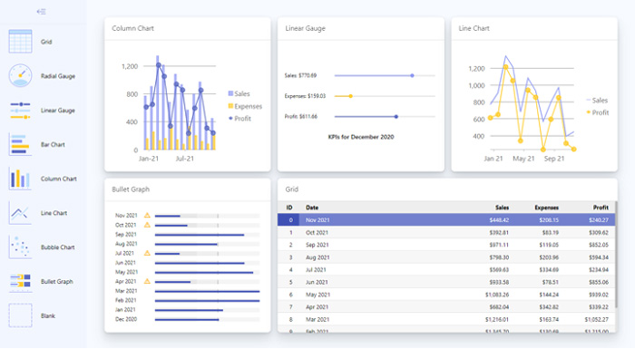
The screenshot below shows the running application:
Conclusion
Porting the dynamic dashboard sample to React was surprisingly easy, given the relative complexity of the app. Creating new tiles of arbitrary types, supporting drag-and-drop operations, and encapsulating arbitrary components within tiles are not trivial tasks.
Some significant benefits of using React in this sample were:
- The ability to use JSX and get full design-time error-checking, IntelliSense, and rich debugging for the entire app (including the JSX markup)
- The clean state-driven architecture imposed by React (which may take a little getting used to but tends to pay off later)
- The ability to encapsulate tiles neatly into single-file components
Use the dynamic dashboard sample as a starting point for actual dashboard apps. Some features that could be added to improve the application are:
- The ability to save and restore dashboard layouts to local storage
- Adding states to tiles so users can customize them
Ready to Create Custom Dashboards? Download Wijmo Today!
Learn more about Wijmo on our home page.
Learn more about using Wijmo in React applications on our React page.
Check out the complete dynamic dashboard demo and the sample code on JS CodeMine.
Tags:
Related Blogs
Try Our JavaScript UI Components & Datagrid
