Add Hierarchical Grouping with FlexGrid ASP.NET MVC TreeView Controls
The FlexGrid is a valuable component for performing CRUD operations. Displaying hierarchical data is one of the unique and popular features of FlexGrid. FlexGrid displays hierarchical data using Group Rows.
These rows' behavior for hierarchical data in Flexgrid is similar to a TreeView with additional information using multiple columns. The toggle icon would be displayed for a row if it has child items, and clicking on it toggles to expand/collapse, similar to a TreeView.
TreeGrid also contains a “Level” property which denotes the hierarchy of the node. Lower-level nodes hold higher-level nodes.
In this blog, we will discuss various methods to display Hierarchy data in FlexGrid:
- Grouping
- Hierarchal Data Binding and Editing
- Displaying Hierarchal Data Using Unbound Mode
- XML Data Binding
- Lazy Loading
Ready to Test out these methods? Download a FREE 30-Day Trial of ComponentOne Today!
Grouping
FlexGrid, by default, supports binding to a Database. The data would be displayed in the same order as it was in the Database. However, if we want the aggregate for columns, we need to calculate them explicitly.
To overcome this issue, FlexGrid has the grouping feature to set the aggregate for the columns.
Here is the code to set FlexGrid’s DataSource from the Model.
<c1-flex-grid group-header-format="{value}" auto-generate-columns="false" style="height:300px">
        <c1-flex-grid-column binding="ID" header="ID"></c1-flex-grid-column>
        <c1-flex-grid-column binding="First" header="First"></c1-flex-grid-column>
        <c1-flex-grid-column binding="Last" header="Last"></c1-flex-grid-column>
        <c1-flex-grid-column binding="Hired" header="Hired"></c1-flex-grid-column>
        <c1-flex-grid-column binding="Sales" header="Sales"></c1-flex-grid-column>
        <c1-flex-grid-column binding="Downloads" header="Downloads"></c1-flex-grid-column>
        <c1-flex-grid-column binding="Active" header="Active"></c1-flex-grid-column>

        <c1-items-source source-collection="Model" ></c1-items-source>
    </c1-flex-grid>
To add the grouping in the FlexGrid, the PropertyGroupDescription instance should be added to the groupDescriptions property.
Here is the code for applying grouping and adding aggregates:
<c1-flex-grid group-header-format="{value}" auto-generate-columns=false style="height:300px">
        <c1-flex-grid-column binding="ID" header="ID"></c1-flex-grid-column>
        <c1-flex-grid-column binding="First" header="First"></c1-flex-grid-column>
        <c1-flex-grid-column binding="Last" header="Last"></c1-flex-grid-column>
        <c1-flex-grid-column binding="Hired" header="Hired" ></c1-flex-grid-column>
        <c1-flex-grid-column binding="Sales" header="Sales" aggregate="Sum"></c1-flex-grid-column>
        <c1-flex-grid-column binding="Downloads" header="Downloads" aggregate="Sum"></c1-flex-grid-column>
        <c1-flex-grid-column binding="Active" header="Active"></c1-flex-grid-column>

          <c1-items-source source-collection="Model" group-by="Country"></c1-items-source>
    </c1-flex-grid>
Here’s how FlexGrid would look after applying the grouping to FlexGrid:

From the image, we can observe the Sales and Downloads, which are grouped Country-wise from the group row highlighted with gray color.
Hierarchal Data Binding and Editing
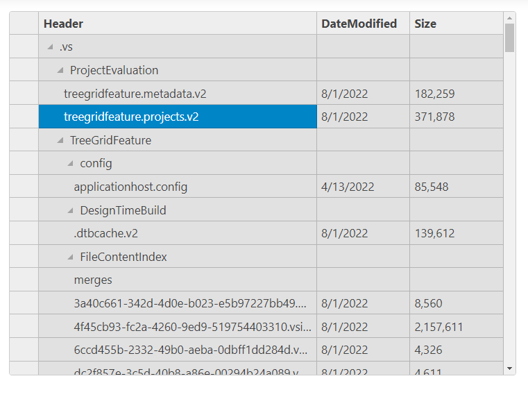
In some instances, the data objects could be hierarchical instead of Flat recordsets. To display this data in FlexGrid, we can use the child-items-path property. This property value would be the property in items having the child items.
Here is the code to show the hierarchical data:
 <c1-flex-grid auto-generate-columns=false child-items-path="Children" height="500px">
    <c1-flex-grid-column binding="Header" width="*"> </c1-flex-grid-column>
    <c1-flex-grid-column binding="DateModified"></c1-flex-grid-column>
    <c1-flex-grid-column binding="Size"></c1-flex-grid-column>

    <c1-items-source source-collection="Model"></c1-items-source>
</c1-flex-grid>
The FlexGrid looks as follows:

By default, FlexGrid nodes do not allow editing. To enable users to edit, we need to handle the loaded-rows event and set the isReadOnly property to false for the rows.
Here is the code for the same:
<script>
    function loadedRows(s,e){
        for (let i = 0;i<s.rows.length;i++){
            s.rows[i].isReadOnly = false;
        }
    }
</script>
<c1-flex-grid auto-generate-columns=false child-items-path="Children" height="500px" loaded-rows="loadedRows"></c1-flex-grid>
Displaying Hierarchal Data using Unbound Mode
The unbound mode allows you to create data items at the client-side and add them to the existing FlexGrid; in this case, the itemsSource would be null, and the rows would be added using the JS code by pushing the row and setting the cell data using the FlexGrid’s setCellData() method.
Here is the code to show the TreeGrid from the hierarchy data using the JS Code.
// Controller Code
[HttpGet,Route("Home/GetData")]
        public string GetResult()
        {
            var list = Folder.Create(Directory.GetCurrentDirectory()).Children;
            return JsonConvert.SerializeObject(list);
        }
//View Code

<c1-flex-grid id="ubgrid" auto-generate-columns="false" >
    <c1-flex-grid-column header="Header"  width="*"></c1-flex-grid-column>
    <c1-flex-grid-column header="Modified Date"></c1-flex-grid-column>
    <c1-flex-grid-column header="Size" align="right" ></c1-flex-grid-column>

</c1-flex-grid>
<script>
    c1.documentReady(function () {
        let grid = wijmo.Control.getControl("#ubgrid");
        // set FlexGrid data
        $.get("/Home/GetData").then(function(d) {
            setGridData(grid, JSON.parse(d));
        })
    });
    function setGridData(grid,data) {
        for (let r = 0; r < data.length; r++) {
            // add header
            var header = data[r];
            var row = new wijmo.grid.GroupRow();
            row.dataItem = header;
            row.isReadOnly = false;
            row.level = 0;
            grid.rows.push(row);
            grid.setCellData(row.index, 0, header.Header);
            if (header.Children) {
                addChild(grid, header, 1);
            }
        }
    }

    function addChild(grid, parent, level){
        for (var c = 0; c < parent.Children.length; c++) {
            // add children
            var child = parent.Children[c];
            row = new wijmo.grid.GroupRow();
            row.dataItem = child;
            row.isReadOnly = false;
            row.level = level;
            grid.rows.push(row);
            grid.setCellData(row.index, 0, child.Header);
            if (child.DateModified) {
                grid.setCellData(row.index, 1, new Date(child.DateModified));
            }
            grid.setCellData(row.index, 2, child.Size);
            if (child.Children) {
                addChild(grid, child, level+1);
            }
        }
    }

</script>
XML Data Binding
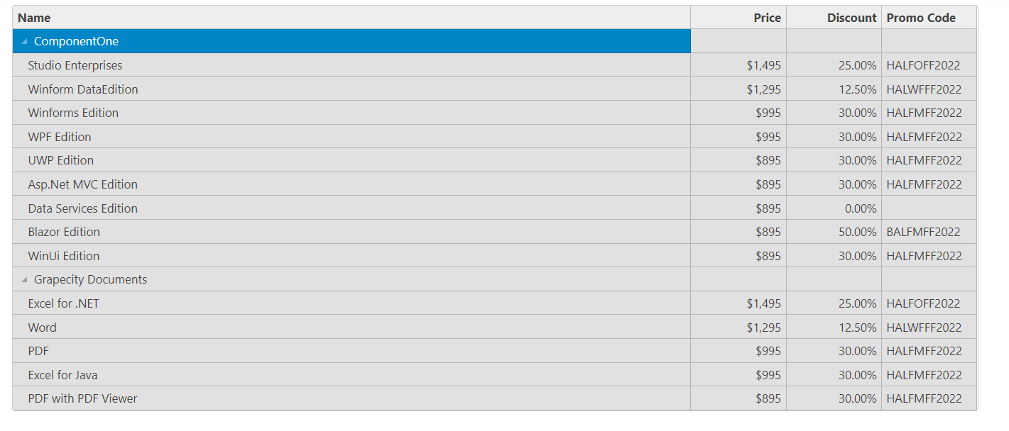
This feature is useful for the users who already have the data in XML format from the existing application or the API returns the XML data.
To display the data from an XML file, we need to read the XML data and convert it to the IEnumerable data. Later, we will bind it to the FlexGrid.
Here is the code for the same:
Convert the XML data to List
public class TProduct
    {
        public int Id { get; set; }
        public string Name { get; set; }
        public List<TEditions> Products { get; set; }
    }

    public class TEditions
    {
        public string Name { get; set; }
        public double Price { get; set; }
        public double Discount { get; set; }
        public string? PromoCode { get; set; }
    }

    public class ProductInfo
    {
        public static List<TProduct> GetProducts(string path)
        {
            var _items = new List<TProduct>();
            var _xml = XElement.Load(path);
            var _products = _xml.Elements("Product");
            foreach (var item in _products)
            {
                _items.Add(new TProduct()
                {
                    Id = Convert.ToInt32(item.Attribute("id").Value),
                    Name = item.Attribute("name").Value,
                    Products = new List<TEditions>()
                });
               var _editions = item.Elements("Edition");
                foreach (var _edition in _editions)
                {
                    _items[_items.Count - 1].Products.Add(new TEditions()
                    {
                        Name = _edition.Attribute("name").Value,
                        Discount = Convert.ToDouble(_edition.Attribute("discount")?.Value),
                        Price = Convert.ToDouble(_edition.Attribute("price").Value),
                        PromoCode = _edition.Attribute("promocode")?.Value
                    });
                }
            }

            return _items;
        }
    }
Bind the Data to FlexGrid
// Controller
public IActionResult XMLBinding()
        {
            var _path = Path.Combine(Directory.GetCurrentDirectory(), @"wwwroot\Content\ProductsInfo.xml");
            return View(ProductInfo.GetProducts(_path));
        }

//View

@model List<TProduct>

<c1-flex-grid auto-generate-columns="false" child-items-path="Products" headers-visibility="Column">
    <c1-flex-grid-column binding="Name" header="Name" width="*"></c1-flex-grid-column>
    <c1-flex-grid-column binding="Price" header="Price" format="c0" align="right"></c1-flex-grid-column>
    <c1-flex-grid-column binding="Discount" header="Discount" format="p2" align="right"></c1-flex-grid-column>
    <c1-flex-grid-column binding="PromoCode" header="Promo Code" ></c1-flex-grid-column>

    <c1-items-source source-collection="Model"></c1-items-source>
</c1-flex-grid> 
Lazy Loading
Lazy loading is a novel concept when working with large datasets, as it reduces the time to fetch as the data is loaded on demand. This is also useful to reduce the load time for the hierarchical view, as instead of loading the complete data for all nodes, the data can be loaded on demand once the Node is expanded.
This can be achieved with the help of the OnClientGroupCollapsedChanged event to detect the node expand/collapse. To implement this, we would bind FlexGrid with the Model. Later, we would expand the node by clicking on the expand icon, making an ajax call, and pushing the fetched data to the target item Children property.
Demo: FlexGrid - Lazy Loading - C1 ASP.NET MVC
Ready to Test out these methods? Download a FREE 30-Day Trial of ComponentOne Today!
