New Release! ComponentOne Studio for Xamarin 2018 v1
We’re excited to announce the release of ComponentOne Studio for Xamarin 2018 v1, which brings plenty of enhancements to the control suite. The new release contains many new features, samples, and even a new project template.
Get the new release
Watch the video
Dashboard Demo
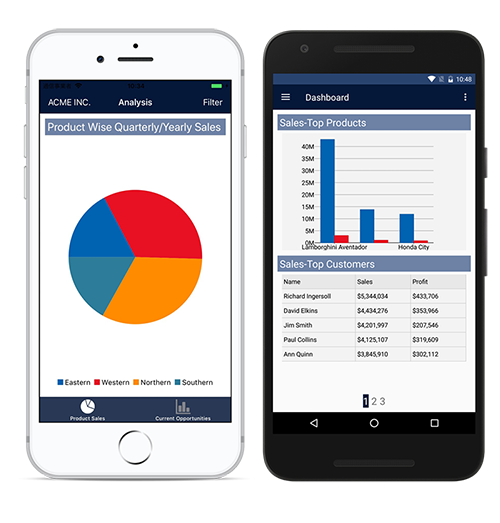
We introduced the Dashboard Demo sample for WPF and UWP in our last release, and for 2018 v1 we’re adding an all-new mobile version of the app. The Dashboard Demo sample displays sales and profit comparison, goals, top products, and customers. It features many of our controls, including FlexChart, FlexPie, FlexGrid, BulletGraph, and CollectionView. The sample also demonstrates using the controls within more complicated multi-page arrangements, including master detail, carousel, and tabbed pages. Also, many of the new control animations are on full display, more on that later…!
Get the demos: Android | iOS available soon
FlexChart
Pan and Zoom
We’ve expanded the ability to pan and zoom substantially in this release.
First, we’ve added pan and zoom to FlexPie and Sunburst charts. We’ve found that very dense datasets can be hard to read when visualized into these chart types, and adding the ability to pan and zoom greatly alleviates this problem. Users now have more agency to magnify portions of the chart that they find hard to read, which should improve interacting with both chart types an even better experience on mobile.
Secondly, we added some new properties to the Axis object of a traditional FlexChart including Scale and DisplayedRange. Scale allows to set a certain proportion of the points on an axis into view; for example, setting it to .5 puts 50% of the points on that axis in view.
DisplayedRange allows you to set a number of points in view rather than a percentage, setting this value to 5 would display the first five points along the axis. Finally, we’ve also added a ScrollTo function that allows you to programmatically scroll to a point in the chart. Taken together, this should allow for much more dynamic interactions on mobile.
Animations
Another large addition in this release is that we’ve added animations for FlexChart and FlexPie. These animations are available for loading and updating data in these chart types, as well as selection for FlexPie.

Read more about Xamarin animations
FlexGrid
Column/Row Dragging Reordering
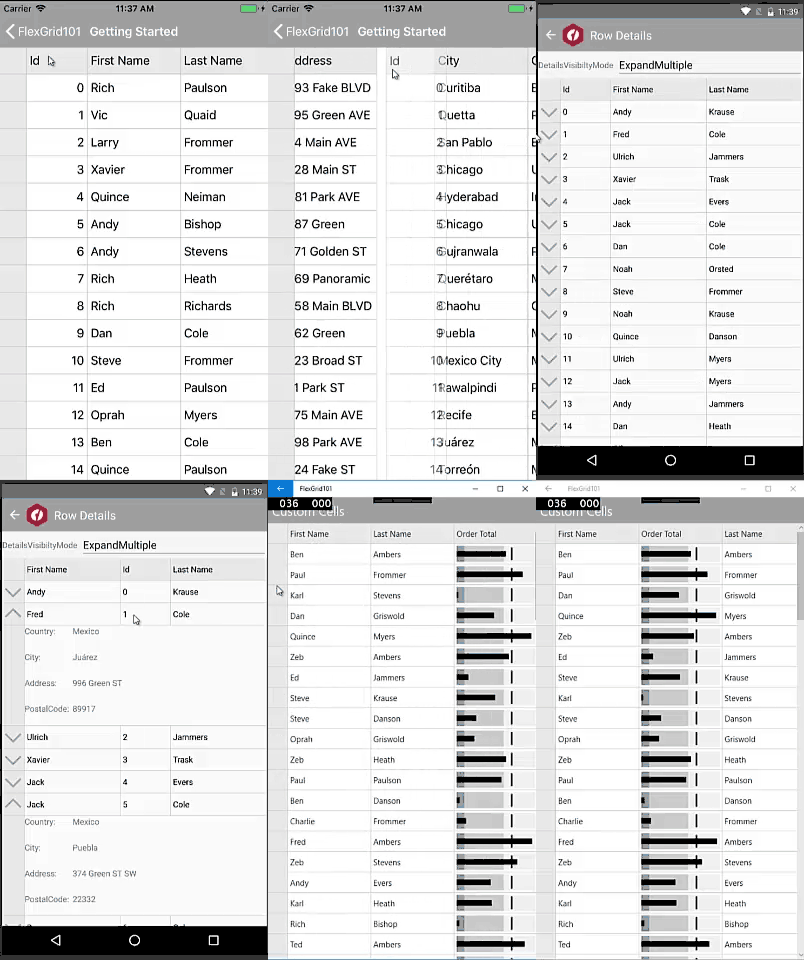
One of the most requested features for FlexGrid was the ability drag to reorder rows and columns. In this release, this is now available by setting the AllowDragging property. Resizing columns and rows should also feel better in this release, as we’ve overhauled most of our gesture and touch interactions.
There are a couple of limitations with the reordering regarding frozen columns or grouped headers. These scenarios are uncommon, but we’ll be addressing these in a future release.
Animations
The feature also has new animations to accompany reordering your data:
Deletion Changes
Finally, we’ve changed deletion to be so that it’s based on selection, rather than current cell. Now changing the SelectionMode has an impact on what is deleted. Cell-based Selection simply deletes the content of the cell without modifying the CollectionView, though Row-based selection have the rows deleted in both the FlexGrid and CollectionView.
Gauge
We’ve added the ability to use dragging interactions with our gauge controls (Linear Gauge, Radial Gauge, and Bullet Graph) rather than just taps. This often feels more natural, and, while a small detail, should noticeably improve the feel of the gauge controls. Learn more
Input
Our input controls also see some quality-of-life improvements in this release. We’ve added animations for all the DropDown derived controls, and you can enable them by setting the IsAnimated property:

We’ve also added some basic keyboard handling to the controls, so for UWP users and mobile users with a keyboard you should now be able to navigate through the list of items available in a DropDown using the arrow keys, use Enter to begin and end editing, and use the tab key to navigate through tab stops on UWP. We’ve also added some new properties for customizing the fonts in AutoComplete and ComboBox. There are now FontAttributes, FontSize, and FontFamily properties for configuring these controls. Read more about Input
Project Template
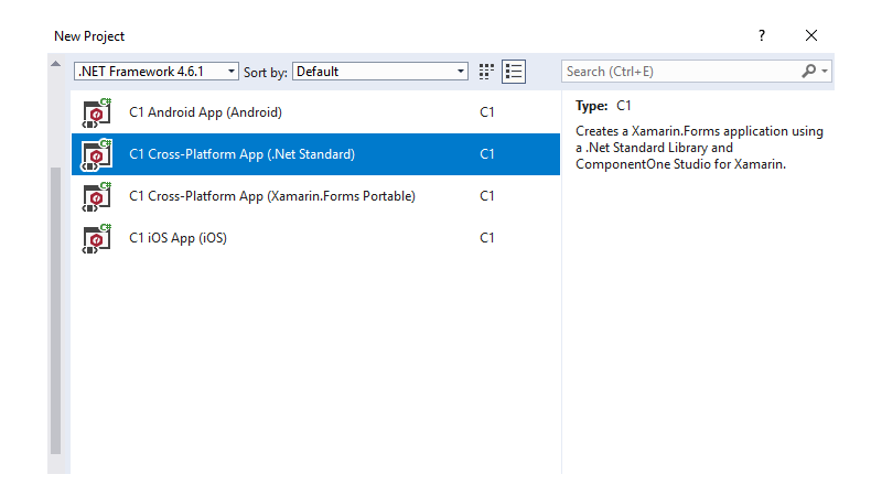
Finally, we’ve added a new .NET Standard project template for Visual Studio 2017. This template should help you modernize your Xamarin.Forms projects as the .NET platform continues to evolve. The templates should now also automatically open up the GrapeCity license manager add in (on platforms that support it) to make licensing your projects more straightforward. See all project templates


