Charts have been a big focus in SpreadJS, as we continually add new charts and enhancements to elevate usefulness and compatibility. With the v12 release, we have added 3 new charts: Radar, Sunburst, and Treemap. In addition, we have added the ability to turn loading animations on and off, to make your charts more appealing.
You can find a link to this sample here.
Radar Charts
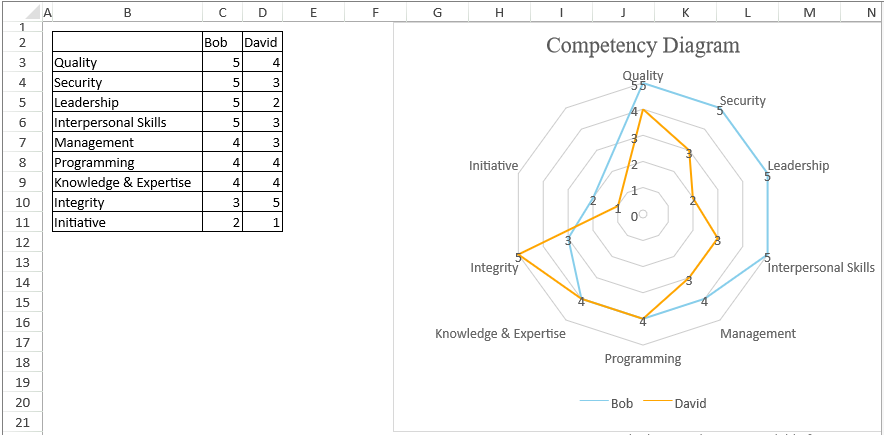
With Radar Charts, developers can show variables in three-plus dimensions and display the weight of each of those variables. Commonly this is use for personality charts and reports. There are also a few different options that can be set, like fill and markers.
The data for a radar chart can be similar to that of a clustered column chart:
var radarDataArray = [
    ['', 'Bob', 'David'],
    ['Quality', 5, 4],
    ['Security', 5, 3],
    ['Leadership', 5, 2],
    ['Interpersonal Skills', 5, 3],
    ['Management', 4, 3],
    ['Programming', 4, 4],
    ['Knowledge & Expertise', 4, 4],
    ['Integrity', 3, 5],
    ['Initiative', 2, 1]
];
The chart type in code is defined as follows:
GC.Spread.Sheets.Charts.ChartType.radar
Sunburst Charts
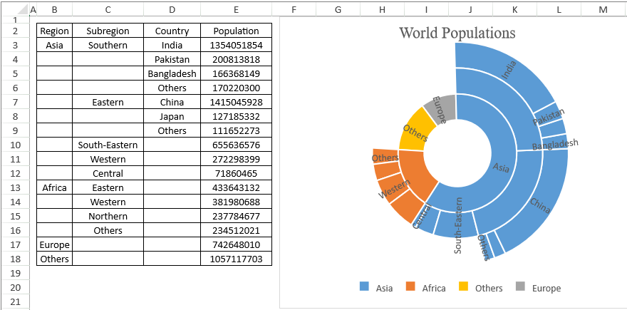
Hierarchical data can be difficult to show in a chart, but that's where Sunburst Charts come in. Sunburst Charts represent each level of a hierarchy by a ring or circle, with the innermost one being the hierarchy's top.
The hierarchical data can be organized as follows:
var sunburstDataArray = [
    ['Region', 'Subregion', 'Country', 'Population'],
    ['Asia', 'Southern', 'India', 1354051854],
    [, , 'Pakistan', 200813818],
    [, , 'Bangladesh', 166368149],
    [, , 'Others', 170220300],
    [, 'Eastern', 'China', 1415045928],
    [, , 'Japan', 127185332],
    [, , 'Others', 111652273],
    [, 'South-Eastern', , 655636576],
    [, 'Western', , 272298399],
    [, 'Central', , 71860465],
    ['Africa', 'Eastern', , 433643132],
    [, 'Western', , 381980688],
    [, 'Northern', , 237784677],
    [, 'Others', , 234512021],
    ['Europe', , , 742648010],
    ['Others', , , 1057117703]
];
With the chart type defined as:
GC.Spread.Sheets.Charts.ChartType.sunburst
Treemap Chart
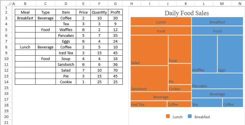
Another way to show hierarchical data is with a Treemap Chart. With this chart, the data in the hierarchy is represented as rectangles, with the inner space corresponding to the value and the rectangles nested under one another according to their hierarchy level.
Similar to the sunburst chart, the data can also be organized hierarchically:
var treemapDataArray = [
    ['Meal', 'Type', 'Item', 'Price', 'Quantity', 'Profit'],
    ['Breakfast', 'Beverage', 'Coffee', 2, 10, 20],
    [, , 'Tea', 3, 3, 9],
    [, 'Food', 'Waffles', 6, 2, 12],
    [, , 'Pancakes', 5, 7, 35],
    [, , 'Eggs', 6, 4, 24],
    ['Lunch', 'Beverage', 'Coffee', 2, 5, 10],
    [, , 'Iced Tea', 3, 15, 45],
    [, 'Food', 'Soup', 4, 4, 16],
    [, , 'Sandwich', 6, 6, 36],
    [, , 'Salad', 7, 10, 70],
    [, , 'Pie', 3, 15, 45],
    [, , 'Cookie', 1, 25, 25]
];
The chart type is also defined similarly:
GC.Spread.Sheets.Charts.ChartType.treemap
Animations in charts
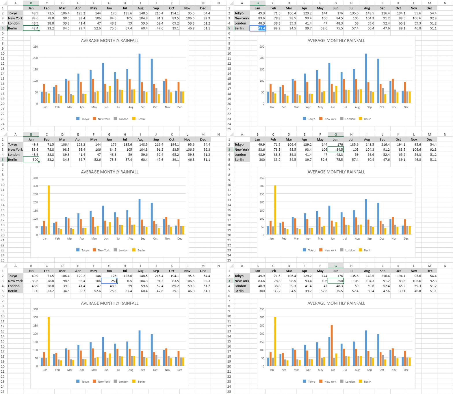
One way that we have enhanced visualization is by supporting animation in charts. This allows users to interact dynamically with the data and see those changes happen in the chart.
Setting this is really simple, requiring just one line of code:
chart.useAnimation(true);
At the moment, animation is only supported in four chart types: Column, Bar, Line, and Pie.

These are the enhancements that we have made to charts with SpreadJS version 12. We are working on adding even more functionality with each release to make sure that you have the tools you need to add beautiful charts to your applications.


