- Menus and Toolbars for WinForms Overview
- Key Features
- Overview
- Design-Time Support
- Menus and Toolbars Overview
- DockingTab Overview
- NavBar Overview
- OutBar Overview
- TopicBar Overview
- RadialMenu Overview
- Menus and Toolbars for WinForms Samples
- Menus and Toolbars for WinForms Task-Based Help
C1TopicBar Toolbars
The Smart Designer for the C1TopicBar control provides the following toolbars for the topic bar, topic page, and topic link:
- C1TopicBar Toolbar
- C1TopicPage Toolbar
- C1TopicLink Toolbar
The TopicBar, C1TopicPage, and C1TopicLink toolbars appear for the C1TopicBar control.
C1TopicBar Toolbar
The C1TopicBar toolbar appears for the C1TopicBarcontrol. To expose the C1TopicBar toolbar, select the C1TopicBar control and position your cursor anywhere on the C1TopicBar control.
Opening and Closing the C1TopicBar Toolbar
To open the C1TopicBar toolbar, click on the  button. To close the C1TopicBar toolbar, click on the
  button.
The C1TopicBar toolbar consists of the following command buttons:
| Toolbar Button | Description |
|---|---|
 |
Add topic page: Adds a new topic page. |
 |
Edit Pages: Opens the C1TopicPage Collection Editor where you can add or remove C1TopicPages or modify their property settings. |
 |
Edit topicbar appearance and layout: Opens the C1TopicBar Appearance dialog box where you can modify the appearance, behavior, and layout styles for the C1TopicBar control. |
 |
Edit miscellaneous properties: Opens the Miscellaneous dialog box for the C1TopicBar control where you can apply miscellaneous properties to the C1TopicBar control. |
Add new page
Clicking on the Add New Page button adds a new topic page after the existing topic page.
Edit Pages
Clicking on the Edit Pages button opens the C1TopicPage Collection Editor where you can add or remove C1TopicPages or modify their property settings.
Edit topicbar appearance and layout
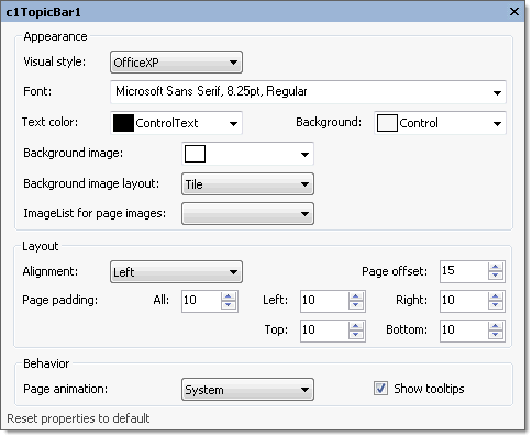
Clicking on the Edit topicbar appearance and layout opens the C1TopicBar properties dialog box where you can modify the appearance, behavior, and layout styles for the C1TopicBar control.

The following table defines the items included in the C1TopicBar properties dialog box:
| Item | Description |
|---|---|
| Appearance | |
| Visual style | The Visual style drop-down box contains the following items for you to select from to change the style of the C1TopicBar control: Custom, System, Office2007Blue, Office2007Black, Office2007Silver, Office2003Blue, Office2003Olive, Office2003Silver, OfficeXP, Classic, and WindowsXP. |
| Font | The Font drop-down box opens the Font dialog box where you can modify the Font style properties for the C1TopicBar control. |
| Text color | The Foreground drop-down list box contains the Custom, System, and Web colors for you to select from to set the Foreground color for the C1TopicBar control. |
| Background | The Background drop-down list box contains the Custom, System, and Web colors for you to select from to set the back color of the highlighted item in the C1TopicBar control. |
| Background image | The Background image drop-down box opens an Open dialog box where you can apply the background image used for the C1TopicBar control. |
| Background image layout | The Background image layout drop-down box opens a list of layout items (None, Tile, Center, Stretch, and Zoom) for you to select from that gets the background image layout for the C1TopicBar control. |
| ImageList for page images | The ImageList for page images drop-down box gets the image list used to provide the images shown on the pages' title bars. |
| Layout | |
| Alignment | The Alignment drop-down box contains Left, Right, and Center items for you to set the alignment of the topicbar pages caption. |
| Page offset | The Page offset sets the integer value for the space between the pages. |
| Page padding | The Page padding sets the space between a page border and a link. |
| Behavior | |
| Page animation | The Page animation drop-down box contains the available values for you to select from to indicate whether to use animation on page collapsing/expanding. |
| ShowToolTips | The ShowToolTips check box indicates whether the ToolTip is shown when the mouse is over the page caption. |
| Reset properties to default | Selecting the Reset properties to default item resets the modified C1TopicBar properties back to their default values. |
Edit miscellaneous topicbar properties
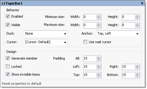
Clicking on the Edit miscellaneous topicbar properties button opens the C1TopicBar dialog box where you can modify C1TopicBars miscellaneous properties.

The following table defines the items included in the C1TopicBar dialog box:
| Item | Description |
|---|---|
| Behavior | |
| Enabled | The Enabled check box indicates whether the C1TopicBarwill be enabled at run time. |
| Visible | The Visible check box indicates whether the C1TopicBarcontrol will be shown at run time. |
| Minimum size | The Minimum size field includes a Width and Height NumericUpDown controls for specifying the minimum width and height size for the C1TopicBarcontrol. |
| Maximum size | The Maximum size field includes a Width and Height NumericUpDown controls for specifying the maximum width and height size for the C1TopicBarcontrol. |
| Dock | The Dock drop-down box contains items for you to select from to define which border of the C1TopicBarcontrol is bound to the container. |
| Cursor | The Cursor drop-down box opens a list of different cursor items for you to set the type of cursor that appears when the pointer moves over the C1TopicBarcontrol. |
| Use wait cursor | The Use wait cursor check box indicates whether to use wait cursor. |
| Anchor | The Anchor drop-down box defines the edges of the container to which the C1TopicBarcontrol is bound. When it's anchored to an edge, the distance between the C1TopicBar’s closest edge and the specified edge will remain constant. |
| Design | |
| Generate member | The Generate member check box indicates whether to generate the member for the C1TopicBarcontrol. (True, if selected; False, if deselected) |
| Locked | The Locked check box indicates whether the C1TopicBaris locked. (True, if selected; False, if deselected) |
| Padding | The Padding specifies the interior spacing of the C1TopicBarcontrol. |
| Reset properties to default | Selecting the Reset properties to default item resets the modified C1TopicBarproperties back to their default values. |
C1TopicPage Toolbar
The C1TopicPage toolbar appears for the C1TopicBar control. To expose the C1TopicPage toolbar, select the C1TopicBar control, then select the topic page on the C1TopicBar and slide your cursor anywhere on the C1TopicPage.
The C1TopicPage toolbar consists of one command button:
| Toolbar Button | Description |
|---|---|
 |
Add topic link: Adds a new topic link in the active topic page. |
 |
Edit the topic page appearance: Opens the properties dialog box for the selected C1TopicPage. |
 |
Delete topic page: Removes the selected C1TopicPage from the C1TopicBar. |
Add new topic link
Clicking on the Add topic link button adds a new topic link to the topic page in the C1TopicBar control.
Edit topic page appearance
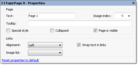
Clicking on the Edit topic page appearance button opens the properties dialog box for the selected C1TopicPage.

The following table defines the items included in the C1TopicBar properties dialog box:
| Item | Description |
|---|---|
| Page | |
| Text | The Text textbox displays the text name that appears on the caption. To rename the text name for the caption select the text in the Text textbox and type the desired text name. |
| Tooltip | The Tooltip textbox sets the ToolTip text for the selected topic page. To add a ToolTip, enter text in the Tooltip textbox. |
| Image index | The Image index drop-down list box displays the index value of the command image. |
| Special style | The Special style check box indicates whether the page has a special dark title. (True, if selected; False, if deselected). |
| Collapsed | The Collapsed check box indicates whether the page is collapsed or not. (True, if selected; False, if deselected). |
| Page is visible | The Page is visible check box indicates whether the page is visible or not. (True, if selected; False, if deselected). |
| Links | |
| Alignment | The Alignment drop-down box contains Left, Right, and Center alignment options to set the alignment for the page's links. |
| Wrap text in links | The Wrap text in links check box indicates whether the page's link text wraps if its length exceeds the page width. (True, if selected; False, if deselected). |
| Image list | The Image list sets the image list used to provide images shown in page links. |
| Reset properties to default | Selecting the Reset properties to default item resets the modified C1TopicPage properties back to their default values. |
Delete topic page
Clicking on the Delete topic page button removes the selected topic page from the C1TopicBar.


