- Menus and Toolbars for WinForms Overview
- Key Features
- Overview
- Design-Time Support
- Menus and Toolbars Overview
- DockingTab Overview
- NavBar Overview
- OutBar Overview
- TopicBar Overview
- RadialMenu Overview
- Menus and Toolbars for WinForms Samples
- Menus and Toolbars for WinForms Task-Based Help
C1DockingTab Toolbars
The C1DockingTab toolbar and the C1DockingTabPage toolbars appear for the C1DockingTab control. To expose the C1DockingTab toolbar, select the C1DockingTab control and slide your cursor on the C1DockingTab control. To expose the C1DockingTabPage toolbar slide you cursor inside the C1DockingTabPage area of the C1DockingTab control.
Opening and Closing the C1DockingTab Toolbar
To open the C1DockingTab toolbar, click on the  button. To close the C1DockingTab toolbar, click on the
  button.
The C1DockingTab toolbar consists of the following command buttons:
| Toolbar Button | Description |
|---|---|
 |
Add tab page: Add tab pages to C1DockingTab. |
 |
Edit the collection of tab pages: Add or remove tab pages or modify the properties for each tab page through the C1DockingTabPage Collection Editor. |
 |
Edit tabs area properties: Apply style, layout, and tab layout to the C1DockingTab control. |
 |
Edit docking tab appearance: Set the color and font styles and apply images to the C1DockingTab control. |
 |
Edit docking tab behavior: Apply behavior settings to the C1DockingTab control. |
.NET
Add New Page
Clicking on the Add tab page button adds a tab after the existing tab.
Edit the collection of tab pages
Clicking on the Edit the collection of tab pages button opens the C1DockingTabPage Collection Editor where you can modify the property settings for each tab page as well as add or remove tab pages. For more information on the C1DockingTabPage Collection Editor, see C1DockingTabPage Collection Editor.
Edit tabs area properties
Clicking on the Edit tabs area properties button opens the Tab Area dialog box where you can modify the settings for the tab area in the C1DockingTab control.
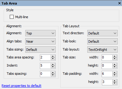
The following table defines the items included in the Tab Area properties dialog box:
| Fields | Description |
|---|---|
| Style | |
| MultiLine | The MultiLine check box gets or sets a value, (True if selected; False, if deselected) indicating whether more than one row of tabs can be displayed. |
| Alignment | |
| Alignment | The Alignment drop-down box displays a list box that contains the area of the control (top, bottom, left or right) for you to select from to specify where the tabs are aligned. |
| Align tabs | The Alignment tabs drop-down box contains the items (Near, Center, or Far) for you to select from to specify how tabs are aligned along side of the page content area. |
| Tabs sizing | The Tab sizing drop-down box contains the items (Normal, Fit, FillToEnd, and User) to select from to set how the tabs are sized. |
| Tabs area spacing | The TabsArea spacing gets or sets the spacing between the edge of the tab area and the tabs. |
| Indent | The Indent property gets or sets the indentation of the first tab from the side of the control. |
| Tabs spacing | The Tabs spacing gets or sets the distance between the tabs (the distance may be negative to overlap the tabs). |
| Tab Layout | |
| Text direction | The Text direction item gets or sets the direction of the text drawn on the tabs. |
| Tab look | The Tab look drop-down box contains the items (Default, Text, Image, and TextAndImage) for you to select from to set the look of the tabs. |
| Tab layout | The Tab layout drop-down box contains the items (TextOnRight, TextOnLeft, TextBelow, TextAbove) for you to select from to set the layout of the text and images on the tabs. |
| Tab size | The Tab size gets the width and height of the tabs. |
| Tab padding | The Tab padding gets the width and height of the padding for the tabs. |
| Reset properties to default | Selecting the Reset properties to default item resets the modified C1DockingTab properties back to their default values. |
Edit docking tab appearance
Clicking on the Edit docking tab appearance button opens the Appearance dialog box where you can modify the appearance properties for the C1DockingTab.
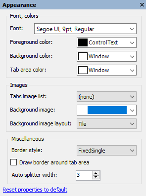
The following table defines the items included in the Appearance properties dialog box:
| Fields | Description |
|---|---|
| Font, colors | |
| Font | The Font drop-down box opens the Font dialog box where you can modify the Font style properties for the C1DockingTab control. |
| Foreground color | The Foreground drop-down list box contains the Custom, System, and Web colors for you to select from to set the Foreground color for the C1DockingTab control. |
| Background color | The Background drop-down list box contains the Custom, System, and Web colors for you to select from to set the back color of the C1DockingTab control. |
| Tab area color | The Tab area color drop-down list box contains the Custom, System, and Web colors for you to select from to set the tab area color for the C1DockingTab control. |
| Images | |
| Tabs image list | Manages the list of collection images for the tabs in the C1DockingTab control. |
| Background image | The Background image drop-down box opens an Open dialog box where you can apply the background image used for the C1DockingTab control. |
| Background image layout | The Background image layout drop-down box opens a list of layout items (None, Tile, Center, Stretch, and Zoom) for you to select from that gets the background image layout for the C1DockingTab control. |
| Miscellaneous | |
| Border style | The Border style drop-down box displays a list box that contains the different types of border styles (None, FixedSingle, Fixed3D) for you to select from to specify the border style for the C1DockingTab control. |
| Draw border around tab area | The Draw border around tab area check box indicates whether to draw a border around the tab area. (True, if selected; False, if deselected) |
| Auto splitter width | The Auto splitter width gets or sets the width of automatic splitters drawn between pages of the control when the page docking is enabled. |
| Reset properties to default | Selecting the Reset properties to default item resets the modified C1DockingTab properties back to their default values. |
Edit docking tab behavior
Clicking on the Edit docking tab behavior button opens the Behavior dialog box where you can enable specific behavior properties for the C1DockingTab.
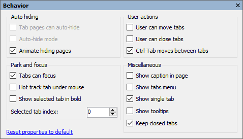
The following table defines the items included in the Behavior properties dialog box:
| Item | Description |
|---|---|
| Auto hiding | |
| Tab pages can auto-hide | The Tab pages can auto hide check box indicates whether the tab pages can auto hide. (True if selected; False, if deselected) |
| Auto-hide mode | The Auto-hide mode check box indicates whether the C1DockingTab is in auto-hide mode. (True if selected; False, if deselected) |
| Animate hiding pages | The Animate hiding pages check box indicates whether to animate the hiding docking tab pages. (True if selected; False, if deselected) |
| Park and focus | |
| Tabs can focus | The Tabs can focus check box indicates whether tabs can receive focus on mouse click. (True if selected; False, if deselected) |
| Hot track tab under mouse | The Hot track tab under mouse check box indicates whether the control's tabs change in appearance when the mouse passes over them. (True if selected; False, if deselected) |
| Show selected tab in bold | The Show selected tab in bold check box indicates whether to bold the text in the selected tab. (True if selected; False, if deselected) |
| Selected tab index | The Selected tab index gets or sets the index of the currently selected page. |
| User actions | |
| User can move tabs | The User can move tabs check box indicates whether the end user can rearrange tabs by dragging them around at run time. (True if selected; False, if deselected) |
| User can close tabs | The User can close tabs check box indicates whether individual tab pages can be closed by the end user. If C1DockingTab.CanCloseTabs is True, a close icon appears either in the caption area (if ShowCaption is True), or in the tabs otherwise. (True if selected; False, if deselected) |
| Ctrl-Tab moves between tabs | The Ctrl-Tab moves between tabs check box indicates whether the C1DockingTab control handles Ctrl-Tab and Ctrl-Shift-Tab keys. (True if selected; False, if deselected) |
| Miscellaneous | |
| Show caption in a page | The Show caption in a page check box indicates whether the caption is shown on the pages. (True if selected; False, if deselected) |
| Show tabs menu | The Show tabs menu check box indicates whether to show a button with a drop-down list of all tabs. (True if selected; False, if deselected). This property is ignored in multiline mode. |
| Show single tab | The Show single tab check box indicates whether a tab will be shown when there is only one page in the control. (True if selected; False, if deselected) |
| Show tooltips | The Show tooltips check box indicates whether the ToolTip is shown when the mouse passes over the tab. (True if selected; False, if deselected) |
| Keep closed tabs | The Keep closed tabs check box indicates whether to keep a closed tab. (True if selected; False, if deselected) |
| Reset properties to default | Selecting the Reset properties to default item resets the modified C1DockingTab properties back to their default values. |
C1DockingTabPage toolbar
The C1DockingTabPage toolbar appears for the C1DockingTabPage control. To expose the C1DockingTabPage toolbar, select the C1DockingTab control and slide you cursor inside the C1DockingTabPage area of the C1DockingTab control.
The C1DockingTabPage toolbar consists of one command button:
| Toolbar Button | Description |
|---|---|
 |
Edit tab page properties: Set the color and font styles for the tab pages. |
Edit tab page properties
Clicking on the Edit tab page properties button opens the Appearance dialog box where you can modify C1DockingTabPages appearance properties.
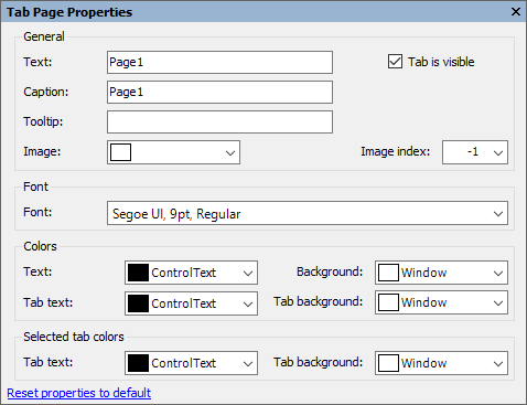
The following table defines the items included in the Tab Page Properties dialog box:
| Item | Description |
|---|---|
| General | |
| Text | The Text textbox displays the text name that appears on the selected tab page. To rename the text name for the tab page, select the text in the Text textbox and type the desired text name. |
| Caption | The Caption text textbox displays the text name that appears on the caption page. To rename the text name for the tab page, select the text in the Text textbox and type the desired text name. |
| Tooltip | The ToolTip text textbox sets the ToolTip text for the tab page. |
| Image | The Image drop-down list box displays the current image attached to the selected tab page. Clicking on the drop-down arrow opens the Open dialog box where you can locate the image you would like to associate with the selected tab page. |
| Image index | The Image index drop-down list box displays the index value of the selected tab page image. |
| Font | |
| Font | The Font drop-down box opens the Font dialog box where you can modify the Font style properties for the selected tab page in the C1DockingTabcontrol. |
| Colors | |
| Text | The Text drop-down list box contains the Custom, System, and Web colors for you to select from to set the text color on the tab and tab page. |
| Background | The Background drop-down list box contains the Custom, System, and Web colors for you to select from to set the back color of the tab and tab page. |
| Tab background | The Tab background drop-down list box contains the Custom, System, and Web colors for you to select from to set the back color of the tab. |
| Selected tab colors | |
| Text | The Text drop-down list box contains the Custom, System, and Web colors for you to select from to set the text color on the selected tab. |
| Background | The Background drop-down list box contains the Custom, System, and Web colors for you to select from to set the back color of the selected tab. |
| Reset properties to default | Selecting the Reset properties to default item resets the modified C1DockingTabPage properties back to their default values. |
.NET FRAMEWORK
Add New Page
Clicking on the Add tab page button adds a tab after the existing tab.
Edit the collection of tab pages
Clicking on the Edit the collection of tab pages button opens the C1DockingTabPage Collection Editor where you can modify the property settings for each tab page as well as add or remove tab pages. For more information on the C1DockingTabPage Collection Editor, see C1DockingTabPage Collection Editor.
Edit tabs area properties
Clicking on the Edit tabs area properties button opens the Tab Area dialog box where you can modify the settings for the tab area in the C1DockingTab control.
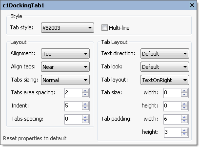
The following table defines the items included in the Tab Area properties dialog box:
| Fields | Description |
|---|---|
| Style | |
| Tab style | The TabStyle drop-down box displays a list of tab style items (Default, WindowsXP, Classic, Sloping, Rounded, Office2003, and Office2007) for you to select from to set the tab style for the C1DockingTab control. |
| MultiLine | The MultiLine check box gets or sets a value, (True if selected; False, if deselected) indicating whether more than one row of tabs can be displayed. |
| Layout | |
| Alignment | The Alignment drop-down box displays a list box that contains the area of the control (top, bottom, left or right) for you to select from to specify where the tabs are aligned. |
| Align tabs | The Alignment tabs drop-down box contains the items (Near, Center, or Far) for you to select from to specify how tabs are aligned along side of the page content area. |
| Tabs sizing | The Tab sizing drop-down box contains the items (Normal, Fit, FillToEnd, and User) to select from to set how the tabs are sized. |
| Tabs area spacing | The TabsArea spacing gets or sets the spacing between the edge of the tab area and the tabs. |
| Indent | The Indent property gets or sets the indentation of the first tab from the side of the control. |
| Tabs spacing | The Tabs spacing gets or sets the distance between the tabs (the distance may be negative to overlap the tabs). |
| Tab Layout | |
| Text direction | The Text direction item gets or sets the direction of the text drawn on the tabs. |
| Tab look | The Tab look drop-down box contains the items (Default, Text, Image, and TextAndImage) for you to select from to set the look of the tabs. |
| Tab layout | The Tab layout drop-down box contains the items (TextOnRight, TextOnLeft, TextBelow, TextAbove) for you to select from to set the layout of the text and images on the tabs. |
| Tab size | The Tab size gets the width and height of the tabs. |
| Tab padding | The Tab padding gets the width and height of the padding for the tabs. |
| Reset properties to default | Selecting the Reset properties to default item resets the modified C1DockingTab properties back to their default values. |
Edit docking tab appearance
Clicking on the Edit docking tab appearance button opens the Appearance dialog box where you can modify the appearance properties for the C1DockingTab.
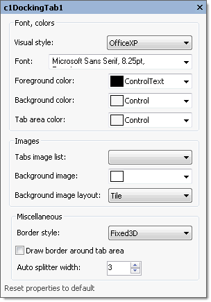
The following table defines the items included in the Appearance properties dialog box:
| Fields | Description |
|---|---|
| Font, colors | |
| Visual style | The Visual style drop-down box contains the following items for you to select from to change the style of the C1DockingTab control: Custom, System, Office2007Blue, Office2007Black, Office2007Silver, Office2003Blue, Office2003Olive, Office2003Silver, OfficeXP, Classic, and WindowsXP. |
| Font | The Font drop-down box opens the Font dialog box where you can modify the Font style properties for the C1DockingTab control. |
| Foreground color | The Foreground drop-down list box contains the Custom, System, and Web colors for you to select from to set the Foreground color for the C1DockingTab control. |
| Background color | The Background drop-down list box contains the Custom, System, and Web colors for you to select from to set the back color of the C1DockingTab control. |
| Tab area color | The Tab area color drop-down list box contains the Custom, System, and Web colors for you to select from to set the tab area color for the C1DockingTab control. |
| Images | |
| Tabs image list | Manages the list of collection images for the tabs in the C1DockingTab control. |
| Background image | The Background image drop-down box opens an Open dialog box where you can apply the background image used for the C1DockingTab control. |
| Background image layout | The Background image layout drop-down box opens a list of layout items (None, Tile, Center, Stretch, and Zoom) for you to select from that gets the background image layout for the C1DockingTab control. |
| Miscellaneous | |
| Border style | The Border style drop-down box displays a list box that contains the different types of border styles (None, FixedSingle, Fixed3D) for you to select from to specify the border style for the C1DockingTab control. |
| Draw border around tab area | The Draw border around tab area check box indicates whether to draw a border around the tab area. (True, if selected; False, if deselected) |
| Auto splitter width | The Auto splitter width gets or sets the width of automatic splitters drawn between pages of the control when the page docking is enabled. |
| Reset properties to default | Selecting the Reset properties to default item resets the modified C1DockingTab properties back to their default values. |
Edit docking tab behavior
Clicking on the Edit docking tab behavior button opens the Behavior dialog box where you can enable specific behavior properties for the C1DockingTab.
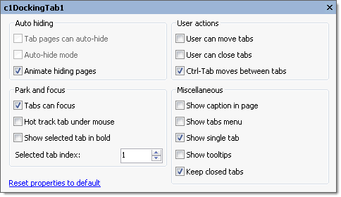
The following table defines the items included in the Behavior properties dialog box:
| Item | Description |
|---|---|
| Auto hiding | |
| Tab pages can auto-hide | The Tab pages can auto hide check box indicates whether the tab pages can auto hide. (True if selected; False, if deselected) |
| Auto-hide mode | The Auto-hide mode check box indicates whether the C1DockingTab is in auto-hide mode. (True if selected; False, if deselected) |
| Animate hiding pages | The Animate hiding pages check box indicates whether to animate the hiding docking tab pages. (True if selected; False, if deselected) |
| Park and focus | |
| Tabs can focus | The Tabs can focus check box indicates whether tabs can receive focus on mouse click. (True if selected; False, if deselected) |
| Hot track tab under mouse | The Hot track tab under mouse check box indicates whether the control's tabs change in appearance when the mouse passes over them. (True if selected; False, if deselected) |
| Show selected tab in bold | The Show selected tab in bold check box indicates whether to bold the text in the selected tab. (True if selected; False, if deselected) |
| Selected tab index | The Selected tab index gets or sets the index of the currently selected page. |
| User actions | |
| User can move tabs | The User can move tabs check box indicates whether the end user can rearrange tabs by dragging them around at run time. (True if selected; False, if deselected) |
| User can close tabs | The User can close tabs check box indicates whether individual tab pages can be closed by the end user. If C1DockingTab.CanCloseTabs is True, a close icon appears either in the caption area (if ShowCaption is True), or in the tabs otherwise. (True if selected; False, if deselected) |
| Ctrl-Tab moves between tabs | The Ctrl-Tab moves between tabs check box indicates whether the C1DockingTab control handles Ctrl-Tab and Ctrl-Shift-Tab keys. (True if selected; False, if deselected) |
| Miscellaneous | |
| Show caption in a page | The Show caption in a page check box indicates whether the caption is shown on the pages. (True if selected; False, if deselected) |
| Show tabs menu | The Show tabs menu check box indicates whether to show a button with a drop-down list of all tabs. (True if selected; False, if deselected). This property is ignored in multiline mode. |
| Show single tab | The Show single tab check box indicates whether a tab will be shown when there is only one page in the control. (True if selected; False, if deselected) |
| Show tooltips | The Show tooltips check box indicates whether the ToolTip is shown when the mouse passes over the tab. (True if selected; False, if deselected) |
| Keep closed tabs | The Keep closed tabs check box indicates whether to keep a closed tab. (True if selected; False, if deselected) |
| Reset properties to default | Selecting the Reset properties to default item resets the modified C1DockingTab properties back to their default values. |
C1DockingTabPage toolbar
The C1DockingTabPage toolbar appears for the C1DockingTabPage control. To expose the C1DockingTabPage toolbar, select the C1DockingTab control and slide you cursor inside the C1DockingTabPage area of the C1DockingTab control.
The C1DockingTabPage toolbar consists of one command button:
| Toolbar Button | Description |
|---|---|
 |
Edit tab page properties: Set the color and font styles for the tab pages. |
Edit tab page properties
Clicking on the Edit tab page properties button opens the Appearance dialog box where you can modify C1DockingTabPages appearance properties.
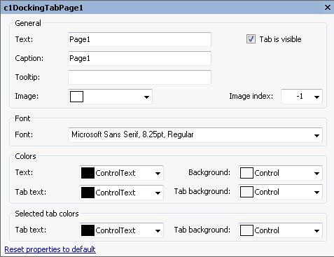
The following table defines the items included in the Tab Page Properties dialog box:
| Item | Description |
|---|---|
| General | |
| Text | The Text textbox displays the text name that appears on the selected tab page. To rename the text name for the tab page, select the text in the Text textbox and type the desired text name. |
| Caption | The Caption text textbox displays the text name that appears on the caption page. To rename the text name for the tab page, select the text in the Text textbox and type the desired text name. |
| Tooltip | The ToolTip text textbox sets the ToolTip text for the tab page. |
| Image | The Image drop-down list box displays the current image attached to the selected tab page. Clicking on the drop-down arrow opens the Open dialog box where you can locate the image you would like to associate with the selected tab page. |
| Image index | The Image index drop-down list box displays the index value of the selected tab page image. |
| Font | |
| Font | The Font drop-down box opens the Font dialog box where you can modify the Font style properties for the selected tab page in the C1DockingTabcontrol. |
| Colors | |
| Text | The Text drop-down list box contains the Custom, System, and Web colors for you to select from to set the text color on the tab and tab page. |
| Background | The Background drop-down list box contains the Custom, System, and Web colors for you to select from to set the back color of the tab and tab page. |
| Tab background | The Tab background drop-down list box contains the Custom, System, and Web colors for you to select from to set the back color of the tab. |
| Selected tab colors | |
| Text | The Text drop-down list box contains the Custom, System, and Web colors for you to select from to set the text color on the selected tab. |
| Background | The Background drop-down list box contains the Custom, System, and Web colors for you to select from to set the back color of the selected tab. |
| Reset properties to default | Selecting the Reset properties to default item resets the modified C1DockingTabPage properties back to their default values. |


