- Menus and Toolbars for WinForms Overview
- Key Features
- Overview
- Design-Time Support
- Menus and Toolbars Overview
- DockingTab Overview
- NavBar Overview
- OutBar Overview
- TopicBar Overview
- RadialMenu Overview
- Menus and Toolbars for WinForms Samples
- Menus and Toolbars for WinForms Task-Based Help
C1OutBar Toolbars
The C1OutBartoolbar appears for the C1OutBar control. To expose the C1OutBar toolbar, select the C1OutBar control and position your cursor on the C1OutBar control.
Opening and Closing the C1OutBar Toolbar
To open the C1OutBar toolbar, click on the  button. To close the C1OutBar toolbar, click on the
  button.
The C1OutBar toolbar consists of the following command buttons:
| Toolbar Button | Description |
|---|---|
 |
Add blank page: Add pages with a toolbar contained in each page. |
 |
Add empty page: Add empty pages without a toolbar to the C1OutBar. |
 |
Edit outbar appearance and layout: Set the color and font styles and apply images to the C1OutBar control. |
 |
Edit miscellaneous outbar properties: Opens the Miscellaneous dialog box for the C1OutBar control where you can apply miscellaneous properties to the C1OutBar control. |
Add blank page
Clicking on the Add blank page button adds a new page with a toolbar to the C1OutBar control.
Add empty page
Clicking on the Add empty page button adds an empty page to the C1OutBar control.
Edit outbar appearance and layout
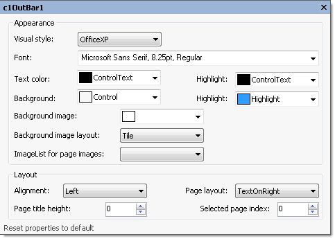
Clicking on the Edit outbar appearance and layout button opens the Properties dialog box where you can modify various properties for the C1OutBar control.

The following table defines the items included in the C1OutBar Properties dialog box:
| Item | Description |
|---|---|
| Appearance | |
| Visual style | The Visual style drop-down box contains the following items for you to select from to change the style of the C1OutBar control: Custom, System, Office2007Blue, Office2007Black, Office2007Silver, Office2003Blue, Office2003Olive, Office2003Silver, OfficeXP, Classic, and WindowsXP. |
| Font | The Font drop-down box opens the Font dialog box where you can modify the Font style properties for the C1OutBar control. |
| Text color | The Foreground drop-down list box contains the Custom, System, and Web colors for you to select from to set the Foreground color for the highlighted text on C1OutBar control. |
| Highlight (ForeHiColor) | The Highlight drop-down list box contains the Custom, System, and Web colors for you to select from to set the fore color for the highlighted item on C1OutBar control. |
| Background | The Background drop-down list box contains the Custom, System, and Web colors for you to select from to set the back color in the C1OutBar control. |
| Highlight (BackHiColor) | The Highlight drop-down list box contains the Custom, System, and Web colors for you to select from to set the back color of the highlighted item in the C1OutBar control. |
| Background image | The Background image drop-down box opens an Open dialog box where you can apply the background image used for the C1OutBar control. |
| Background image layout | The Layout drop-down box opens a list of layout items (None, Tile, Center, Stretch, and Zoom) for you to select from that gets the background image layout for the C1OutBar control. |
| ImageList for page images | The ImageList for page images drop-down box gets the image list used to provide the images shown on the pages' title bars. |
| Layout | |
| Alignment | The Alignment drop-down box gets the alignment (Left, Right, Center) of text and image on the pages' title bars. |
| Page layout | The Page layout drop-down box contains items for you to set the text above, below, to the left or to the right of the image in the page title. The default value for the C1OutBar.PageLayout property is TextOnRight. |
| Page title height | The Page title height numericupdown box sets the height of each page title. |
| Selected page index | The Selected page index sets the index of the selected page. |
| Reset properties to default | Selecting the Reset properties to default item resets the modified C1OutBar properties back to their default values. |
Edit miscellaneous properties
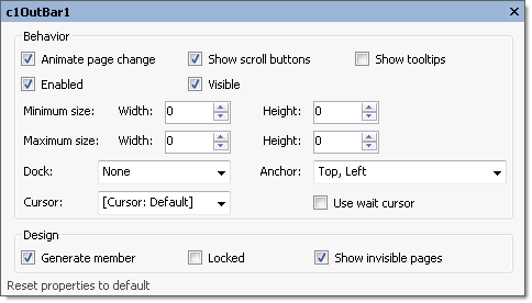
Clicking on the Edit miscellaneous properties button opens the Miscellaneous dialog box where you can modify C1OutBar’s Miscellaneous properties.

The following table defines the items included in the C1OutBar Miscellaneous dialog box:
| Item | Description |
|---|---|
| Behavior | |
| Animate page change | The Animate page change gets or sets a value (True, if selected; False, if deselected) to indicate whether to use animation when changing the selected page. |
| Show scroll buttons | The Show scroll buttons gets or sets a value (True, if selected; False, if deselected) to indicate whether scroll buttons for scrolling toolbar links are visible. |
| Show Tooltips | The Show tooltips check box indicates whether to show ToolTip texts when the mouse cursor is over the page item. Selecting the check box enables this property and deselecting the check box disables this property. |
| Minimum size | The Minimum size field includes a Width and Height NumericUpDown controls for specifying the minimum width and height size for the C1OutBar control. |
| Maximum size | The Maximum size field includes a Width and Height NumericUpDown controls for specifying the maximum width and height size for the C1OutBar control. |
| Dock | The Dock drop-down box contains items for you to select from to define which border of the C1OutBar control is bound to the container. |
| Cursor | The Cursor drop-down box opens a list of different cursor items for you to set the type of cursor that appears when the pointer moves over the C1OutBar control. |
| Use Wait cursor | The Use wait cursor check box indicates whether to use wait cursor. |
| Anchor | The Anchor drop-down box defines the edges of the container to which the C1OutBar control is bound. When it's anchored to an edge, the distance between the C1OutBar's closest edge and the specified edge will remain constant. |
| Design | |
| Generate member | The Generate member check box indicates whether to generate the member for the C1OutBar control. (True, if selected; False, if deselected) |
| Locked | The Locked check box indicates whether the C1OutBar is locked. (True, if selected; False, if deselected) |
| Reset properties to default | Selecting the Reset properties to default item resets the modified C1OutBar's miscellaneous properties back to their default values. |


