- Menus and Toolbars for WinForms Overview
- Key Features
- Overview
- Design-Time Support
- Menus and Toolbars Overview
- DockingTab Overview
- NavBar Overview
- OutBar Overview
- TopicBar Overview
- RadialMenu Overview
- Menus and Toolbars for WinForms Samples
- Menus and Toolbars for WinForms Task-Based Help
C1NavBar Toolbars
The C1NavBar toolbar appears for the C1NavBar control. To expose the C1NavBar toolbar, select the C1NavBar control and slide your cursor on the C1NavBar control.
Opening and Closing the C1NavBar Toolbar
To open the C1NavBar toolbar, click on the  button. To close the C1NavBar toolbar, click on the
  button.
The C1NavBar toolbar consists of the following command buttons:
| Toolbar Button | Description |
|---|---|
 |
Add button and corresponding panel: Add buttons to C1NavBar. |
 |
Edit navigation bar appearance and layout: Set the color and font styles and apply images to the C1NavBar control. |
 |
Edit miscellaneous navigation bar properties: Opens the C1NavBar dialog box for the C1NavBar control where you can apply behavior properties to the C1NavBar control. |
Add button and corresponding panel
Clicking on the Add button and corresponding panel button adds a tab after the existing tab.
Edit navigation bar appearance and layout
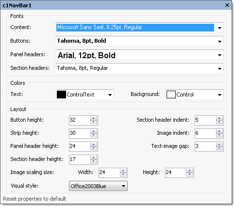
Clicking on the Edit navigation bar appearance and layout button opens the C1NavBar properties dialog box where you can modify the appearance properties for the C1NavBar.

The following table defines the items included in the C1NavBar properties dialog box:
| Item | Description |
|---|---|
| Fonts | |
| Content | The Contents drop-down box opens the Font dialog box where you can modify the Font style properties for the content in the C1NavBar control. |
| Buttons | The Buttons drop-down box opens the Font dialog box where you can modify the Font style properties for the buttons in the C1NavBar control. |
| Panel headers | The Panel headers drop-down box opens the Font dialog box where you can modify the Font style properties for the panel header in the C1NavBar control. |
| Section headers | The Section headers drop-down box opens the Font dialog box where you can modify the Font style properties for the section header in the C1NavBar control. |
| Colors | |
| Text | The Text drop-down list box contains the Custom, System, and Web colors for you to select from to set the Foreground color for the menu control. |
| Background | The Background drop-down list box contains the Custom, System, and Web colors for you to select from to set the back color of the C1NavBar control. |
| Layout | |
| ButtonHeight | The ButtonHeight sets the integer value for the height of the button. |
| Section header indent | The Section header indent determines the space before the text caption in a section header. |
| StripHeight | The StripHeight sets the integer value for the strip height of the button. |
| ImageIndent | The ImageIndent drop-down box sets the integer value for the height of the panel header. |
| PanelHeaderHeight | The PanelHeaderHeight sets the integer value for the height of the panel header. |
| Text-image gap | The Text-image gap gets the space between the image and the text on a stack button. |
| SectionHeaderHeight | The SectionHeaderHeight sets the integer value for the height of the section header. |
| Image scaling size | The Image scaling size sets the size, in pixels, of an image displayed on a stack button. The default is 24 x 24 pixels. To set the width for the image, use the Width numericupdown box and to set the height for the image, use the Height numericupdown box. |
| Visual style | The Visual style drop-down box contains the following items for you to select from to change the style of the C1NavBar control: Custom, System, Office2007Blue, Office2007Black, Office2007Silver, Office2003Blue, Office2003Olive, Office2003Silver, OfficeXP, Classic, and WindowsXP. |
| Reset properties to default | Selecting the Reset properties to default item resets the modified C1NavBar properties back to their default values. |
Edit miscellaneous navigation bar properties
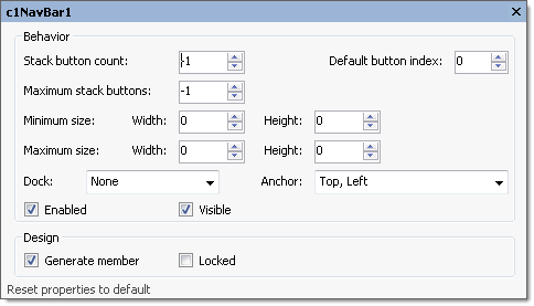
Clicking on the Edit miscellaneous navigation bar properties button opens the C1NavBar dialog box where you can modify C1NavBars miscellaneous properties.

The following table defines the items included in the C1NavBar properties dialog box:
| Item | Description |
|---|---|
| Behavior | |
| StackButtonCount | The StackButtonCount gets or sets the number of buttons displayed in the stack. |
| DefaultButtonIndex | The DefaultButtonIndex specifies the index of the button to be selected when the form opens. |
| Maximum stack buttons | The Maximum stack buttons gets or sets the maximum number of buttons in the stack. If set to -1 the maximum number is unlimited. |
| Minimum size | The Minimum size field includes a Width and Height NumericUpDown controls for specifying the minimum width and height size for the C1NavBar control. |
| Maximum size | The Maximum size field includes a Width and Height NumericUpDown controls for specifying the maximum width and height size for the C1NavBar control. |
| Dock | The Dock drop-down box contains items for you to select from to define which border of the C1NavBar control is bound to the container. |
| Anchor | The Anchor drop-down box defines the edges of the container to which the C1NavBar control is bound. When it's anchored to an edge, the distance between the C1NavBar's closest edge and the specified edge will remain constant. |
| Enabled | The Enabled check box indicates whether the C1NavBar control will be enabled at run time. |
| Visible | The Visible check box indicates whether the C1NavBar will be shown at run time. |
| Design | |
| Generate member | The Generate member check box indicates whether to generate the member for the C1NavBar control. (True, if selected; False, if deselected) |
| Locked | The Locked check box indicates whether the C1NavBar is locked. (True, if selected; False, if deselected) |
| Reset properties to default | Selecting the Reset properties to default item resets the modified C1NavBar miscellaneous properties back to their default values. |


