
WinForms Pareto Chart
Pareto charts graphically summarize the process problems in ranking order from the most frequent to the least one. These charts comprise of both a bar and a line chart where bar chart values are plotted in decreasing order of relative frequency while the line chart plots the cumulative total percentage of frequencies. Pareto chart is essentially used in scenarios where the data is broken into different categories, and when the developer needs to highlight the most important factors from a given set of factors. For example, quality control, inventory control, and customer grievance handling are some areas where Pareto chart analysis can be frequently used.
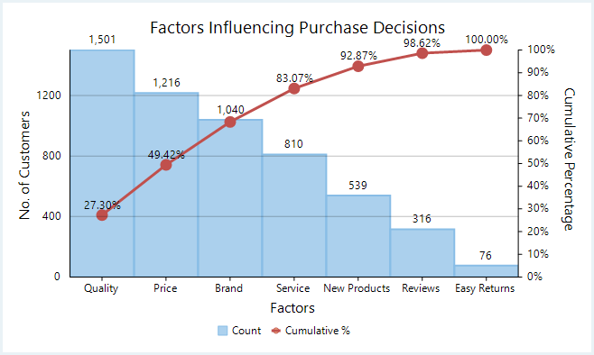
With FlexChart, Pareto chart can be easily created by combining ranged histogram chart with any of line, spline, line symbol, or spline symbol chart. First, plot the relative frequency on a ranged histogram in descending order. Then, calculate the cumulative relative frequency in percentage using original data to create another series which is plotted using any of the line, spline, line symbol, or spline symbol chart. This forms Pareto line of the chart which helps in identifying the added contribution of each category.
private void Form1_Load(object sender, EventArgs e)
{
    this.flexChart1.ChartType = ChartType.RangedHistogram;
    var histogram = new C1.Win.Chart.RangedHistogram()
    {
        Binding = "Value",
        BindingX = "Name",
        Name = "Count",
        SortDescending = true,
        DataSource = GetPurchaseFactorsData(),
        DataLabel = new DataLabel { Content = "{y:N0}", Position = LabelPosition.Top },
    };
    this.flexChart1.Series.Add((Series)histogram);
    //calculate data for Pareto line
    var histoYs = histogram.GetValues(0);
    var sum = histoYs.Sum();
    var paretoData = new List<PointF>();
    double cumulativeSum = 0;
    for (int i = 0; i < histoYs.Length; i++)
    {
        cumulativeSum += histoYs[i];
        paretoData.Add(new PointF
        {
            X = i,
            Y = (float)(cumulativeSum / sum),
        });
    }
    var paretoLine = new Series
    {
        Name = "Cumulative %",
        ChartType = ChartType.LineSymbols,
        DataSource = paretoData,
        Binding = "Y",
        BindingX = "X",
        AxisY = new Axis
        {
            Position = Position.Right,
            Min = 0,
            Max = 1,
            Format = "P0",
            Title = "Cumulative Percentage",
        },
    };
    this.flexChart1.Series.Add(paretoLine);
}
Private Sub Form1_Load(sender As Object, e As EventArgs)
Me.flexChart1.ChartType = ChartType.RangedHistogram
Dim histogram As RangedHistogram = New C1.Win.Chart.RangedHistogram() With {
.Binding = "Value",
.BindingX = "Name",
.Name = "Count",
.SortDescending = True,
.DataSource = GetPurchaseFactorsData(),
.DataLabel = New DataLabel() With {
.Content = "{y:N0}",
.Position = LabelPosition.Top
}
}
Me.flexChart1.Series.Add(DirectCast(histogram, Series))
'calculate data for Pareto line
Dim histoYs As Double() = histogram.GetValues(0)
Dim sum As Double = histoYs.Sum()
Dim paretoData As List(Of PointF) = New List(Of PointF)()
Dim cumulativeSum As Double = 0
For i As Integer = 0 To (histoYs.Length - 1)
cumulativeSum += histoYs(i)
paretoData.Add(New PointF() With {
.X = i,
.Y = CSng(cumulativeSum / sum)
})
Next
Dim paretoLine As Series = New Series() With {
.Name = "Cumulative %",
.ChartType = ChartType.LineSymbols,
.DataSource = paretoData,
.Binding = "Y",
.BindingX = "X",
.AxisY = New Axis() With {
.Position = Position.Right,
.Min = 0,
.Max = 1,
.Format = "P0",
.Title = "Cumulative Percentage"
}
}
Me.flexChart1.Series.Add(paretoLine)
End SubNote that the above sample code uses a custom method named GetPurchaseFactorsData to supply data to the chart. You can set up the data source as per your requirements.
Random rnd = new Random();
public List<CategoricalPoint> GetPurchaseFactorsData()
{
    var data = new List<CategoricalPoint>();
    for (int i = 1; i <= 7; i++)
    {
        int fact = 1;
        foreach (string factor in PurchaseFactors)
        {
            data.Add(new CategoricalPoint
            {
                Name = factor,
                Value = (22 - (fact * 3)) * rnd.Next(9, 15),
            });
            fact++;
        }
    }
    return data;
}
Private rnd As New Random()
Public Function GetPurchaseFactorsData() As List(Of CategoricalPoint)
Dim data As List(Of CategoricalPoint) = New List(Of CategoricalPoint)()
For i As Integer = 1 To 7
Dim fact As Integer = 1
For Each factor As String In PurchaseFactors
data.Add(New CategoricalPoint() With {
.Name = factor,
.Value = (22 - (fact * 3)) * rnd.[Next](9, 15)
})
fact += 1
Next
Next
Return data
End Function
Private _purchaseFactors As String()
Public ReadOnly Property PurchaseFactors() As String()
Get
If _purchaseFactors Is Nothing Then
_purchaseFactors = GetObject("PurchaseFactors").ToString().Split("|"C)
End If
Return _purchaseFactors
End Get
End Property
Private _dict As Dictionary(Of String, Object)
Private Function GetObject(key As String) As Object
If _dict Is Nothing Then
Dim json As String = File.ReadAllText("../../Data.json")
Dim javaScriptSerializer As New JavaScriptSerializer()
_dict = javaScriptSerializer.Deserialize(Of Dictionary(Of String, Object))(json)
End If
Return _dict(key)
End Function