


- Getting Started
-
Topics
- Wijmo
- Chart
- Map
- Cloud
- Gauge
- Grid
-
Scheduler
- overview
- Create and Bind Scheduler
- Configure Event Data
- Query, Filter, and Refresh Events
- Configure Resources
- Configure Views and Navigate the Schedule
- Create Advanced Layouts
- Synchronize Scrolling
- Configure Working Time
- Configure Time Zones
- Create, Edit, and Delete Events
- Drag and Resize Events
- Detect and Handle Conflicts
- Customize Event Display and Templates
- Customize Context Menus
- Hit Testing
- Keyboard Navigation, Focus, and Selection
- Troubleshooting
- OLAP
- Input
- Nav
- Viewer
- Tutorials
overview
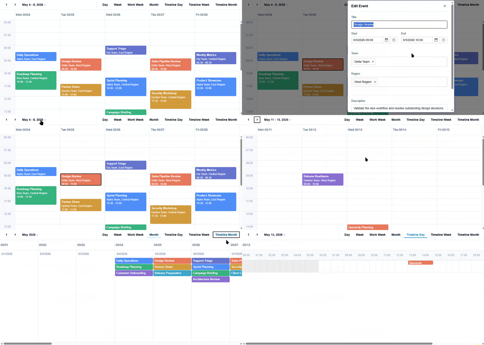
FlexScheduler displays and edits time-based business records in calendar views. An application supplies event data, optional resources, and a view definition; Scheduler renders the resulting time and resource structure and provides navigation and editing interactions.
Scheduler Structure
Scheduler consists of a top toolbar area and a bottom surface area.
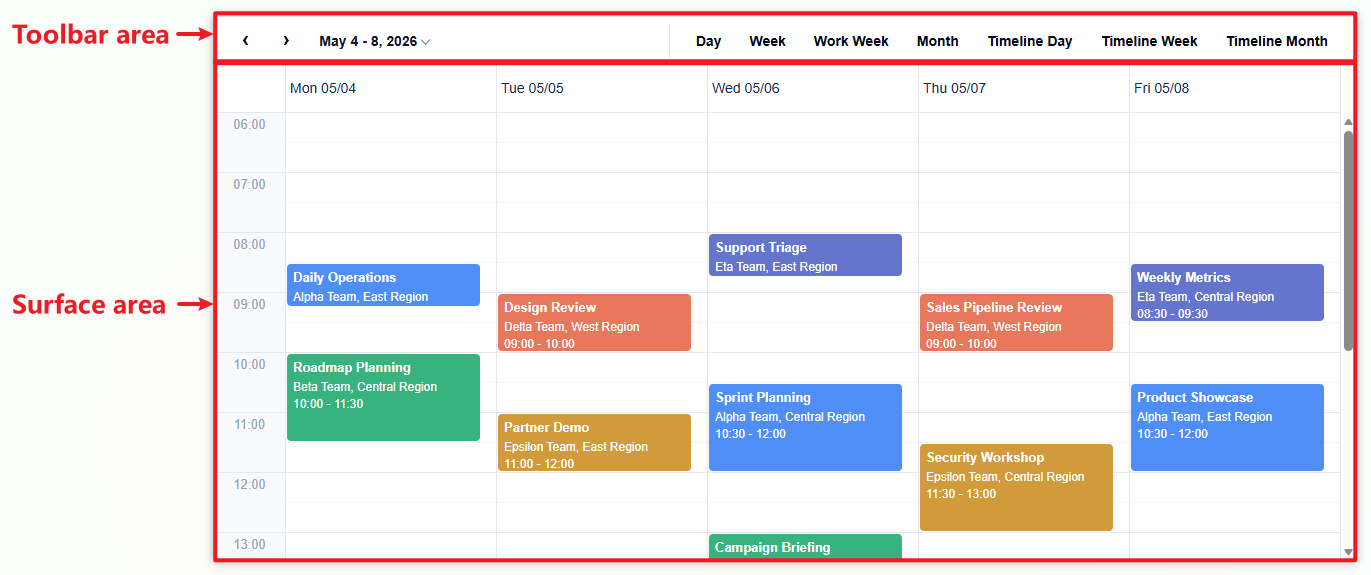
Area | Purpose |
|---|---|
Toolbar area | Provides date navigation, the calendar selector, and view buttons. |
Surface area | Presents the axes, headers, cells, sections, and event items generated by the active |
Toolbar Area
The toolbar area controls the date range and active view.

Element | Description |
|---|---|
Previous/Next Navigator | Moves the visible date range backward or forward. |
Calendar selector | Selects the date used as the anchor of the current view. |
View buttons | Switches between available Scheduler views. |
Use showToolbar: false to hide the toolbar.
Surface Area
The surface area is the visual presentation of the active definition.
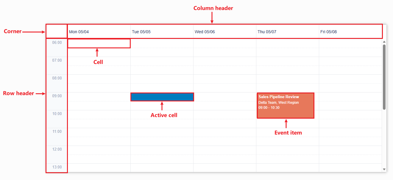
Element | Description |
|---|---|
Corner | The top-left area where the row header and column header intersect. |
Row header | Labels rows generated by the active definition. |
Column header | Labels columns generated by the active definition. |
Cell | Represents a time range and optional resource context. |
Active cell | The cell with focus or used to start an operation. |
Section | A rendered group of cells and items. |
Event item | The visual representation of a source item. |
Fragment | One rendered piece of a source item. A single event can produce several fragments when it spans dates or resource lanes. |
Lane | The continuous strip where events are positioned by time. In a view with resources, each resource value renders in its own lane. |
A source item is the object in itemsSource that supplies the event data. One source item can render as several fragments, and every fragment stays linked to that item.
Use showRowHeaders: false or showColumnHeaders: false to hide the corresponding header area.
Quick Start
The following is a configuration-only example. It assumes that wjScheduler has been imported and that the page contains a #scheduler host element. See Create and Bind Scheduler for a runnable setup.
const scheduler = new wjScheduler.FlexScheduler('#scheduler', {
  itemsSource: [{
    subject: 'Planning',
    start: new Date(2026, 7, 24, 9),
    end: new Date(2026, 7, 24, 10),
  }],
  displayDate: new Date(2026, 7, 24),
});
Scheduler Configuration Model
Input | Role | Question it answers |
|---|---|---|
| Supplies the event data. | Which events are displayed? |
| Maps application properties to event fields. | Which properties contain title, start, and end? |
| Defines resource dimensions and values. | Which rooms, teams, or people are assigned? |
| Defines rows, columns, axes, and cell semantics. | In what format are time and resources displayed? |
| Anchors the visible range. | Which date is shown? |
| Controls date and time interpretation. | In which time zone is it displayed? |
| Describes hours and exceptions. | Which periods are working? |
Keep the source collection as the single source of truth. An event remains one source item even when rendered as several fragments.
Recommended Implementation Order
Create the control with a host element that has a stable height.
Bind one valid event and map its start, end, and subject fields.
Add resource descriptors when events belong to resource dimensions.
Select a built-in view or define a custom row and column layout.
Configure working time and the display time zone when needed.
Enable CRUD, conflict validation, and mouse interactions required by the application.
Customize templates, menus, keyboard workflows, and advanced layouts.
Find a Topic by Task
Development task | Start here |
|---|---|
Install dependencies and create the control | |
Map application fields | |
Query, filter, or refresh events | |
Add rooms, teams, people, or equipment | |
Group, assign, or filter resources | |
Select a view or navigate dates | |
Build a custom axis layout | |
Synchronize scrolling between schedules | |
Define office hours or closures | |
Display events across regions | |
Create, edit, or delete events | |
Move or resize events | |
Detect overlaps and unavailable time | |
Customize event content and templates | |
Customize context menus | |
Identify a pointer target | |
Configure keyboard focus and selection | |
Diagnose problems |