


- Getting Started
-
Topics
- Wijmo
- Chart
- Map
- Cloud
- Gauge
- Grid
-
Scheduler
- overview
- Create and Bind Scheduler
- Configure Event Data
- Query, Filter, and Refresh Events
- Configure Resources
- Configure Views and Navigate the Schedule
- Create Advanced Layouts
- Synchronize Scrolling
- Configure Working Time
- Configure Time Zones
- Create, Edit, and Delete Events
- Drag and Resize Events
- Detect and Handle Conflicts
- Customize Event Display and Templates
- Customize Context Menus
- Hit Testing
- Keyboard Navigation, Focus, and Selection
- Troubleshooting
- OLAP
- Input
- Nav
- Viewer
- Tutorials
Customize Context Menus
Scheduler opens a context menu for valid cells and event items. Use the built-in commands for common workflows, or assign a custom SchedulerMenu when the application needs additional commands.
Understand the built-in menu
Users can open the menu with the mouse or with the platform context-menu command, such as Shift+F10, when a cell or item has focus.
Target | Enabled commands | Screenshot |
|---|---|---|
Cell | Add and Today |
|
Event item | Edit, Delete, and Today |
|
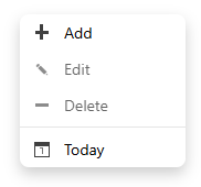
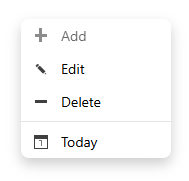
Commands that do not apply to the target remain visible but disabled. Add uses the cell's time range and resource values. Edit and Delete operate on the source item. Today navigates to the current date in the Scheduler's configured time zone. Focus returns to the target when the menu closes.
Create a custom menu
Subclass SchedulerMenu, define the menu items, and assign the instance to scheduler.contextMenu.
class CustomSchedulerMenu extends wjScheduler.Schedul erMenu {
  constructor(element: HTMLElement, scheduler: wjScheduler.FlexScheduler) {
    super(element, scheduler);
    this.itemsSource = [
      { text: 'Add event', action: wjScheduler.SchedulerMenuAction.Add, icon: 'wj-glyph-plus' },
      { text: 'Create focus block', action: 'focusBlock', icon: 'wj-glyph-calendar' },
      { text: 'Edit event', action: wjScheduler.SchedulerMenuAction.Edit, icon: 'wj-glyph-pencil' },
      { text: 'Delete event', action: wjScheduler.SchedulerMenuAction.Delete, icon: 'wj-glyph-minus' },
      { text: 'Go to today', action: wjScheduler.SchedulerMenuAction.Today, icon: 'wj-glyph-circle' },
    ];
  }

  canExecute(action: string | number): boolean {
    if (typeof action === 'number') {
      return super.canExecute(action);
    }
    return action === 'focusBlock' &&
      this.hitTestType === wjScheduler.SchedulerHitTestType.Cell;
  }

  executeContextMenuAction(action: string | number): void {
    if (typeof action === 'number') {
      super.executeContextMenuAction(action);
      return;
    }
    if (action === 'focusBlock') {
      const info = this.hitInfo;
      if (!info || this.hitTestType !== wjScheduler.SchedulerHitTestType.Cell) {
        return;
      }
      this.scheduler.create({
        subject: 'Focus block',
        start: info.start,
        end: info.end,
        ...info.resources,
      });
    }
  }
}

const menuHost = document.createElement('div');
document.body.appendChild(menuHost);
scheduler.contextMenu = new CustomSchedulerMenu(menuHost, scheduler);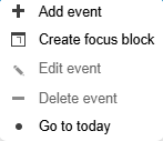
Control command state
Override canExecute to determine whether a command is enabled for the current target. Call the base implementation for built-in numeric actions so the default Add, Edit, Delete, and Today rules remain available.
Use hitTestType to distinguish a cell from an item. hitInfo provides the target's time range, source item, and resource values. These properties describe the active menu target while the menu is open.
The following override enables the application-defined focusBlock action only when the menu was opened from a cell. Returning false keeps the command visible but disables it.
canExecute(action: wjScheduler.SchedulerMenuAction | string): boolean {
  if (typeof action === 'number') {
    return super.canExecute(action);
  }

  return action === 'focusBlock' &&
    this.hitTestType === wjScheduler.SchedulerHitTestType.Cell;
}
Execute application commands
Override executeContextMenuAction for custom actions. Use Scheduler methods and source items to perform the operation; do not manipulate the target DOM element directly. In a custom action, this.hitInfo provides the target of the menu. A cell hit exposes start, end, resources, and isWorkingTime. An item hit exposes the source item, the matched resource records, and any conflicts. Use this.hitTestType to tell which one you have.
This example handles the application-defined focusBlock action and delegates built-in actions to the base class. The property names passed to create match the custom eventFields mapping used by the Scheduler.
executeContextMenuAction(action: wjScheduler.SchedulerMenuAction | string): void {
  if (typeof action === 'number') {
    super.executeContextMenuAction(action);
    return;
  }

  if (action === 'focusBlock') {
    const info = this.hitInfo;
    if (!info || this.hitTestType !== wjScheduler.SchedulerHitTestType.Cell) {
      return;
    }

    this.scheduler.create({
      title: 'Focus block',
      beginsAt: info.start,
      endsAt: info.end,
      ...info.resources,
    });
  }
}
Customize labels and icons
Each item in the menu's itemsSource can specify display text, an action identifier, and an icon. Set icon to a Wijmo glyph class name such as wj-glyph-plus, or to an image URL or base64 data URI. Scheduler renders a glyph class as a <span> and an image as an <img>. Supported image types are png, jpg, jpeg, gif, webp, bmp, svg, and avif. Keep labels short and make the command state clear through canExecute.
Define labels and icons when you assign itemsSource. Numeric SchedulerMenuAction values connect items to built-in commands; an application-defined action can use a unique string.
this.itemsSource = [
  {
    text: 'Add event',
    action: wjScheduler.SchedulerMenuAction.Add,
    icon: 'wj-glyph-plus',
  },
  {
    text: 'Create focus block',
    action: 'focusBlock',
    icon: 'wj-glyph-calendar',
  },
  {
    text: 'Delete event',
    action: wjScheduler.SchedulerMenuAction.Delete,
    icon: 'wj-glyph-minus',
  },
];
The menu uses the current Scheduler culture for built-in command labels. Custom command text is supplied by the application.