


- Getting Started
-
Topics
- Wijmo
- Chart
- Map
- Cloud
- Gauge
- Grid
-
Scheduler
- overview
- Create and Bind Scheduler
- Configure Event Data
- Query, Filter, and Refresh Events
- Configure Resources
- Configure Views and Navigate the Schedule
- Create Advanced Layouts
- Synchronize Scrolling
- Configure Working Time
- Configure Time Zones
- Create, Edit, and Delete Events
- Drag and Resize Events
- Detect and Handle Conflicts
- Customize Event Display and Templates
- Customize Context Menus
- Hit Testing
- Keyboard Navigation, Focus, and Selection
- Troubleshooting
- OLAP
- Input
- Nav
- Viewer
- Tutorials
Configure Views and Navigate the Schedule
Choose a built-in view for common calendar layouts, or assign a custom SchedulerDefinition for a specific time and resource arrangement.
Use a built-in view
Scheduler provides Day, Week, Work Week, Month, Timeline Day, Timeline Week, and Timeline Month definitions. Create a definition from a SchedulerBuiltInViewItem value with createSchedulerDefinitionPreset, then assign it to the Scheduler.
scheduler.definition = wjScheduler.createSchedulerDefinitionPreset(
  wjScheduler.SchedulerBuiltInViewItem.TimelineWeek
);
The active definition controls the visible range and whether events are positioned by time (Timed) or arranged inside summary cells (Summary). Set displayDate to the date around which the initial range is displayed.
Built-in view | Display range and layout | Event presentation | Example |
|---|---|---|---|
Day | Displays the date specified by | Events are positioned and sized according to their start and end times. |
|
Week | Displays the week containing | Events are positioned and sized according to their start and end times. |
|
Work Week | Displays the work week containing | Events are positioned and sized according to their start and end times. |
|
Month | Displays the month containing | Events are arranged chronologically within each day cell rather than sized by duration. |
|
Timeline Day | Displays the date specified by | Events are positioned and sized horizontally according to their start and end times. |
|
Timeline Week | Displays the week containing | Events are positioned and sized horizontally according to their start and end times. |
|
Timeline Month | Displays the month containing | Events are arranged chronologically within each day cell rather than sized by duration. |
|
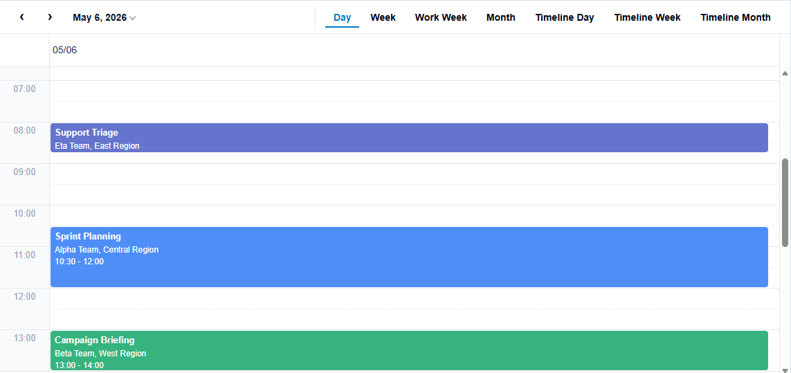
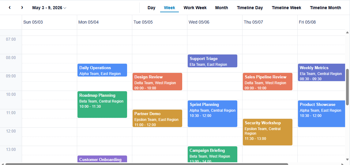
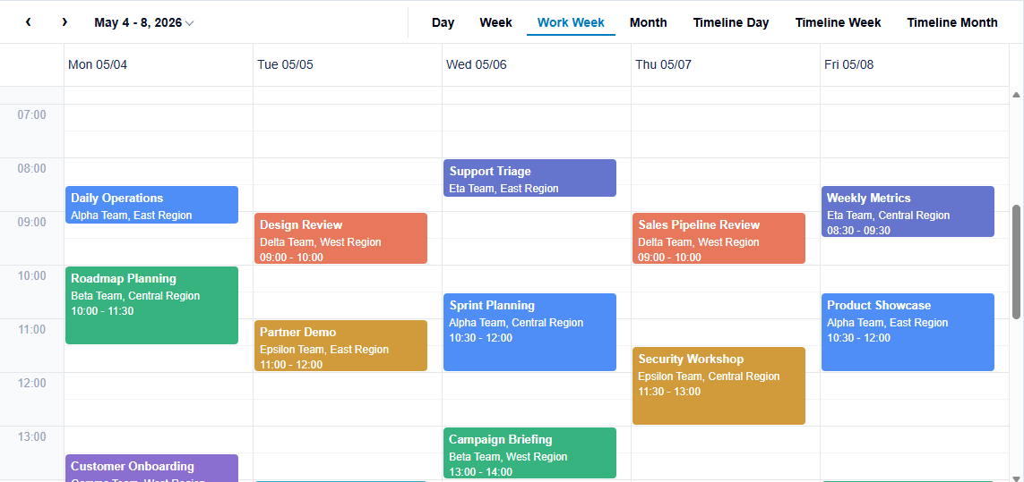
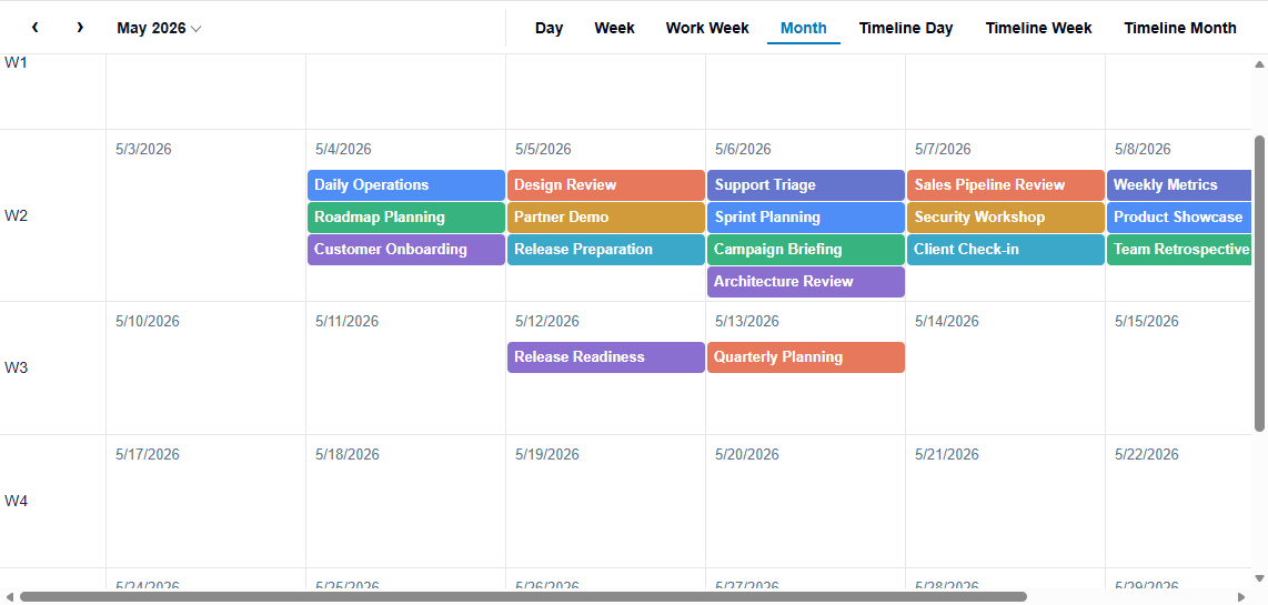
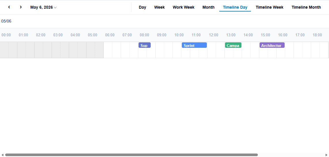
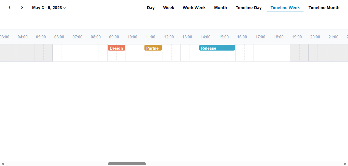
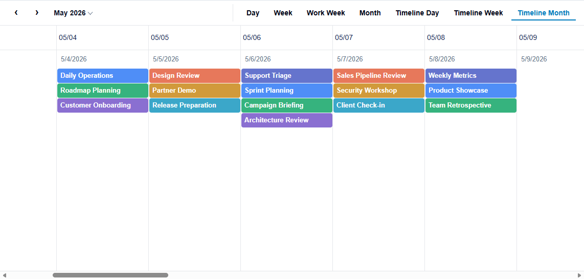
Day, Week, Work Week, Timeline Day, and Timeline Week are timed views. Month and Timeline Month are summary views. To change the axis arrangement, add resource dimensions, or filter visible time slots, create a custom SchedulerDefinition.
Navigate the schedule
The built-in toolbar provides Previous and Next buttons and a date picker. Users can navigate the schedule with these controls without additional application code.
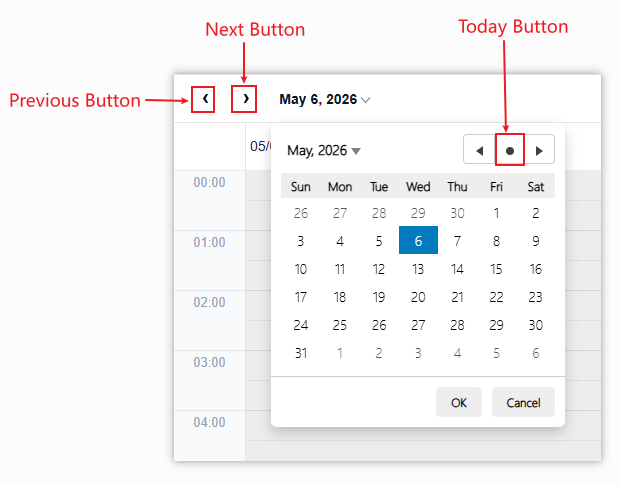
Use the Previous and Next buttons to move the visible date range backward or forward. The navigation interval depends on the active view. For example, Day moves by one day, while Week moves by one week. Open the date picker to select a specific date or use the Today button to return to the current date.
Configure the view toolbar
Hide the default toolbar or replace its view items with an application-defined list.
Scenario | Required configuration |
|---|---|
Use a built-in view | Create a definition with |
Add a built-in view button | Use a |
Add a custom view button | Provide a string |
Override a built-in view | Use the built-in key and provide the replacement definition. |
// scheduler.showToolbar = false;

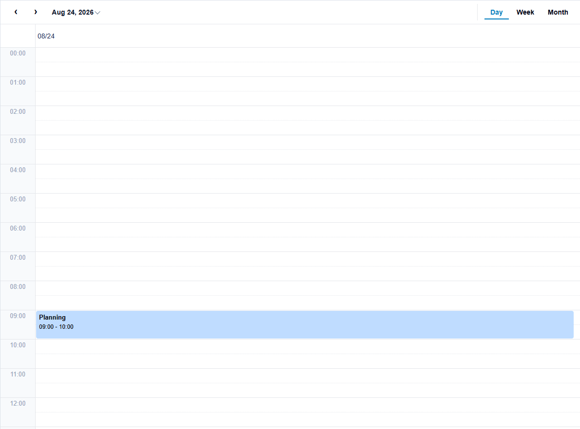
scheduler.toolbarViewItems = [
  { name: 'Day', key: wjScheduler.SchedulerBuiltInViewItem.Day },
  { name: 'Week', key: wjScheduler.SchedulerBuiltInViewItem.Week },
  { name: 'Month', key: wjScheduler.SchedulerBuiltInViewItem.Month },
];
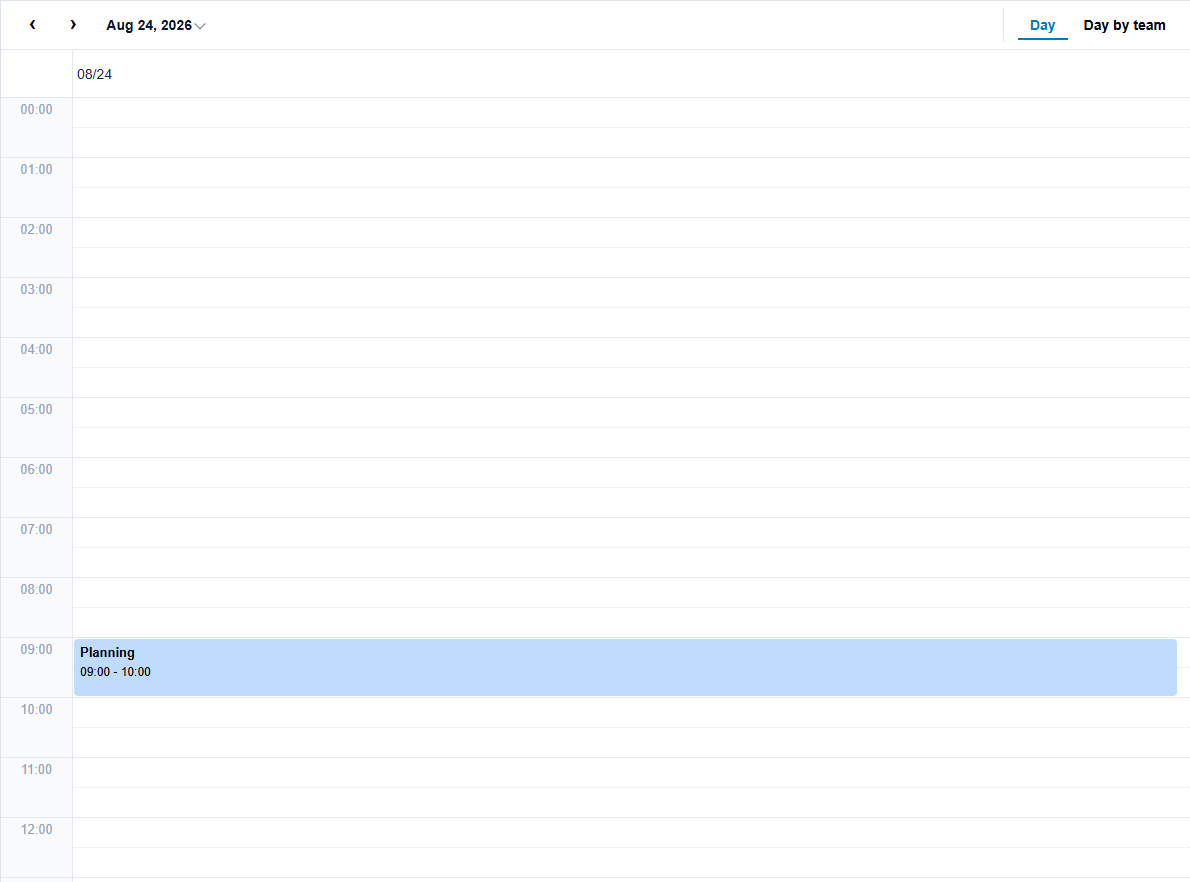
For a built-in key, Scheduler supplies the corresponding definition when definition is omitted. A custom string key requires a definition whose key matches the toolbar item's key.
const teamDay = wjScheduler.createSchedulerDefinitionPreset(
  wjScheduler.SchedulerBuiltInViewItem.Day
);
teamDay.key = 'teamDay';
scheduler.toolbarViewItems = [
  { name: 'Day', key: wjScheduler.SchedulerBuiltInViewItem.Day },
  { name: 'Day by team', key: 'teamDay', definition: teamDay },
];
Assign a new array when changing toolbarViewItems. Duplicate or invalid keys are ignored after the first valid item. The selected item is the one whose key matches scheduler.definition.key.
Use createSchedulerDefinitionPreset to start from an independent copy of a built-in definition before changing its bindings. The available built-in presets are day, week, workWeek, month, timelineDay, timelineWeek, and timelineMonth.
Create a custom definition
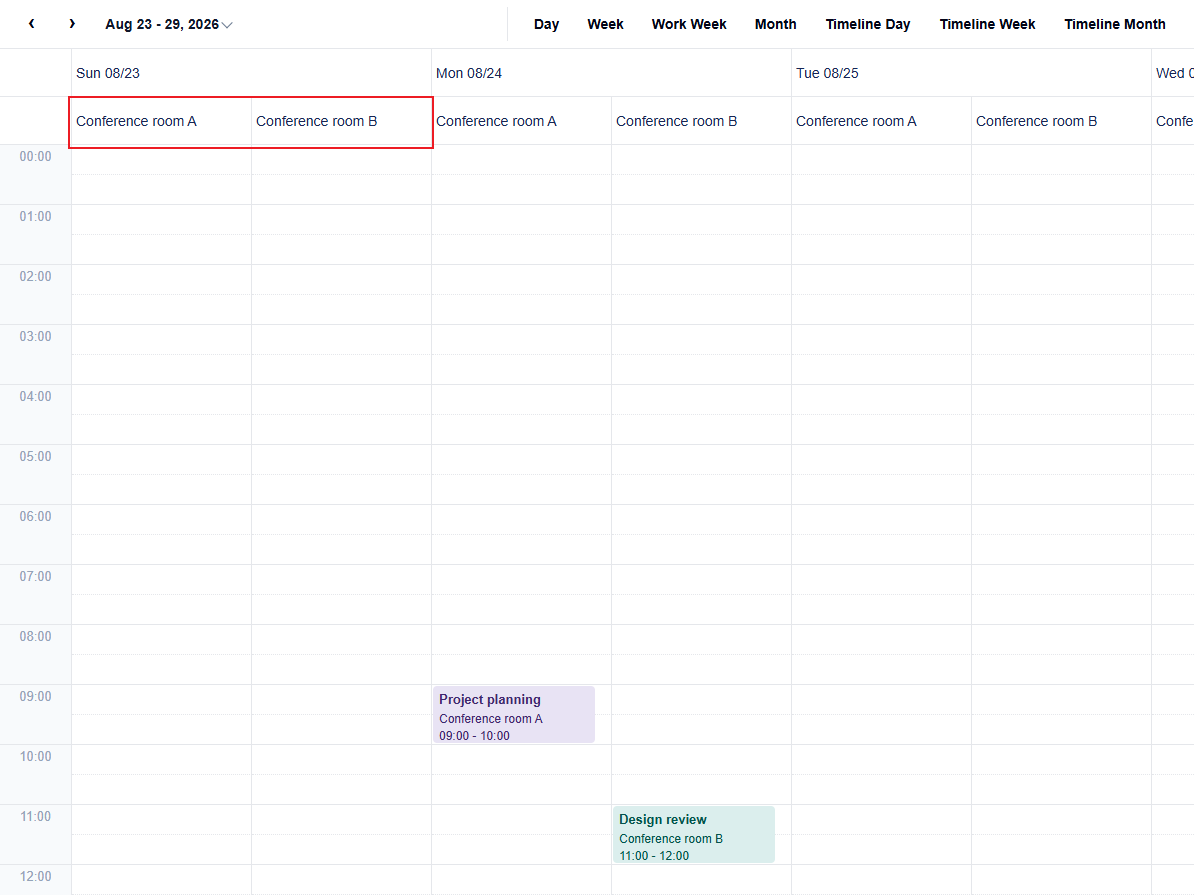
const weekByRoom: wjScheduler.SchedulerDefinition = {
  key: 'weekByRoom',
  rows: { bindings: [{ type: wjScheduler.SchedulerAxisBindingType.Time, unit: wjScheduler.SchedulerTimeUnit.Hour }] },
  columns: { bindings: [
    { type: wjScheduler.SchedulerAxisBindingType.Time, unit: wjScheduler.SchedulerTimeUnit.DayOfWeek },
    { type: wjScheduler.SchedulerAxisBindingType.Resource, fieldExpr: 'roomId' },
  ] },
  cellSemantic: wjScheduler.SchedulerCellSemantic.Timed,
};
scheduler.definition = weekByRoom;
Time bindings create date or time slots. Resource bindings expand the corresponding resource dimension. Binding order determines nesting order. The resource fieldExpr must match a descriptor in scheduler.resources.
Filter visible time slots
Use visible on a time-axis binding when the layout must omit specific axis items.
Setting | Hides axis items | Styles cells | Rejects edits |
|---|---|---|---|
Binding | Yes | No | No |
| No | Yes | No |
| No | Yes | No |
| No | No | Yes, when canceled |
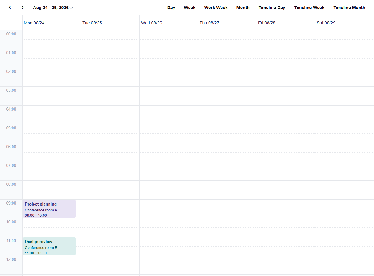
const workWeek = wjScheduler.createSchedulerDefinitionPreset(
  wjScheduler.SchedulerBuiltInViewItem.Week
);
workWeek.key = 'workWeekCustom';
workWeek.columns.bindings[0].visible = args =>
  args.dayOfWeek >= wjScheduler.SchedulerDayOfWeek.Monday &&
  args.dayOfWeek <= wjScheduler.SchedulerDayOfWeek.Saturday;
scheduler.definition = workWeek;
Use workDays, workHours, and nonworkingTime for working-time behavior. A hidden time slot is different from a visible slot marked as non-working. See Configure Working Time.
Switch views at runtime
Assign a complete definition when the user changes views. Scheduler recalculates its axes and event positions after the definition changes.
viewSelect.onchange = () => {
  const viewType = viewSelect.value === 'timeline'
    ? wjScheduler.SchedulerBuiltInViewItem.TimelineWeek
    : wjScheduler.SchedulerBuiltInViewItem.Week;
  scheduler.definition = wjScheduler.createSchedulerDefinitionPreset(viewType);
};