


- Getting Started
-
Topics
- Wijmo
- Chart
- Map
- Cloud
- Gauge
- Grid
-
Scheduler
- overview
- Create and Bind Scheduler
- Configure Event Data
- Query, Filter, and Refresh Events
- Configure Resources
- Configure Views and Navigate the Schedule
- Create Advanced Layouts
- Synchronize Scrolling
- Configure Working Time
- Configure Time Zones
- Create, Edit, and Delete Events
- Drag and Resize Events
- Detect and Handle Conflicts
- Customize Event Display and Templates
- Customize Context Menus
- Hit Testing
- Keyboard Navigation, Focus, and Selection
- Troubleshooting
- OLAP
- Input
- Nav
- Viewer
- Tutorials
Create and Bind Scheduler
Create a FlexScheduler control, bind an event collection, and set the date shown when the control first renders. This is the minimum setup required before configuring resources, views, editing, or navigation.
Prerequisites
Install the packages required by Scheduler before creating the control:
npm install @mescius/wijmo @mescius/wijmo.input @mescius/wijmo.scheduler @mescius/wijmo.styles@mescius/wijmo.scheduler depends on @mescius/wijmo and @mescius/wijmo.input. The Scheduler module uses input controls internally, including Popup, InputDateTime, MultiAutoComplete, and InputDate. The styles package provides the CSS required for the Scheduler layout and appearance.
When using a bundler such as webpack, Vite, or Angular CLI, these dependencies are resolved from the package metadata.
When using browser-native ES modules with an import map, add entries for the three JavaScript Wijmo modules.
If the application already installs @mescius/wijmo.all, the required packages are included. Import the Scheduler module and the Wijmo stylesheet explicitly in application code.
Add a host element
The Scheduler fills its host element. Give the host a height before creating the control; a host with no height can make a correctly configured Scheduler appear blank.
<div id="scheduler" style="height: 640px"></div>In a responsive layout, set the height through a stylesheet instead of an inline style. Make sure the element exists and is visible when the constructor runs.
Bind event data
The following example creates a Scheduler with one event. itemsSource can be a plain array or a Wijmo CollectionView.
import * as wjCore from '@mescius/wijmo';
import * as wjScheduler from '@mescius/wijmo.scheduler';
import '@mescius/wijmo.styles/wijmo.css';

const events = new wjCore.CollectionView([
  { title: 'Planning', beginsAt: new Date(2026, 7, 24, 9), endsAt: new Date(2026, 7, 24, 10) },
]);

const scheduler = new wjScheduler.FlexScheduler('#scheduler', {
  itemsSource: events,
  eventFields: { subject: 'title', start: 'beginsAt', end: 'endsAt' },
  displayDate: new Date(2026, 7, 24),
});
eventFields contains property names from each source item. The start and end mappings are required. Mapping subject is recommended so users can identify events. Use valid Date objects and ensure that start is earlier than end.
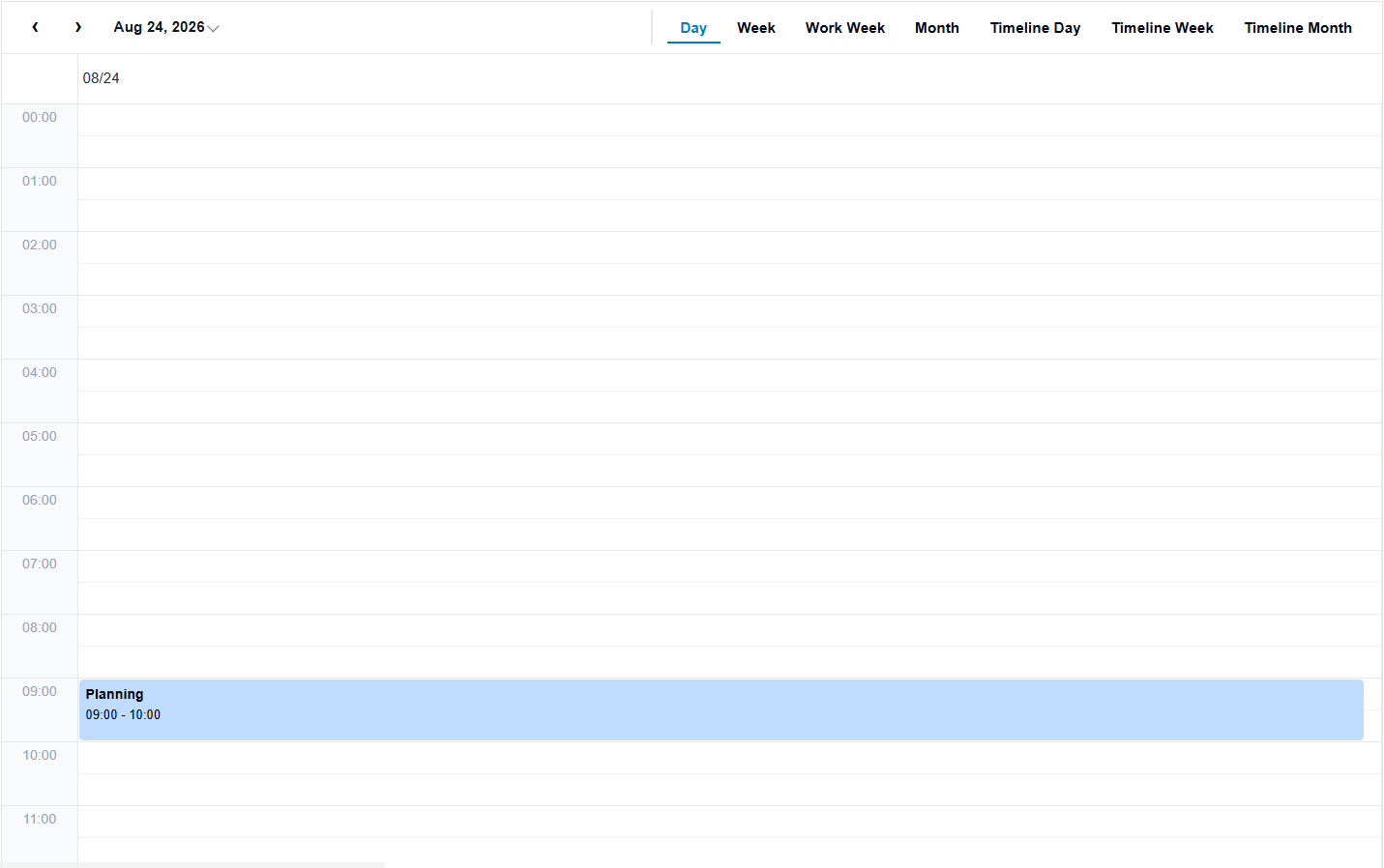
If source data already uses the Scheduler field names, the mapping can be omitted:
const scheduler = new wjScheduler.FlexScheduler('#scheduler', {
  itemsSource: [{ subject: 'Planning', start: new Date(2026, 7, 24, 9), end: new Date(2026, 7, 24, 10) }],
  displayDate: new Date(2026, 7, 24),
});
Choose the initial view
When definition is not specified, Scheduler uses its default built-in view. To start in a built-in view, create a definition from a preset and assign it. To use a custom layout, assign a SchedulerDefinition object.
scheduler.definition = wjScheduler.createSchedulerDefinitionPreset(
  wjScheduler.SchedulerBuiltInViewItem.Week
);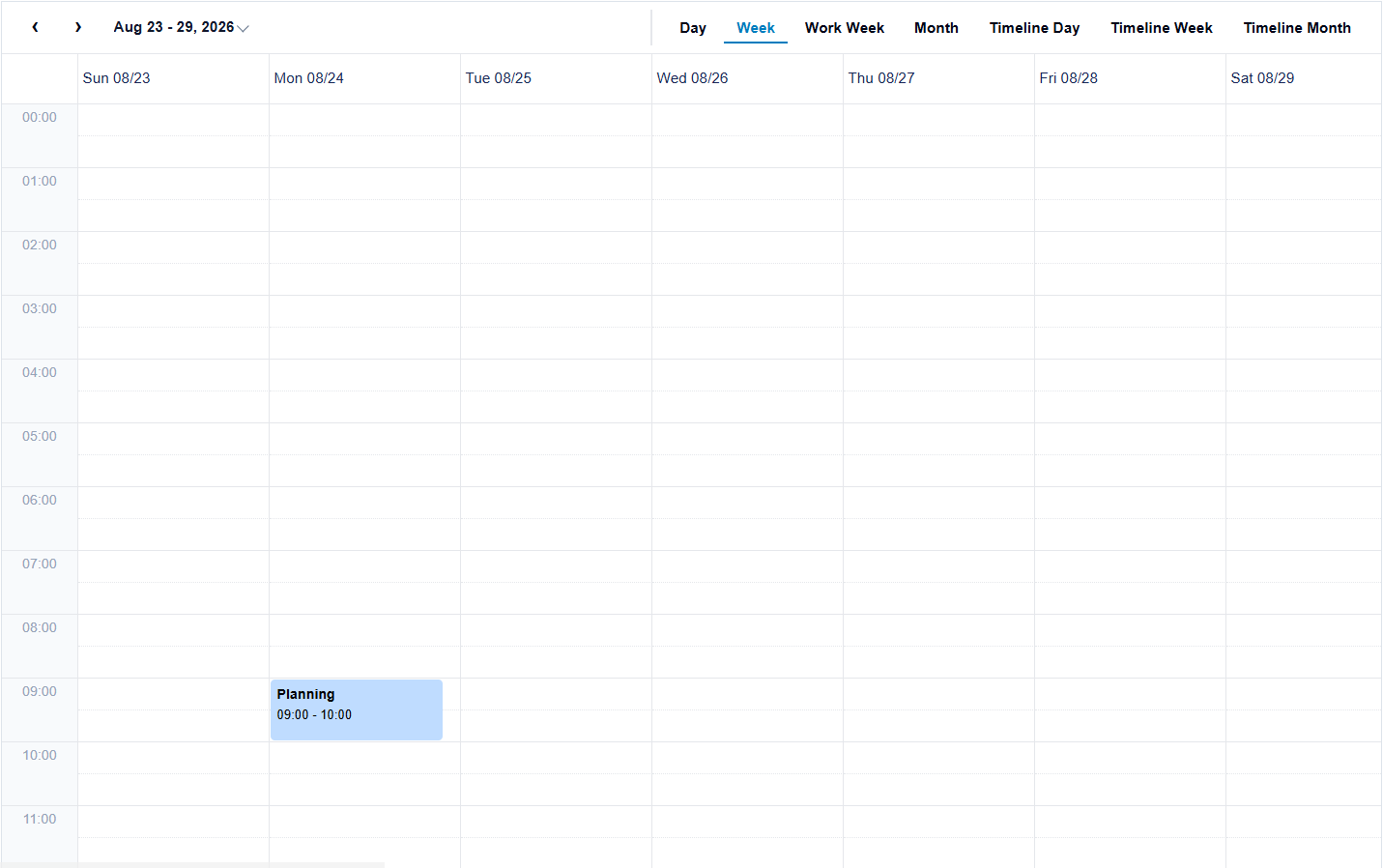
Set displayDate to the date that should be visible when the control is created. The active definition determines the visible range around that date. Configure definitions in Configure Views and Navigate the Schedule.
Update the bound collection
Use a CollectionView when the application needs to observe or persist changes. Update the collection rather than manipulating rendered event elements.
events.addNew({ title: 'Review', beginsAt: new Date(2026, 7, 26, 8), endsAt: new Date(2026, 7, 26, 9) });
events.commitNew();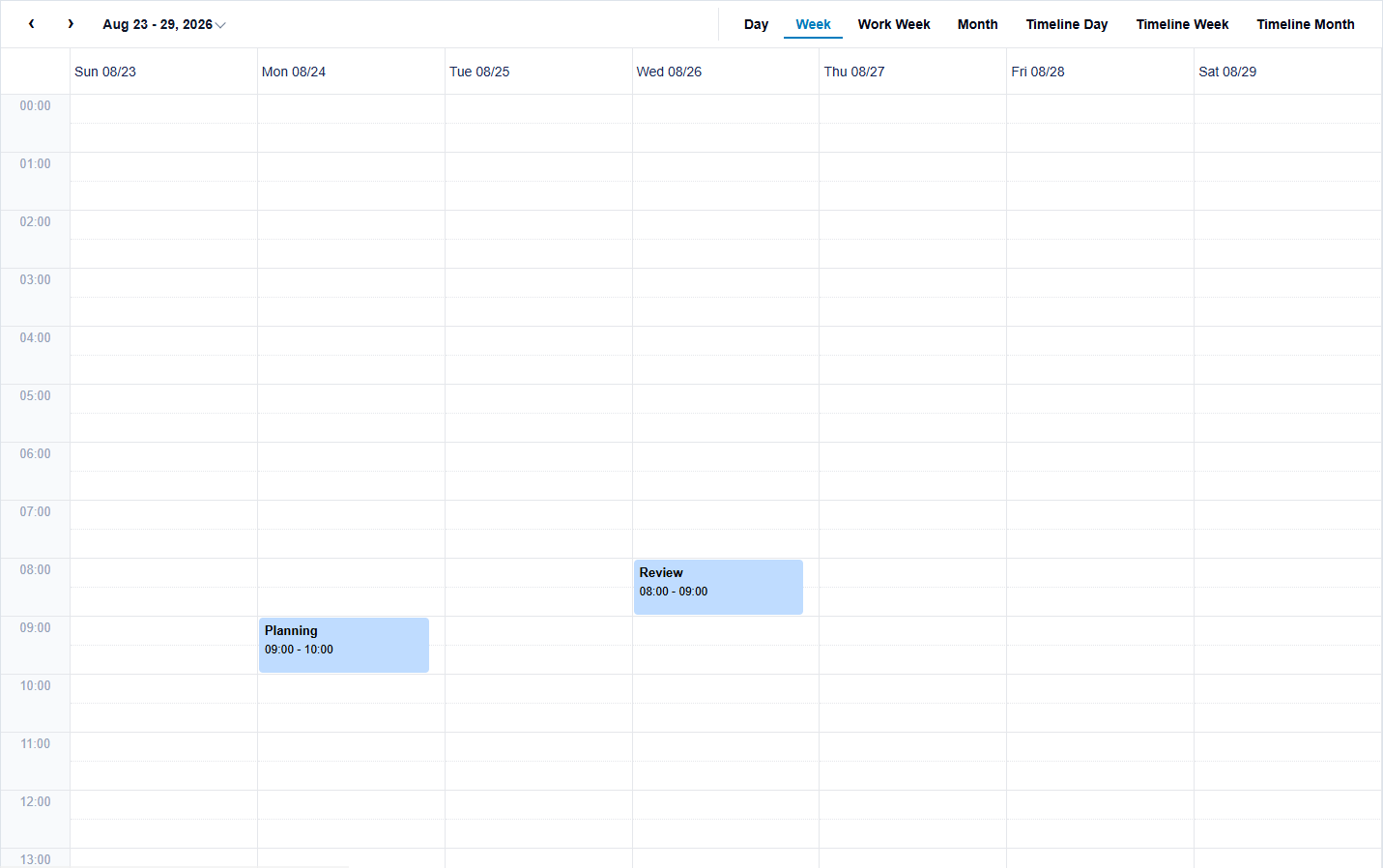
The Scheduler observes changes in the bound collection. Use the CRUD events described in Create, Edit, and Delete Events to validate changes and persist them.