- SpreadJS Overview
- Getting Started
- JavaScript Frameworks
- Best Practices
-
Features
- Workbook
- Worksheet
- Rows and Columns
- Headers
- Cells
- Data Binding
- Data Manager
- TableSheet
- GanttSheet
- ReportSheet
- Data Charts
- JSON Schema with SpreadJS
- SpreadJS File Format
- Data Validation
- Conditional Formatting
- Sort
- Group
- Formulas
- What-If Analysis
- Serialization
- Keyboard Actions
- Shapes
- Floating Objects
- Barcodes
- Charts
- Sparklines
- Tables
- Pivot Table
- Slicer
- Theme
- User Management
- Culture
- AI Assistant
- SpreadJS Designer
- SpreadJS Designer VSCode Plugin
- Tutorials
- SpreadJS Designer Component
- SpreadJS Collaboration Server
- Touch Support
- Formula Reference
- Import and Export Reference
- Events
- API Documentation
- Release Notes
Waterfall Charts
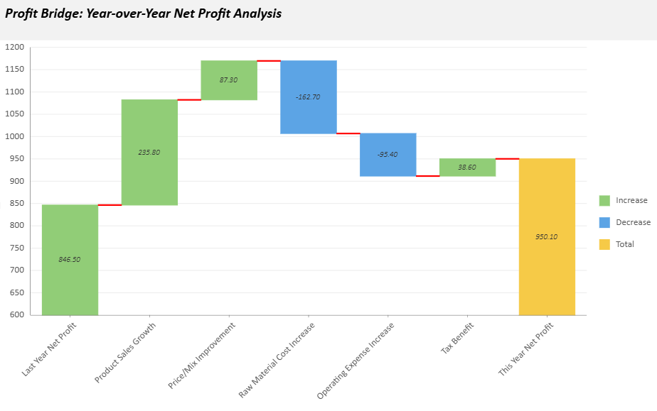
A Waterfall chart illustrates how sequential positive and negative values contribute to a cumulative total. It is commonly used to analyze profit changes, budget variance, sales performance, or other incremental value transitions.
Each bar represents an individual contribution, and the final bar can optionally display the cumulative total.
Category Configuration
A Waterfall chart uses a single category field.
If multiple category levels are bound, only the first level is used. Nested category levels are ignored and not displayed.
For predictable labeling behavior, use a flat category field when configuring a Waterfall chart.
If the first category field is a Date field, you can use dateMode to group values by a time unit such as year, quarter, month, or day.
Basic Waterfall Chart
The following example creates a minimal Waterfall chart configuration.
const sheet = spread.getActiveSheet();
sheet.name("Waterfall Chart");

const dataChart = sheet.dataCharts.add(
  'waterfall-chart',
  10, 10, 600, 400,
  GC.Spread.Sheets.DataCharts.DataChartType.waterfall
);

dataChart.setChartConfig({
  tableName: 'Profits',
  plots: [{
    type: GC.Spread.Sheets.DataCharts.DataChartType.waterfall,
    encodings: {
      values: [{
        field: 'Value',
        aggregate: GC.Spread.Sheets.DataCharts.Aggregate.sum
      }],
      category: {
        field: 'Category'
      }
    }
  }]
});
Waterfall Unique Settings
Waterfall charts provide dedicated configuration options under the config.waterfall object.
Property | Description | Sample Preview |
|---|---|---|
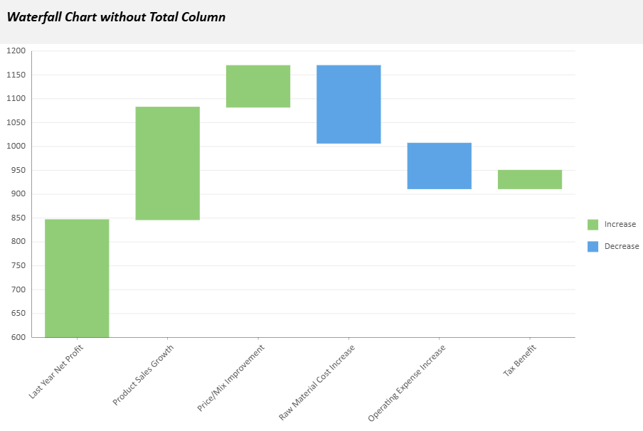
| Controls whether the final total bar is displayed in the chart. Set to |
|
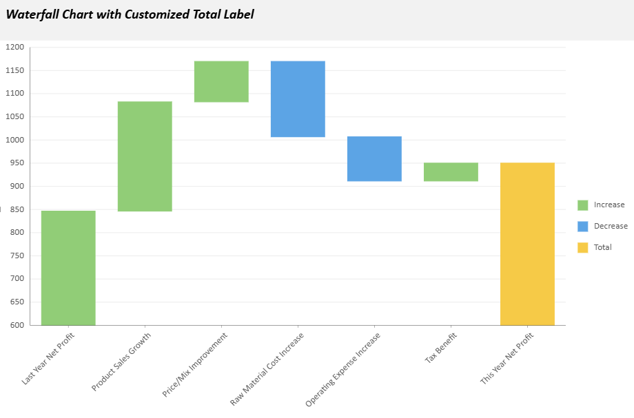
| Specifies the text label used for the total column (default: |
|
| Determines chart orientation. Accepts |
|
| Defines the style of the connecting lines between bars. You can customize properties such as
|
|
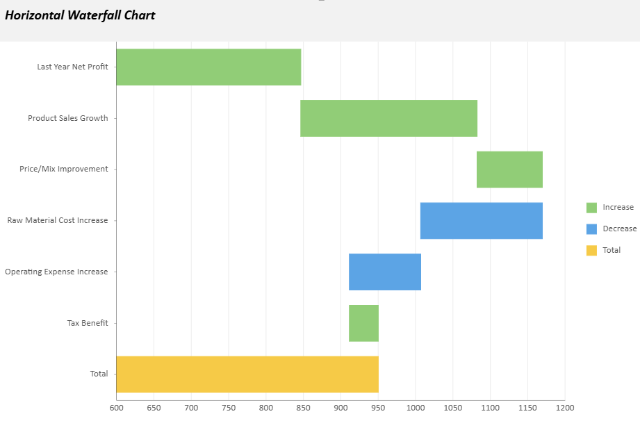
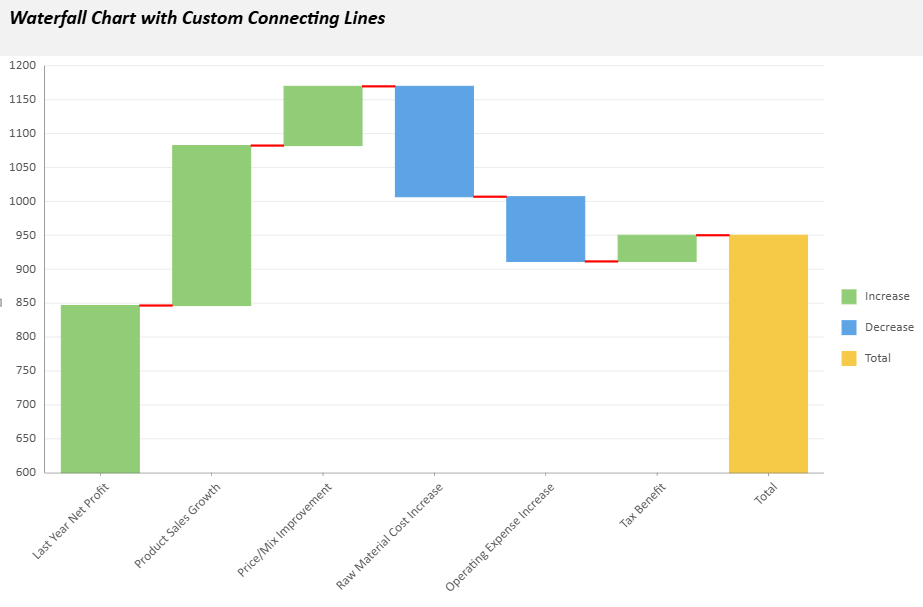
Example configuration:
config: {
  waterfall: {
    showTotal: true,
    totalLabel: "Net Profit",
    orientation: "vertical",
    connectingLineStyle: {
      stroke: { type: 'CssColor', color: 'red' },
      strokeWidth: 2,
      strokeDasharray: "5,5"
    }
  }
}
Advanced Example
The following sample creates a Waterfall Chart for a Year‑over‑Year Net Profit Analysis. It includes a custom chart configuration, text styling, tooltips, and animation effects.
// Basic setup
const sheet = spread.getActiveSheet();
sheet.name("Waterfall Data Chart");
const dataManager = spread.dataManager();

function createProfitsTable(dataManager) {
    const records = [
        ["Last Year Net Profit", 846.5],
        ["Product Sales Growth", 235.8],
        ["Price/Mix Improvement", 87.3],
        ["Raw Material Cost Increase", -162.7],
        ["Operating Expense Increase", -95.4],
        ["Tax Benefit", 38.6],
    ];
  const columns = ["Category", "Value"];
  return dataManager.addTable("Profits", {
    data: records.map(record => {
      const item = {};
      columns.forEach((column, index) => item[column] = record[index]);
      return item;
    }),
  });
}

const ProfitsTable = createProfitsTable(dataManager);
await ProfitsTable.fetch();

// Create a waterfall data chart
const dataChart = sheet.dataCharts.add('WaterfallChart6', 10, 10, 600, 400);
dataChart.setChartConfig({
  tableName: 'Profits',
  plots: [{
    type: GC.Spread.Sheets.DataCharts.DataChartType.waterfall,
    encodings: {
      values: [{ field: 'Value', aggregate: GC.Spread.Sheets.DataCharts.Aggregate.sum }],
      category: { field: 'Category' },
    },
    config: {
      waterfall: {
        totalLabel: 'This Year Net Profit',
        connectingLineStyle: {
          stroke: { type: 'CssColor', color: 'red' },
          strokeWidth: 2,
        },
      },
      text: [{
        template: '{valueField.value}',
        format: { value: '0.00' },
        overlappingLabels: 'Hide',
        position: GC.Spread.Sheets.DataCharts.TextPosition.center,
        textStyle: {
          fontFamily: 'Calibri',
          fontSize: 10,
          fontWeight: 'Lighter',
          fontStyle: GC.Spread.Sheets.DataCharts.FontStyle.italic,
          color: '#333333',
        },
      }],
      tooltip: [{
        style: {
          fill: { type: 'CssColor', color: '#ffffff' },
          stroke: { type: 'CssColor', color: '#e0e0e0' },
          strokeWidth: 1,
        },
        textStyle: {
          fontFamily: 'Calibri',
          fontSize: 12,
          fontWeight: 'Lighter',
          fontStyle: GC.Spread.Sheets.DataCharts.FontStyle.italic,
          color: '#333333',
        },
      }],
      hoverAnimation: {
        duration: 400,
        easing: GC.Spread.Sheets.DataCharts.AnimationEasing.linear,
        scale: 1.5,
      },
      updateAnimation: {
        startDelay: 200,
        duration: 1000,
        easing: GC.Spread.Sheets.DataCharts.AnimationEasing.linear,
      },
    },
  }],
    config: {
    header: {
      title: 'Profit Bridge: Year-over-Year Net Profit Analysis',
      padding: {
        left: 10,
        right: 10,
        top: 10,
        bottom: 20,
      },
   style: {
        fill: { type: 'CssColor', color: '#f2f2f2' },
    },
      textStyle: {
        color: 'black',
        fontSize: 18,
        fontStyle: GC.Spread.Sheets.DataCharts.FontStyle.italic,
        fontWeight: 'Bold',
        alignment: GC.Spread.Sheets.DataCharts.HAlign.left,
      },
    },
  },
});