
- SpreadJS Overview
- Getting Started
- JavaScript Frameworks
- Best Practices
-
Features
- Workbook
- Worksheet
- Rows and Columns
- Headers
- Cells
- Data Binding
- Data Manager
- TableSheet
- GanttSheet
- ReportSheet
- Data Charts
- JSON Schema with SpreadJS
- SpreadJS File Format
- Data Validation
- Conditional Formatting
- Sort
- Group
- Formulas
- What-If Analysis
- Serialization
- Keyboard Actions
- Shapes
- Floating Objects
- Barcodes
- Charts
- Sparklines
- Tables
- Pivot Table
- Slicer
- Theme
- User Management
- Culture
- AI Assistant
- SpreadJS Designer
- SpreadJS Designer VSCode Plugin
- Tutorials
- SpreadJS Designer Component
- SpreadJS Collaboration Server
- Touch Support
- Formula Reference
- Import and Export Reference
- Events
- API Documentation
- Release Notes
Bar Charts
SpreadJS supports several types of bar charts that compare categorical data using horizontal bars. Categories are displayed along the vertical axis, and aggregated values are shown on the horizontal axis.
Bar charts are particularly useful when category labels are long or when horizontal layout improves readability.
Notes:
All samples in this topic use the Sales table introduced in the Create Data Charts topic. Ensure that the data source has been configured before adding a chart.
For details about category and value encodings, see Bind Data Source.
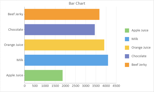
Bar Chart
A bar chart uses rectangular bars to compare different categories or to illustrate the relationship between a category and a value. The length of each bar corresponds to the value it represents, making it easy to visually compare the magnitudes of different categories.
Bar charts are commonly used to display categorical data, such as comparing sales figures for different products or showing the distribution of the population across various age groups. They are versatile and effective in presenting data clearly and easy-to-understand manner.
An image of a bar chart is shown below:
Refer to the following sample code to add a bar chart.
// Bar Chart
const sheet = spread.getActiveSheet();
sheet.name("Bar Chart");
const dataChart = sheet.dataCharts.add('data-chart', 10, 10, 500, 300);
dataChart.setChartConfig({
tableName: 'Sales',
config: {
header: {
title: "Bar Chart"
}
},
plots: [
{
type: GC.Spread.Sheets.DataCharts.DataChartType.bar,
encodings: {
values: [
{
field: "Sales",
aggregate: GC.Spread.Sheets.DataCharts.Aggregate.sum
}
],
category: {
field: "Product"
},
color: {
field: "Product"
}
},
}
]
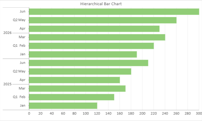
});Bar Chart with Hierarchical Category
Bar charts support hierarchical category structures. Multiple grouping levels can be defined in the category encoding.
The following example shows a Bar chart grouped by Year → Quarter → Month.
// Bar Chart with Hierarchical Category
const sheet = spread.getActiveSheet();
sheet.name("Hierarchical Bar Chart");

const dataChart = sheet.dataCharts.add(
  'data-chart-hierarchy',
  10, 10, 500, 300
);

dataChart.setChartConfig({
  tableName: 'HierarchySales',
  config: {
    header: {
      title: "Hierarchical Bar Chart"
    }
  },
  plots: [{
    type: GC.Spread.Sheets.DataCharts.DataChartType.bar,
    encodings: {
      values: [{
        field: "sales",
        aggregate: GC.Spread.Sheets.DataCharts.Aggregate.sum
      }],
      category: {
        field: "year",
        child: {
          field: "quarter",
          child: {
            field: "month"
          }
        }
      }
    }
  }]
});
Range Bar Chart
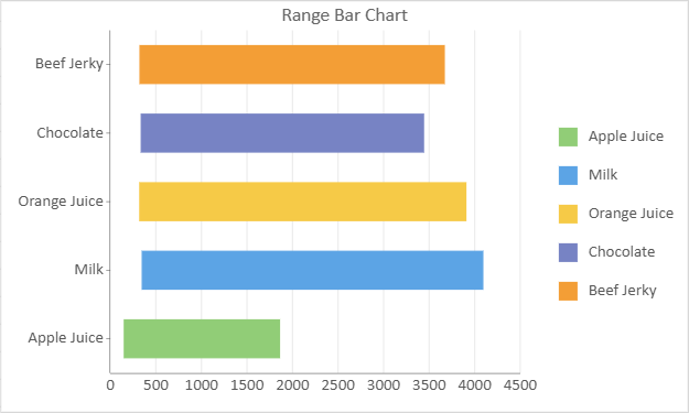
A range bar chart displays a value range for each category instead of a single aggregated value. Each bar represents one lower-to-upper interval, which makes this chart useful for comparing spreads, thresholds, or measurement ranges across categories.
An image of a range bar chart is shown below:
Refer to the following sample code to add a range bar chart.
// Range Bar Chart
const sheet = spread.getActiveSheet();
sheet.name("Range Bar Chart");
const dataChart2 = sheet.dataCharts.add('data-chart-2', 10, 10, 500, 300);
dataChart2.setChartConfig({
          tableName: 'Sales',
          config: {
                    header: {
                        // title settings
                        title: 'Range Bar Chart'
                    }
          },
          plots: [
                    {
                        type: GC.Spread.Sheets.DataCharts.DataChartType.rangeBar,
                        encodings: {
                                values: [{
                                vectors: {
                                    lower: { field: "Return" },
                                    upper: { field: "Sales" }
                                },
                                aggregate: GC.Spread.Sheets.DataCharts.Aggregate.sum
                                }],
                            category: { field: 'Product' },
                            color: { field: 'Product' },
                        }
                    }
          ]
});
Stacked Bar Chart
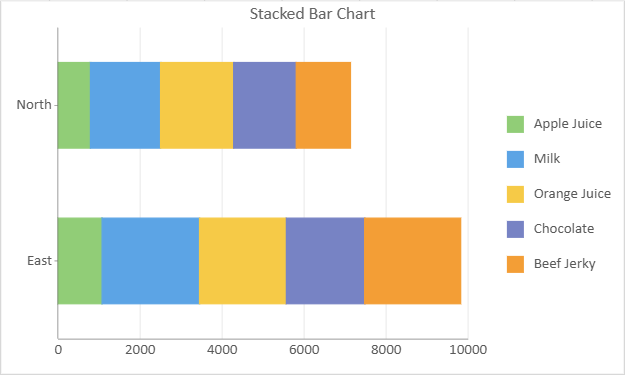
A stacked bar chart displays multiple data series stacked on top of one another within a single bar. Each bar represents a category, and each segment of the bar represents a different sub-category or data series. The total height of the bar shows the total value for that category, while the segments illustrate how that total is divided among the sub-categories.
Stacked bar charts are effective for comparing the total size of different categories while also illustrating the composition of each category as parts of a whole. This allows viewers to easily see both the total value for each category and the relative proportions of the sub-categories within that total.
An image of a stacked bar chart is shown below:
Refer to the following sample code to add a stacked bar chart.
// Stacked Bar Chart
const sheet = spread.getActiveSheet();
sheet.name("Stacked Bar Chart");
const dataChart3 = sheet.dataCharts.add('data-chart-3', 10, 10, 500, 300);
dataChart3.setChartConfig({
         tableName: 'Sales',
         config: {
                    header: {
                        // title settings
                        title: 'Stacked Bar Chart'
                    },
         },
         plots: [
                    {
                        type: GC.Spread.Sheets.DataCharts.DataChartType.stackedBar,
                        encodings: {
                            values: [{ field: 'Sales', aggregate: GC.Spread.Sheets.DataCharts.Aggregate.sum }],
                            category: { field: 'Region' },
                            color: { field: 'Product' },
                        }
                    }
         ]
});
Percent Stacked Bar Chart
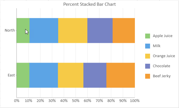
A percent stacked bar chart is similar to a stacked bar chart but with an add-on feature of displaying the data in percentage terms. Here, each bar represents the total value for a category, and the individual segments within the bar represent the proportion of each sub-category as a percentage of the total.
This type of chart is particularly useful when you want to compare the total sizes of different categories while also understanding the relative distribution or composition of each category in the percentage format. Percent stacked bar charts facilitate intuitive comparisons of the relative contributions of different sub-categories across categories, providing a clear visual representation of the percentage breakdown of data within each category.
An image of a percent stacked bar chart is shown below:
Refer to the following sample code to add a percent stacked bar chart.
// Percent Stacked Bar Chart
const sheet = spread.getActiveSheet();
sheet.name("Percent Stacked Bar Chart");
const dataChart4 = sheet.dataCharts.add('data-chart-4', 10, 10, 500, 300);
dataChart4.setChartConfig({
    tableName: 'Sales',
    config: {
        header: {
            // title settings
            title: 'Percent Stacked Bar Chart'
        }
    },
    plots: [
        {
            type: GC.Spread.Sheets.DataCharts.DataChartType.percentStackedBar,
            encodings: {
                values: [{ field: 'Sales', aggregate: GC.Spread.Sheets.DataCharts.Aggregate.sum }],
                category: { field: 'Region' },
                color: { field: 'Product' },
            }
        }
    ]
});