- SpreadJS Overview
- Getting Started
- JavaScript Frameworks
- Best Practices
-
Features
- Workbook
- Worksheet
- Rows and Columns
- Headers
- Cells
- Data Binding
- Data Manager
- TableSheet
- GanttSheet
- ReportSheet
- Data Charts
- JSON Schema with SpreadJS
- SpreadJS File Format
- Data Validation
- Conditional Formatting
- Sort
- Group
- Formulas
- What-If Analysis
- Serialization
- Keyboard Actions
- Shapes
- Floating Objects
- Barcodes
- Charts
- Sparklines
- Tables
- Pivot Table
- Slicer
- Theme
- User Management
- Culture
- AI Assistant
- SpreadJS Designer
- SpreadJS Designer VSCode Plugin
- Tutorials
- SpreadJS Designer Component
- SpreadJS Collaboration Server
- Touch Support
- Formula Reference
- Import and Export Reference
- Events
- API Documentation
- Release Notes
Funnel Charts
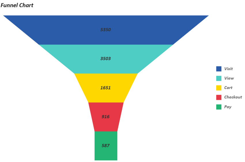
Funnel Chart is a visualization tool used to represent the stages of a process and quantify the number of users or items that progress through each stage. It typically illustrates a gradual decrease in data volume from the initial to the final stage, adopting a funnel-like shape—wide at the top and narrowing toward the bottom.
This capability allows you to visually track flows such as sales pipelines, website visitor conversions, or recruitment processes within your application, making it easier to identify patterns or drop-off points across stages.
With SpreadJS, you can add and customize funnel charts by modifying various properties, including funnel type, color palette, graph opacity, border style, canvas padding, orientation, reverse direction, and more. These adjustments can be made either programmatically through code or visually via the Inspector tab in the SpreadJS Designer, offering flexibility for both developers and designers.
Below is an example of a funnel chart:
Example Foundation
All example codes in this document are built upon the foundational code provided below, which includes core configurations such as core variables and data sources.
You are welcome to customize these configurations according to your specific use-case requirements.
const sheet = spread.getActiveSheet();
sheet.name("Funnel Chart");
const dataManager = spread.dataManager();

function createConversionTable (dataManager) {
    const records = [
        ['Visit', 5350],
        ['View', 3503],
        ['Cart', 1651],
        ['Checkout', 916],
        ['Pay', 587],
    ];
    const columns = ['Stage', 'Count'];

    return dataManager.addTable('Conversion', {
        data: records.map(record => {
            const item = {};
            columns.forEach((column, index) => {
                item[column] = record[index];
            });
            return item;
        })
    });
}

const ConversionTable = createConversionTable(dataManager);
await ConversionTable.fetch();

const dataChart = sheet.dataCharts.add('data-chart', 10, 10, 600, 400);
Data Binding
A Funnel chart uses category-value binding. The category field defines the funnel stages, and the value field determines the size of each segment.
Funnel charts do not support detail encoding.
To assign different colors to funnel segments or generate a color legend, configure color encoding explicitly.
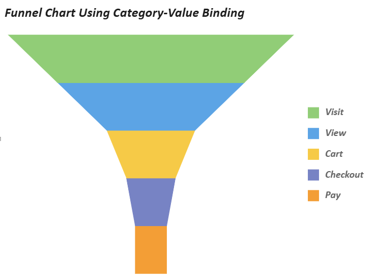
Refer to the following sample code to add a funnel chart using category-value binding.
// Funnel Chart Using Category-Value Binding
dataChart.setChartConfig({
    tableName: 'Conversion',
    plots: [
        {
            type: GC.Spread.Sheets.DataCharts.DataChartType.funnel,
            encodings: {
                values: [{ field: 'Count', aggregate: GC.Spread.Sheets.DataCharts.Aggregate.sum }],
                category: { field: 'Stage' },
                color: { field: 'Stage' },
            },
        }
    ],
    config: {
        header: {
            title: "Funnel Chart Using Category-Value Binding",
            padding: {
                left: 10,
                right: 10,
                top: 10,
                bottom: 10,
            },
            style: {
                fill: { type: 'CssColor', color: 'rgba(255,255,255,0.9)' },
                shadow: { blur: 4, color: 'rgba(0,0,0,0.05)' }
            },
            textStyle: {
                color: 'rgba(30,30,30,1)',
                fontSize: 24,
                fontFamily: 'Calibri',
                fontStyle: GC.Spread.Sheets.DataCharts.FontStyle.italic,
                fontWeight: 'Bold',
                alignment: GC.Spread.Sheets.DataCharts.HAlign.left,
            },
        },
        plotAreas: [{
            legends: [{
                type: GC.Spread.Sheets.DataCharts.LegendType.color,
                textStyle: {
                    fontFamily: 'Calibri',
                    fontSize: 18,
                    fontStyle: GC.Spread.Sheets.DataCharts.FontStyle.italic,
                    fontWeight: 'Bold',
                },
            }],
        }],
    },
});
Funnel Settings
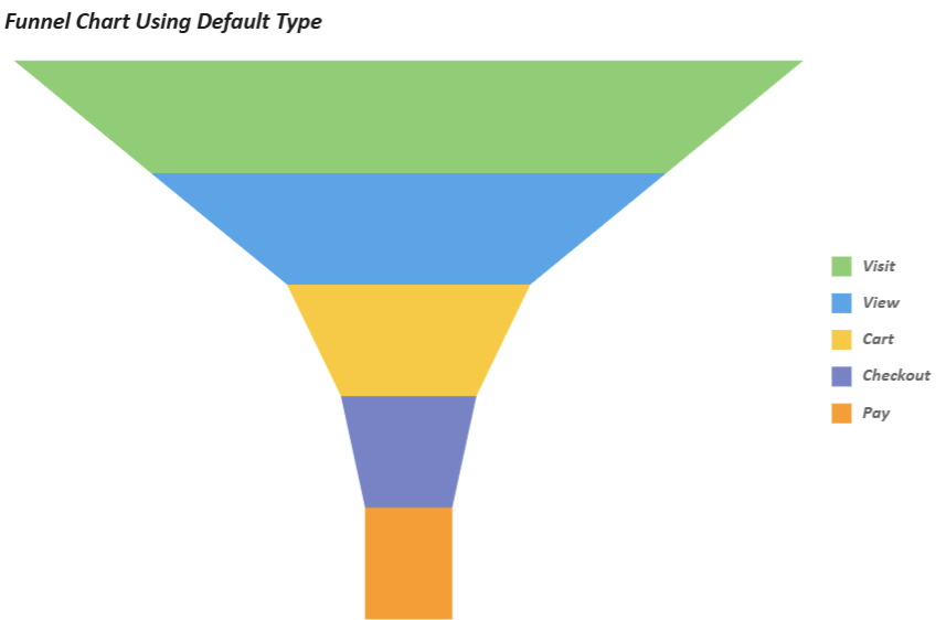
Funnel charts utilize specialized configuration parameters under plots.config.funnel to tailor their visual structure and analytical focus.
Funnel charts provide chart-specific settings such as funnel type, orientation, and reverse direction. These settings control how funnel segments are rendered and how the chart is oriented.
Orientation settings (vertical/horizontal) and directional adjustments (reversed) further adapt the chart to diverse data narratives, while funnelType variants (e.g., trapezoid, rectangle, triangle) expand its applicability across use cases like sales pipelines or user drop-off analysis.
The following table outlines dedicated properties for customizing funnel charts:
Property | Description | Sample Preview |
|---|---|---|
funnelType | Specifies the datachart funnel type:
|
|
orientation | Specifies the funnel’s orientation. ( |
|
reversed | Reverses the funnel. |
|
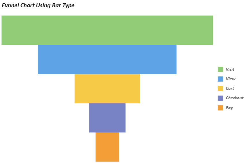
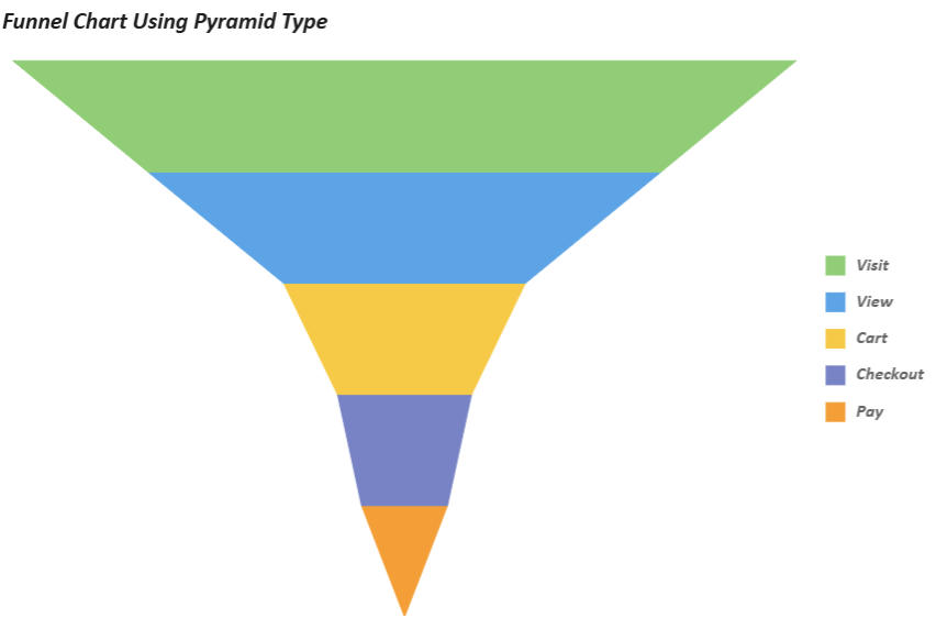
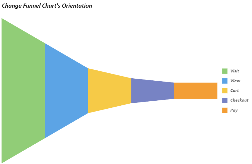
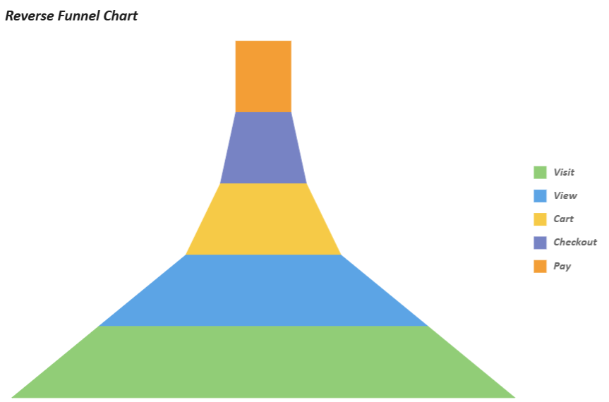
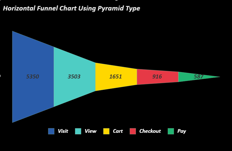
Using Code
const dataChart = sheet.dataCharts.add('data-chart1', 10, 10, 600, 400);
// Category-Value Binding: Horizontal Funnel Chart Using Pyramid Type
dataChart.setChartConfig({
    tableName: 'Conversion',
    plots: [
        {
            type: GC.Spread.Sheets.DataCharts.DataChartType.funnel,
            encodings: {
                values: [{ field: 'Count', aggregate: GC.Spread.Sheets.DataCharts.Aggregate.sum }],
                category: { field: 'Stage' },
                color: { field: 'Stage' }
            },
            config: {
                funnel: {
                    funnelType: GC.Spread.Sheets.DataCharts.FunnelType.pyramid,
                    orientation: GC.Spread.Sheets.DataCharts.Orientation.horizontal,
                },
                palette: ['#2A5CAA', '#4ECDC4', '#FFD700', '#E63946', '#22B573'],
                style: {
                    stroke: { type: 'CssColor', color: '#96CEB4' },
                    strokeWidth: 1,
                    strokeOpacity: 0.5,
                },
                text: [{
                    template: '{valueField.value}',
                    position: GC.Spread.Sheets.DataCharts.TextPosition.center,
                    textStyle: {
                        fontFamily: 'Calibri',
                        fontSize: 20,
                        fontWeight: 'Bold',
                        fontStyle: GC.Spread.Sheets.DataCharts.FontStyle.italic,
                        color: 'rgba(51,51,51,1)',
                    },
                }],
            }
        }
    ],
    config: {
        header: {
            title: "Horizontal Funnel Chart Using Pyramid Type",
            padding: {
                left: 10,
                right: 10,
                top: 10,
                bottom: 10,
            },
            textStyle: {
                color: 'rgba(255,255,255,0.9)',
                fontSize: 24,
                fontFamily: 'Calibri',
                fontStyle: GC.Spread.Sheets.DataCharts.FontStyle.italic,
                fontWeight: 'Bold',
                alignment: GC.Spread.Sheets.DataCharts.HAlign.left,
            },
        },
        plotAreas: [{
            padding: {
                left: 40,
                right: 40,
                top: 40,
                bottom: 40,
            },
            legends: [{
                type: GC.Spread.Sheets.DataCharts.LegendType.color,
                position: GC.Spread.Sheets.DataCharts.LegendPosition.bottom,
                hAlign: GC.Spread.Sheets.DataCharts.HAlign.center,
                textStyle: {
                    fontFamily: 'Calibri',
                    fontSize: 18,
                    fontStyle: GC.Spread.Sheets.DataCharts.FontStyle.italic,
                    fontWeight: 'Bold',
                    color: 'rgba(255,255,255,1)'
                },
            }],
        }],
        dvStyle: {
            fill: { type: 'CssColor', color: 'black' },
            stroke: { type: 'CssColor', color: 'grey' },
            strokeWidth: 2,
        },
    },
});