


- SpreadJS Overview
- Getting Started
- JavaScript Frameworks
- Best Practices
-
Features
- Workbook
- Worksheet
- Rows and Columns
- Headers
- Cells
- Data Binding
- Data Manager
- TableSheet
- GanttSheet
- ReportSheet
- Data Charts
- JSON Schema with SpreadJS
- SpreadJS File Format
- Data Validation
- Conditional Formatting
- Sort
- Group
- Formulas
- What-If Analysis
- Serialization
- Keyboard Actions
- Shapes
- Floating Objects
- Barcodes
- Charts
- Sparklines
- Tables
- Pivot Table
- Slicer
- Theme
- User Management
- Culture
- AI Assistant
- SpreadJS Designer
- SpreadJS Designer VSCode Plugin
- Tutorials
- SpreadJS Designer Component
- SpreadJS Collaboration Server
- Touch Support
- Formula Reference
- Import and Export Reference
- Events
- API Documentation
- Release Notes
Radar Charts
Radar charts display multivariate data on axes that radiate from a common center. They are commonly used to compare patterns across several dimensions, such as revenue, cost, performance, or evaluation metrics.
SpreadJS supports two radar-based chart types: Radar and Filled Radar.
Note: All samples in this topic use the Sales table introduced in the Create Data Charts topic. Ensure that the data source has been configured before adding a chart.
Radar Chart
A radar chart connects data points across multiple radial axes to form a polygon, making it useful for comparing value distributions across dimensions.
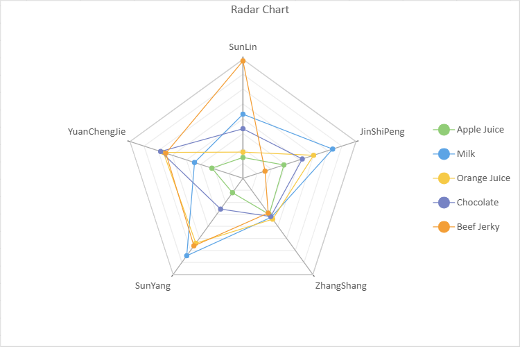
Refer to the following sample code to add a radar chart.
// Radar Chart
const sheet = spread.getActiveSheet();
sheet.name("Radar Chart");
const dataChart = sheet.dataCharts.add('data-chart', 10, 10, 600, 400);
dataChart.setChartConfig({
    tableName: 'Sales',
    config: {
        header: {
            title: "Radar Chart"
        }
    },
    plots: [
        {
            type: GC.Spread.Sheets.DataCharts.DataChartType.radar,
            encodings: {
                values: [
                    {
                        field: "Sales",
                        aggregate: GC.Spread.Sheets.DataCharts.Aggregate.sum
                    }
                ],
                category: {
                    field: "Salesman"
                },
                details: [{ field: 'Product' }],
                color: {
                    field: "Product"
                },
                filter: {
                    operate: GC.Spread.Sheets.DataCharts.LogicalOperation.and,
                    conditions: [
                        {
                            field: "Region",
                            excludeMatched: false,
                            operate: GC.Spread.Sheets.DataCharts.ComparisonOperator.in,
                            value: ["East"]
                        }
                    ]
                }
            }
        }
    ]
});
Filled Radar Chart
A filled radar chart shades the area enclosed by the plotted values, making it easier to compare overall magnitude and relative distribution.
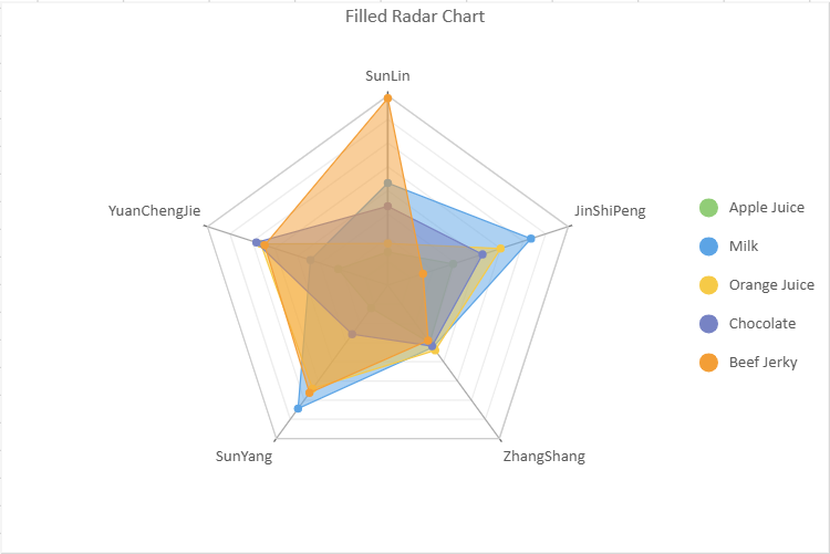
Refer to the following sample code to add a filled radar chart.
// Filled Radar Chart
const sheet = spread.getActiveSheet();
sheet.name("Filled Radar Chart");
const dataChart2 = sheet.dataCharts.add('data-chart-2', 10, 10, 600, 400);
dataChart2.setChartConfig({
     tableName: 'Sales',
     config: {
         header: {
             title: "Filled Radar Chart"
         },
     },
     plots: [
         {
             type: GC.Spread.Sheets.DataCharts.DataChartType.filledRadar,
             encodings: {
                 values: [
                     {
                         field: "Sales",
                         aggregate: GC.Spread.Sheets.DataCharts.Aggregate.sum
                     }
                 ],
                 category: {
                     field: "Salesman"
                 },
                 details: [{ field: 'Product' }],
                 color: {
                     field: "Product"
                 },
                 filter: {
                     operate: GC.Spread.Sheets.DataCharts.LogicalOperation.and,
                     conditions: [
                         {
                             field: "Region",
                             excludeMatched: false,
                             operate: GC.Spread.Sheets.DataCharts.ComparisonOperator.in,
                             value: ["East"]
                         }
                     ]
                 }
             },
         }
     ]
});
Line Aspect
Radar and Filled Radar charts support the lineAspect property to control how data points are connected around the radial axis.
Data Type | Default | Spline | Bezier Curve |
|---|---|---|---|
Radar |
|
|
|
Filled Radar |
|
|
|
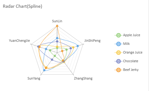
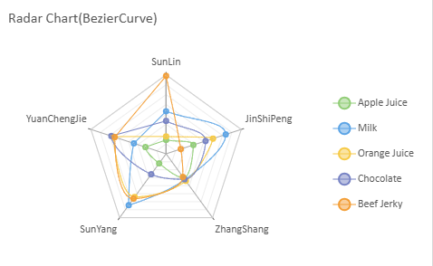
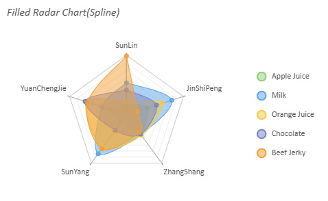
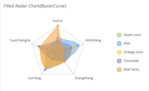
If lineAspect is set to null or undefined, the chart renders using the Default behavior.
Example
config: {
  lineAspect: GC.Spread.Sheets.DataCharts.LineAspect.Spline
}