
- SpreadJS Overview
- Getting Started
- JavaScript Frameworks
- Best Practices
-
Features
- Workbook
- Worksheet
- Rows and Columns
- Headers
- Cells
- Data Binding
- Data Manager
- TableSheet
- GanttSheet
- ReportSheet
- Data Charts
- JSON Schema with SpreadJS
- SpreadJS File Format
- Data Validation
- Conditional Formatting
- Sort
- Group
- Formulas
- What-If Analysis
- Serialization
- Keyboard Actions
- Shapes
- Floating Objects
- Barcodes
- Charts
- Sparklines
- Tables
- Pivot Table
- Slicer
- Theme
- User Management
- Culture
- AI Assistant
- SpreadJS Designer
- SpreadJS Designer VSCode Plugin
- Tutorials
- SpreadJS Designer Component
- SpreadJS Collaboration Server
- Touch Support
- Formula Reference
- Import and Export Reference
- Events
- API Documentation
- Release Notes
Column Charts
SpreadJS supports several types of column charts that compare categorical data using vertical bars. In column charts, categories are plotted on the horizontal axis and aggregated values are displayed on the vertical axis.
Column charts are commonly used to compare values across categories or to visualize trends over time.
Notes:
All samples in this topic use the
Salestable introduced in the Create Data Charts topic. Ensure that the data source has been configured before adding a chart.For details about category and value encodings, see Bind Data Source.
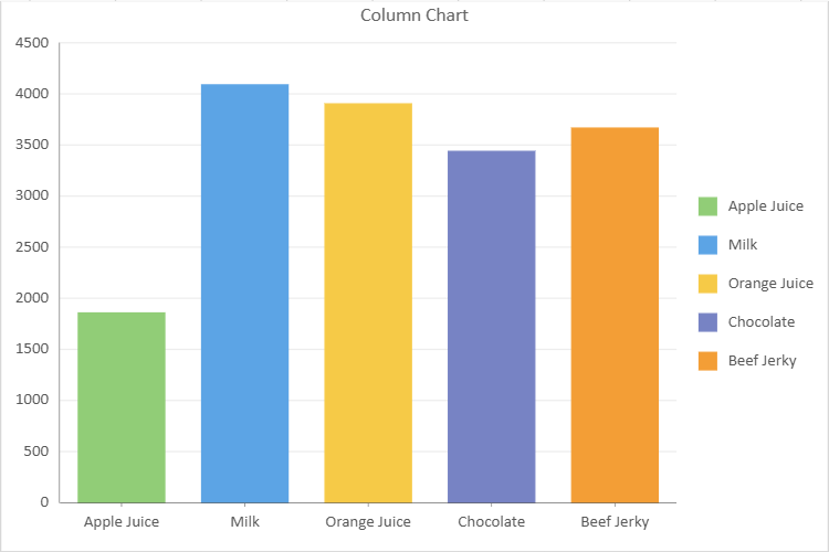
Column Chart
A column chart is a common data visualization tool that compares different categories or displays trends over time. It consists of vertical bars where the height of each bar represents the value of the corresponding category, which allows a straightforward comparison between data points.
An image of a column chart is shown below:
The following example creates a basic column chart:
// Column Chart
const sheet = spread.getActiveSheet();
sheet.name("Column Chart");
const dataChart = sheet.dataCharts.add('data-chart', 10, 10, 600, 400, GC.Spread.Sheets.DataCharts.DataChartType.column);
dataChart.setChartConfig({
tableName: 'Sales',
config: {
header: {
title: "Column Chart"
}
},
plots: [
{
type: GC.Spread.Sheets.DataCharts.DataChartType.column,
encodings: {
values: [
{
field: "Sales",
aggregate: GC.Spread.Sheets.DataCharts.Aggregate.sum
}
],
category: {
field: "Product"
},
color: {
field: "Product"
}
}
}
]
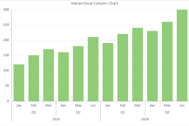
});Column Chart with Hierarchical Category
Column charts support hierarchical category structures.
Multiple grouping levels can be defined in the category encoding.
The following example shows a Column chart grouped by Year → Quarter → Month.
// Column Chart with Hierarchical Category
const sheet = spread.getActiveSheet();
sheet.name("Hierarchical Column Chart");
const dataChart = sheet.dataCharts.add(
'data-chart-hierarchy',
10, 10, 600, 400,
GC.Spread.Sheets.DataCharts.DataChartType.column
);
dataChart.setChartConfig({
tableName: 'HierarchySales',
config: {
header: {
title: "Hierarchical Column Chart"
}
},
plots: [{
type: GC.Spread.Sheets.DataCharts.DataChartType.column,
encodings: {
values: [{
field: "sales",
aggregate: GC.Spread.Sheets.DataCharts.Aggregate.sum
}],
category: {
field: "year",
child: {
field: "quarter",
child: {
field: "month"
}
}
}
}
}]
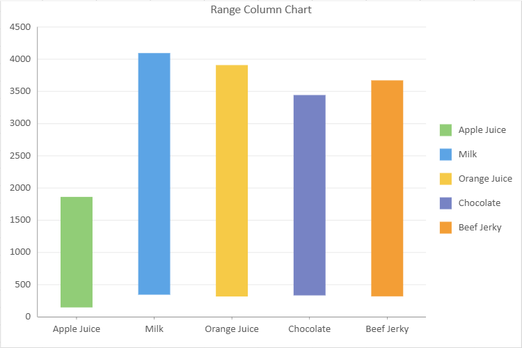
});Range Column Chart
A range column chart displays value ranges for each category using vertical bars.
Each column represents the interval between a lower and an upper value.
Range column charts are commonly used to visualize minimum and maximum values, confidence intervals, or value fluctuations.
An image of a stacked column chart is shown below:
To define the lower and upper bounds, provide both fields within a single value configuration using the vectors structure (introduced in v19.1).
const sheet = spread.getActiveSheet();
sheet.name("Range Column Chart");
const dataChart = sheet.dataCharts.add(
'data-chart-2',
10, 10, 600, 400,
GC.Spread.Sheets.DataCharts.DataChartType.column
);
dataChart.setChartConfig({
tableName: 'Sales',
config: {
header: {
title: "Range Column Chart"
}
},
plots: [{
type: GC.Spread.Sheets.DataCharts.DataChartType.rangeColumn,
encodings: {
values: [{
vectors: {
lower: { field: "Return" },
upper: { field: "Sales" }
},
aggregate: GC.Spread.Sheets.DataCharts.Aggregate.sum
}],
category: {
field: "Product"
},
color: {
field: "Product"
}
}
}]
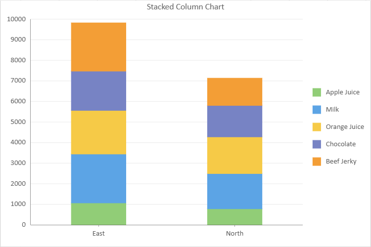
});Stacked Column Chart
A stacked column chart compares the total value of each category while also showing how sub-categories contribute to that total. Each column represents a category, and individual series are stacked vertically.
The following example creates a stacked column chart:
// Stacked Column Chart
const sheet = spread.getActiveSheet();
sheet.name("Stacked Column Chart");
const dataChart3 = sheet.dataCharts.add('data-chart-3', 10, 10, 600, 400, GC.Spread.Sheets.DataCharts.DataChartType.column);
dataChart3.setChartConfig({
tableName: 'Sales',
config: {
header: {
title: 'Stacked Column Chart'
}
},
plots: [
{
type: GC.Spread.Sheets.DataCharts.DataChartType.stackedColumn,
encodings: {
values: [{ field: 'Sales', aggregate: GC.Spread.Sheets.DataCharts.Aggregate.sum }],
category: { field: 'Region' },
color: { field: 'Product' },
}
}
]
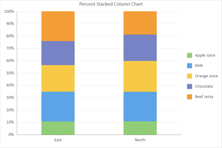
});Percent Stacked Column Chart
A percent stacked column chart is similar to a regular stacked column chart but displays data in percentage terms. In this chart, the height of each column represents the total value for that category, while the individual segments within the column show the proportion of each sub-category as a percentage of the total.
Percent stacked column charts are helpful when you want to compare the total sizes of different categories and also understand the relative distribution or composition of each category in terms of percentages. This type of chart provides a clearer picture of the overall distribution of data by allowing for easy comparisons of the relative contributions of different sub-categories across categories.
An image of a percent stacked column chart is shown below:
The following example creates a percent stacked column chart:
// Percent Stacked Column Chart
const sheet = spread.getActiveSheet();
sheet.name("Percent Stacked Column Chart");
const dataChart4 = sheet.dataCharts.add('data-chart-3', 10, 10, 600, 400, GC.Spread.Sheets.DataCharts.DataChartType.column);
dataChart4.setChartConfig({
    tableName: 'Sales',
    config: {
        header: {
            title: 'Percent Stacked Column Chart'
        }
    },
    plots: [
        {
            type: GC.Spread.Sheets.DataCharts.DataChartType.percentStackedColumn,

            encodings: {
                values: [{ field: 'Sales', aggregate: GC.Spread.Sheets.DataCharts.Aggregate.sum }],
                category: { field: 'Region' },
                color: { field: 'Product' },
            }
        }
    ]
});