- SpreadJS Overview
- Getting Started
- JavaScript Frameworks
- Best Practices
-
Features
- Workbook
- Worksheet
- Rows and Columns
- Headers
- Cells
- Data Binding
- Data Manager
- TableSheet
- GanttSheet
- ReportSheet
- Data Charts
- JSON Schema with SpreadJS
- SpreadJS File Format
- Data Validation
- Conditional Formatting
- Sort
- Group
- Formulas
- What-If Analysis
- Serialization
- Keyboard Actions
- Shapes
- Floating Objects
- Barcodes
- Charts
- Sparklines
- Tables
- Pivot Table
- Slicer
- Theme
- User Management
- Culture
- AI Assistant
- SpreadJS Designer
- SpreadJS Designer VSCode Plugin
- Tutorials
- SpreadJS Designer Component
- SpreadJS Collaboration Server
- Touch Support
- Formula Reference
- Import and Export Reference
- Events
- API Documentation
- Release Notes
Line Charts
Line charts connect data points with lines to show how values change across categories or over time. They are commonly used to visualize trends, fluctuations, and directional movement in business, financial, and operational data.
SpreadJS allows you to customize line charts by modifying properties such as the color palette, line thickness, symbol display, tooltip style, and axis appearance, either through code or by using the Inspector tab in the SpreadJS Designer.
Note: The samples in this topic use the Sales table introduced in Bind Data Source. Ensure that the data source has been configured before adding a chart.
Line Chart
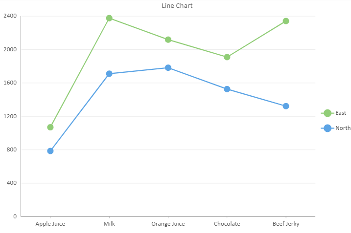
A basic line chart displays aggregated values across categories. Each data point is connected to illustrate the overall trend.
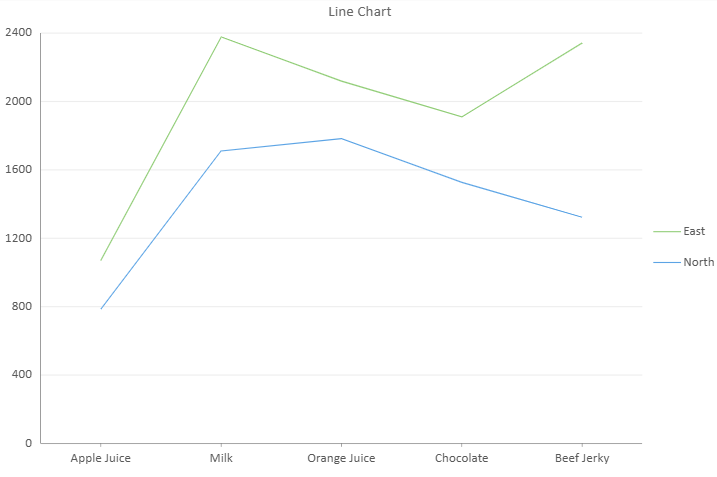
// Line Chart
const sheet = spread.getActiveSheet();
sheet.name("Line Chart");

const dataChart = sheet.dataCharts.add(
  'data-chart',
  10, 10, 600, 400
);

dataChart.setChartConfig({
  tableName: 'Sales',
  config: {
    header: {
      title: "Line Chart"
    }
  },
  plots: [{
    type: GC.Spread.Sheets.DataCharts.DataChartType.line,
    encodings: {
      category: { field: "Product" },
      details: [{ field: 'Region' }],
      color: { field: "Region" },
      values: [{
        field: "Sales",
        aggregate: GC.Spread.Sheets.DataCharts.Aggregate.sum
      }]
    },
    config: {
      axisMode: GC.Spread.Sheets.DataCharts.AxisMode.cartesian
    }
  }]
});
Line Chart with Hierarchical Category
Line charts support hierarchical category grouping.
category: {
  field: "ProductCategory",
  child: {
    field: "Product"
  }
}
The nesting order defines the grouping hierarchy.

Line Aspect
Line charts support the lineAspect property, which controls how data points are connected and rendered.
Line Aspect | Sample |
|---|---|
Default |
|
Spline |
|
StepCenter |
|
StepLeft |
|
StepRight |
|
BezierCurve |
|
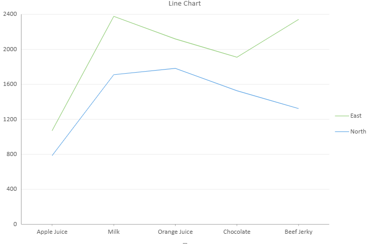
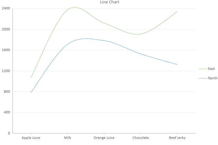
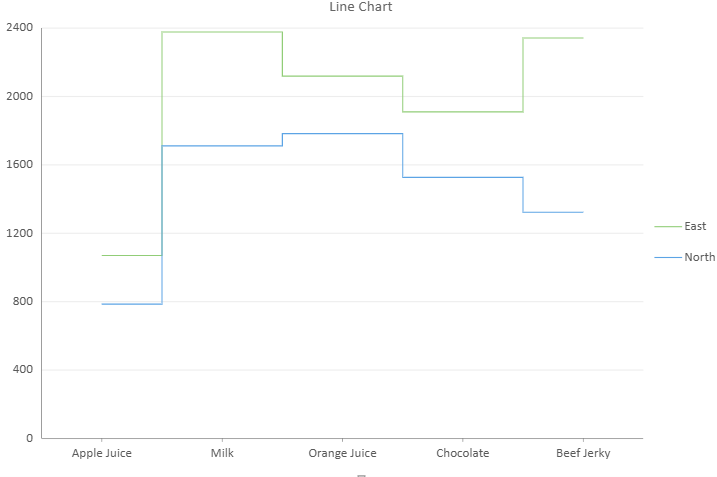
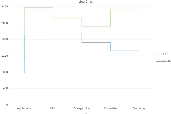
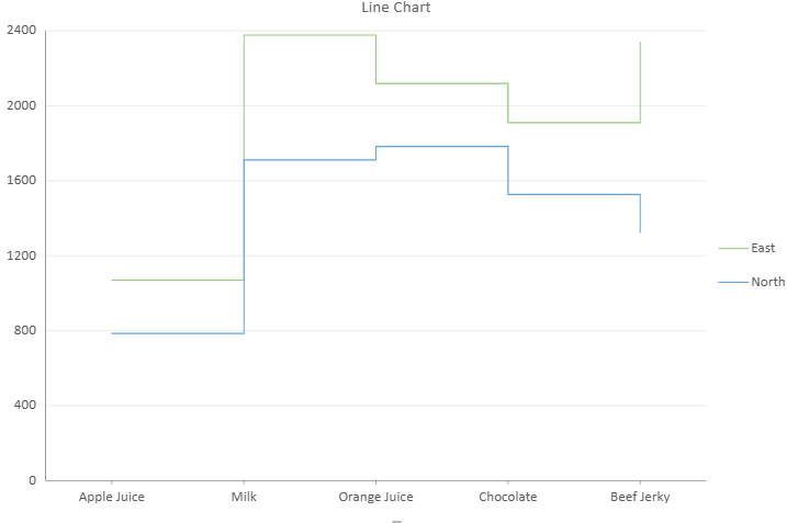
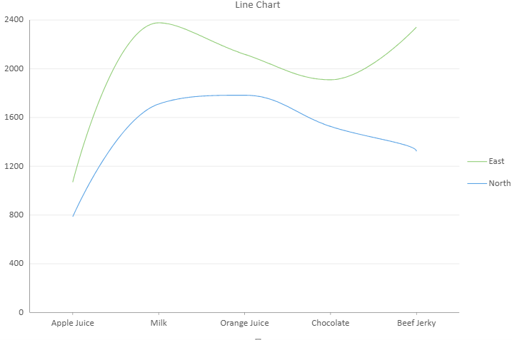
If
lineAspectis set tonullorundefined, the chart renders using theDefaultbehavior.
Example
config: {
  lineAspect: GC.Spread.Sheets.DataCharts.LineAspect.Spline
}
Symbols and Line Style
Line charts allow customization of line thickness and symbol appearance.
config: {
  style: {
    strokeWidth: 2,
    symbolShape: GC.Spread.Sheets.DataCharts.SymbolShape.dot,
    symbolSize: 10
  },
  symbols: true
}strokeWidthcontrols the thickness of the line.symbolShapedefines the marker shape.symbolSizecontrols marker size.symbolsenables or disables symbol display.
Color Palette
The palette property defines the color sequence used for multiple series.
config: {
  palette: [
    "#88bde6",
    "#fbb258",
    "#90cd97",
    "#f6aac9",
    "#bfa554",
    "#bc99c7"
  ]
}
The palette is applied in order to the generated series.