Version 1
Masonry Layout
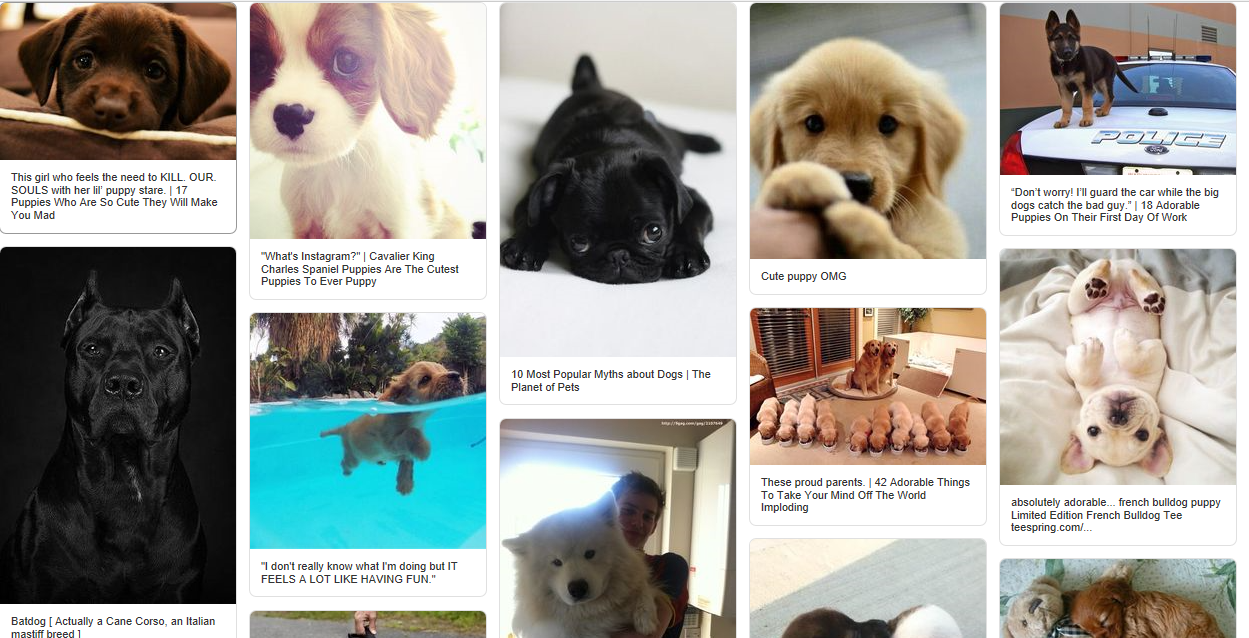
DataViewsJS provides the Masonry Layout. The Masonry Layout is a dynamic grid layout plug-in which treats rows as cards. Unlike the Card Layout that has the same size of display blocks, the cards in the Masonry Layout are laid out in a container that can have varying height or width.
You can choose from the following Masonry Layout options.
| Option | Default Value | Description |
|---|---|---|
| rowHeight | 1 | The minimum distance between the cards lined up in the horizontal direction. When set to the default value, the Masonry Layout displays the cards side by side. |
| columnWidth | 1 | The minimum distance between the cards lined up in the vertical direction. When set to the default value, the Masonry Layout displays the cards side by side. |
| gutter | 0 | Controls the distance between the cards. Note: Gutter and row template are separate options. Gutter is used to set the space between the cards, whereas the rowtemplate refers to the template element that formats the cards. |
| keepOrder | true | Indicates the layout strategy for the Masonry Layout. When set to true, the Masonry Layout pushes the cards one by one, based on the order in which the data was specified. When set to false, the Masonry Layout creates a compact layout to minimize the extra space. |
| rightToLeft | false | Specifies whether to display the right-to-left layout. |
| showScrollBar | true | Specifies whether to display the scroll bars. |
Use the following steps to implement the Masonry Layout.

Sample Code
- Add the following file references after the Dataview reference.
<link rel="stylesheet" type="text/css" href="[Your Stylesheet Path]/gc.dataviews.masonry.[VERSION].css" />
<script src="[Your Script Path]/gc.dataviews.masonrylayout.[VERSION].min.js" type="text/javascript"></script>
- Add a div tag within the body tag to include the DOM element as the container in the page. Then add the template element to lay out the cards.
<div id="grid1" style="height:100%"></div>
<template id="rowTemplate" style="display:none">
  <div class="img-board">
    <div data-column="image"></div>
    <div class="image-meta">
      <div data-column="meta" class="image-meta-context"></div>
    </div></div
></template>
- Add the column definition for two column tables. One column is for the image and the other is for the description.
var columns = [
  {
    id: 'image',
    name: 'image',
    dataField: 'image',
    presenter: '<img class="image-content" src="\{{=it.image}}" alt="dogs">',
  },
  {
    id: 'meta',
    name: 'meta',
    dataField: 'meta',
    presenter: '<div class="image-meta-context">\{{=it.meta}}</div>',
  },
];
- Initialize the code while defining the event listeners.
var dataView = new GC.DataViews.DataView(
  document.getElementById('grid1'),
  data,
  columns,
  new GC.DataViews.MasonryLayout({
    gutter: 12,
    rowTemplate: '#rowTemplate',
  })
);
window.dataView = dataView;

window.addEventListener('resize', function () {
  dataView.invalidate();
});
Feedback
Submit and view feedback for


