
- Getting Started
- Developer Guides
-
Report Author Guides
- Quick Start
- Report Designer Interface
- Report Viewer Interface
- Data Binding
- Report Configuration
- Report Themes
- Report Stylesheets
- Report Layers
- Report Parameters
- Interactive Reports
-
Report Items
- Common Properties
-
Data Regions
- Table
- Banded List
- List
- Tablix
-
Chart
- Plot
- Axes
- Legend
- Overlays
- Sparkline
- Bullet Chart
- Data Visualizers
- Supplemental report items
- Expressions
- Report Parts
- Master Reports
- Tutorials
Creating Gauge Plots
Introduction
Before creating and configuring Gauge Plots, ensure that a chart has been added to your report.
For instructions on adding a chart and launching the Chart Wizard, see Adding a Chart.
Once the Chart Wizard is open, select the Gauge plot type, choose the dataset to visualize, and proceed to the next page.
Plot Settings
The Settings page of the Chart Wizard for Gauge plots is structured as shown below:
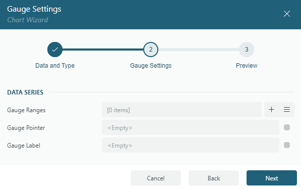
Gauge plots consist of the following key components:
Gauge Ranges – Defines the background sectors of the gauge, representing different performance levels such as Low, Medium, and High, or Poor, Average, and Excellent.
Gauge Pointer – Represents the current value, displayed as an arrow or indicator that points to the corresponding position on the gauge scale.
Gauge Label – Displays text annotations along the gauge, typically showing numerical values or descriptive labels to enhance readability.