
- Getting Started
- Developer Guides
-
Report Author Guides
- Quick Start
- Report Designer Interface
- Report Viewer Interface
- Data Binding
- Report Configuration
- Report Themes
- Report Stylesheets
- Report Layers
- Report Parameters
- Interactive Reports
-
Report Items
- Common Properties
-
Data Regions
- Table
- Banded List
- List
- Tablix
-
Chart
- Plot
- Axes
- Legend
- Overlays
- Sparkline
- Bullet Chart
- Data Visualizers
- Supplemental report items
- Expressions
- Report Parts
- Master Reports
- Tutorials
Pie and Doughnut Plots
Overview
Pie and Donut plots are used to visualize the proportions of a whole, making it easy to compare the relative sizes of different parts within a dataset.
A Pie Plot represents Data Values as a full disk divided into slices.
A Donut Plot (also called a Doughnut Plot) represents Data Values as a ring, with slices appearing as segments.
In both cases, the arc length of each slice or segment is proportional to its corresponding Data Value, effectively illustrating its share of the whole.For clarity, we use the term circular sector to refer to both Pie slices and Donut segments. The examples below emphasize Data Values in bold and their Parts in italics.
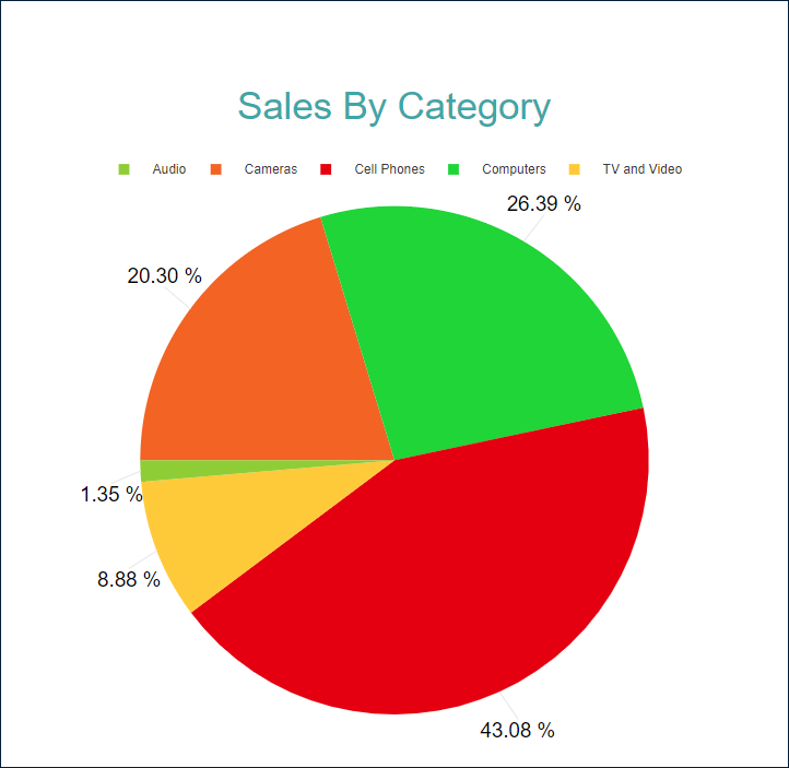
Single Value Pie Plot
A Single Value Pie Plot visualizes how different parts contribute to a single Data Value, making it easy to compare proportions within a whole.For example, the Pie Plot Demo illustrates the contribution of product categories to the overall Net Sales, with each category represented as a distinct slice of the pie.
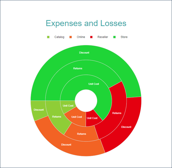
Multiple Value Doughnut Plot
A Multiple Value Doughnut Plot allows for the visualization of several Data Values within a common set of categories, making it easier to compare multiple aspects of a dataset in a single view.For example, the Doughnut Plot Demo illustrates how different product categories contribute to Discounts, Returns, and Unit Cost, with each ring representing a distinct metric while maintaining a unified categorical structure.
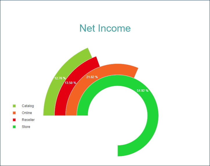
Circular Bar Plot
A Circular Bar Plot is a variation of the Doughnut Plot where segments are placed next to each other, creating a bar-like appearance in a circular layout. This visualization effectively compares multiple data values while maintaining a radial structure.For example, the Circular Bar Plot Demo illustrates the contribution of sales channels to Net Income, with each segment representing a different channel’s proportional share.
You can configure all these types using the Pie template and its properties described in the following sections. The Doughnut template is just a shortcut to a pre-configured Inner Radius property value.
You can use the following demos to explore plot properties - open a link, toggle the Report explorer, select the Plot - Plot 1 node and use the Properties panel to modify the configuration.
You could also download the report files listed below and open them in the Standalone Report Designer.