
- Getting Started
- Developer Guides
-
Report Author Guides
- Quick Start
- Report Designer Interface
- Report Viewer Interface
- Data Binding
- Report Configuration
- Report Themes
- Report Stylesheets
- Report Layers
- Report Parameters
- Interactive Reports
-
Report Items
- Common Properties
-
Data Regions
- Table
- Banded List
- List
- Tablix
-
Chart
- Plot
- Axes
- Legend
- Overlays
- Sparkline
- Bullet Chart
- Data Visualizers
- Supplemental report items
- Expressions
- Report Parts
- Master Reports
- Tutorials
Creating Pie and Doughnut Plots
Introduction
Before creating and configuring Pie and Doughnut Plots, make sure you have added a chart to your report. For instructions on adding a chart and launching the Chart Wizard, see Adding a Chart. Once the Chart Wizard is open, select the Pie or Doughnut Plot type, choose the dataset to visualize, and proceed to the next page.
Plot Settings
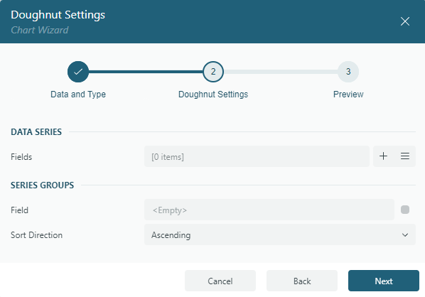
The Settings page of the Chart Wizard for Pie and Doughnut plots structured as shown below:
It is divided into two sections:
Data Series
The Fields collection defines the Data Values you want to visualize. These values determine the following visual properties:
Arc Length of Each Circular Sector – Represents the proportion of the corresponding Data Value relative to the total sum of all values.
Color Assignment – Each part of the whole is visually distinguished using a unique color.
Typically, each value is an aggregate expression, such as {Sum(SalesAmount)}.
Series Groups
Field: Select the field, or specify an expression, that determines how the Pie or Doughnut Plot is divided into slices. Each unique value in this field represents a distinct slice or segment. Common examples include product types, sales channels, or expense categories.
Sort Direction: Specify whether slices are arranged in Ascending or Descending order based on their corresponding data values.
Once you have configured the Data Values and Series Groups, click Next to proceed to the Preview and Final Adjustments page to complete the chart creation.