
- Getting Started
- Developer Guides
-
Report Author Guides
- Quick Start
- Report Designer Interface
- Report Viewer Interface
- Data Binding
- Report Configuration
- Report Themes
- Report Stylesheets
- Report Layers
- Report Parameters
- Interactive Reports
-
Report Items
- Common Properties
-
Data Regions
- Table
- Banded List
- List
- Tablix
-
Chart
- Plot
- Axes
- Legend
- Overlays
- Sparkline
- Bullet Chart
- Data Visualizers
- Supplemental report items
- Expressions
- Report Parts
- Master Reports
- Tutorials
Line and Area Plots (Standard & Radar)
Overview
Line, Area, Radar Line, and Radar Area plots are effective for visualizing trends, patterns, and fluctuations in Data Values across sequential Categories. These plot types share similar configuration options but differ in how they represent data:
Line Plots display categories along a horizontal axis, with Symbols representing data points connected by line segments to emphasize changes over time or across categories. The Swap Axes option allows flipping the layout, placing categories along the vertical axis instead.
Area Plots are similar to Line Plots but do not display Symbols. Instead, they fill the space beneath the line, emphasizing magnitude and distribution.
Radar Line Plots arrange categories radially around a circular layout instead of along a straight axis:
Categories are evenly distributed around a central point.
Data Values are plotted along radial lines extending outward from the center.
Symbols are connected by either straight or curved lines, forming a closed shape when multiple categories are present.
Radar Area Plots extend Radar Line Plots by filling the space beneath the line, further emphasizing magnitude and distribution:
Categories are distributed evenly around a circle, with Data Values plotted along radial lines.
Data points are connected to form a closed shape, and the area inside is filled with color.
Curved or straight lines can be used to define the boundaries of the filled area.
Each of these plot types provides a structured way to analyze trends, fluctuations, and distributions. Additionally, you can choose how to organize Data Values within a containing Category. The examples below emphasize Data Values in bold and Categories in italics.
Single Line Plot
A single line plot represents changes in a single Data Value over time or across a sequence of Categories. It connects individual data points with line segments to highlight trends, fluctuations, or patterns in the data.
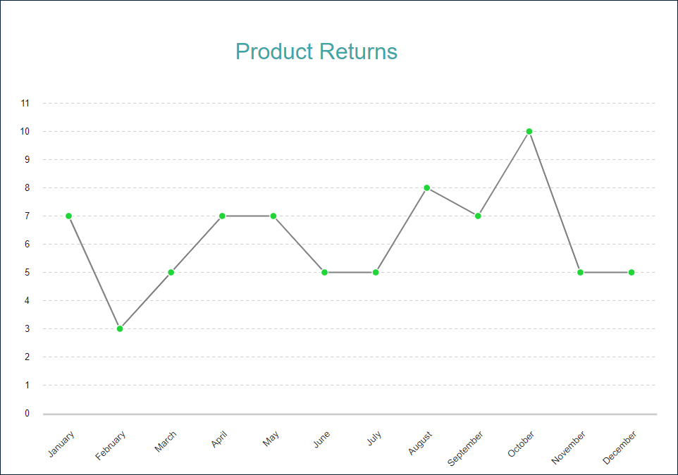
For example, the Single Line Demo visualizes the number of product returns over the course of a year, showing how the values rise and fall across different months.
Multiple Line Plot
A multiple-line plot enables the visualization of multiple Data Values across the same set of Categories, allowing for a more detailed comparison of trends and patterns between different subcategories.
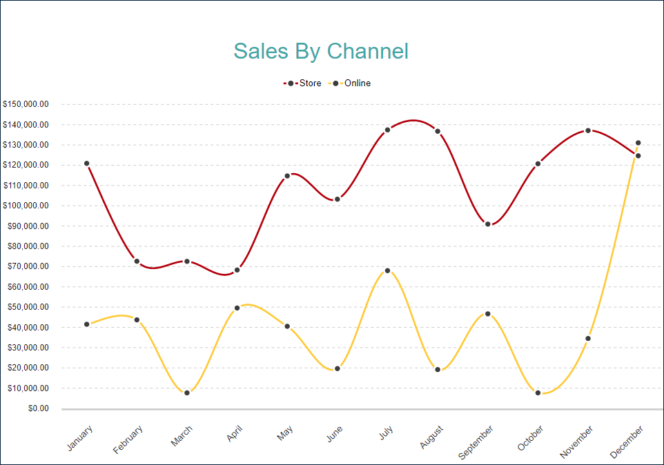
For example, the Multiple Line Demo illustrates the changes in Net Sales over the course of a year for two different sales channels: Online and Store. Each line represents a separate subcategory, making it easier to identify differences, correlations, and seasonal variations between them.
Multiple Values Line Plot
A multiple values line plot allows for the visualization of multiple distinct Data Values over the same period, whether they are related or independent. This enables direct comparisons between different metrics and helps identify correlations or discrepancies in trends.
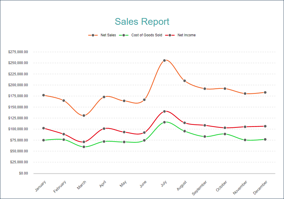
For example, the Multiple Values Line Demo displays how Net Sales, Cost of Goods Sold, and Net Income change over the course of a year for a given product. Each line represents a separate metric, making it easier to analyze their relationships and overall financial performance.
Radar Line Plot with Multiple Values
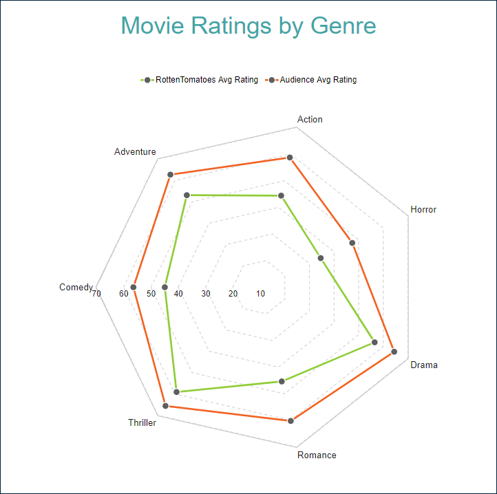
A Radar Line Plot is useful for visualizing multiple data series across a set of categories, making it easy to compare different variables in a circular layout.For example, the Radar Line Plot with Multiple Values Demo presents two types of average movie ratings—Rotten Tomatoes and Audience Ratings—across multiple movie genres. Each line represents a separate data series, allowing for quick comparison of how critics and audiences rate different genres.
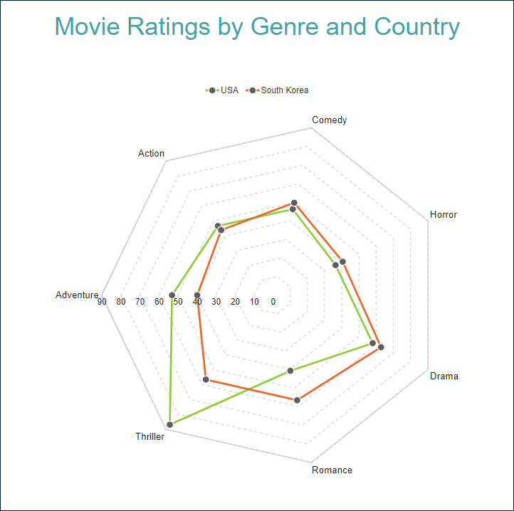
Radar Line Plot with Multiple Lines
A Multiple-Line Radar Plot is used to compare data series across a set of categories, with each line representing a distinct subgroup. This allows for a more granular analysis of variations between different data subsets.For example, the Radar Line Plot with Multiple Lines Demo visualizes average movie ratings across multiple genres, comparing ratings from different countries—in this case, USA and South Korea. Each line represents a country, making it easy to identify regional differences in audience preferences.
Clustered Area Plot
A Clustered Area Plot is used to break down Data Values into subcategories, providing a more detailed view of how different groups contribute to the overall trend. Each subcategory is represented as a separate layer, making it easier to compare multiple data series over time.For example, the Clustered Area Demo visualizes Net Sales over the course of a year, with sales data divided into separate areas for different product categories. This approach allows for direct comparison of individual trends while maintaining overall visibility.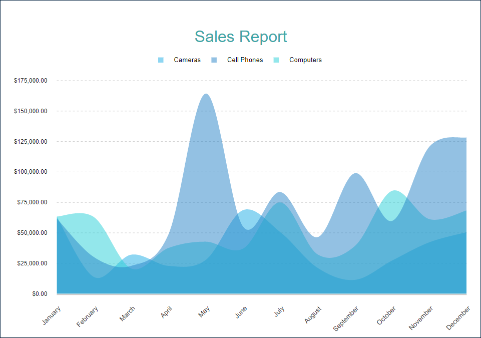
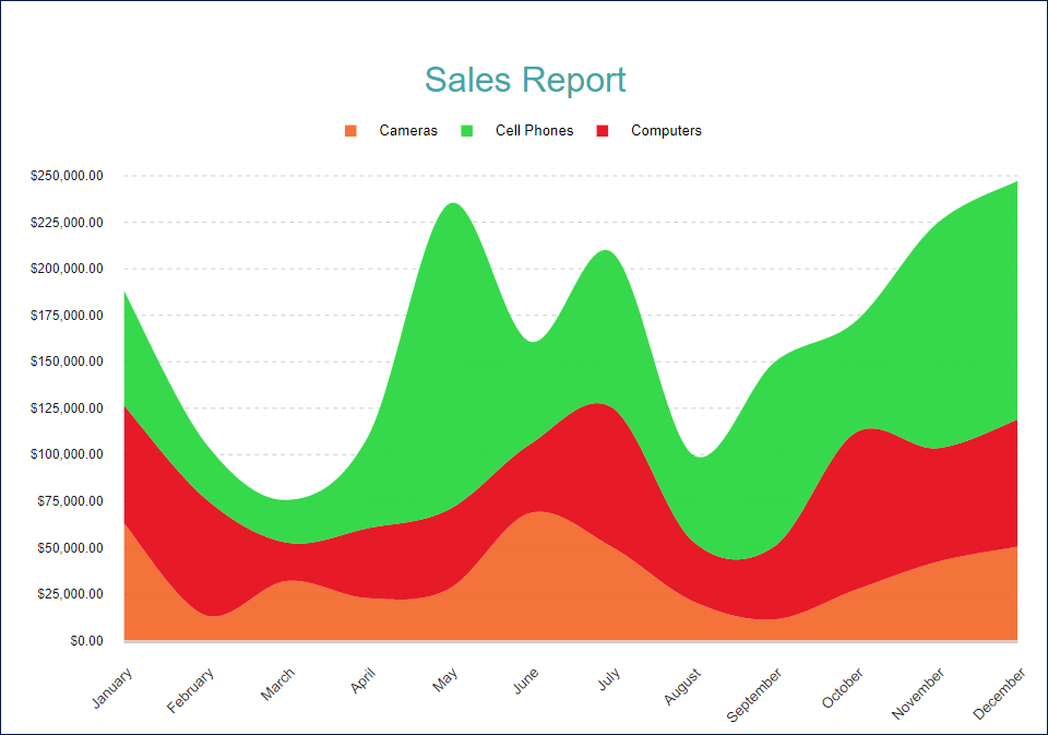
Stacked Area Plot
A Stacked Area Plot is used to break down Data Values into subcategories while emphasizing the cumulative total. Instead of displaying individual layers separately, each subcategory is placed on top of the previous one, creating a visually distinct representation of how different components contribute to the whole.For example, the Stacked Area Demo visualizes Net Sales changes over the course of a year, with sales data divided into stacked areas for different product categories. This format allows for easy comparison of category contributions while also revealing overall trends.
Percentage Stacked Area Plot
A Percentage Stacked Area Plot combines the Stacked Area Plot with a percentage-based axis scale. Instead of displaying absolute values, it represents each subcategory's relative contribution to the total at each point in time.
The y-axis is scaled to 100%, ensuring that variations in proportions are clearly visible, regardless of absolute value fluctuations.
Each stacked area represents a subcategory's share of the total at any given point.
For example, the Percentage Stacked Area Demo visualizes the percentage distribution of different product categories within Net Sales over time, making it easy to track changes in relative market share.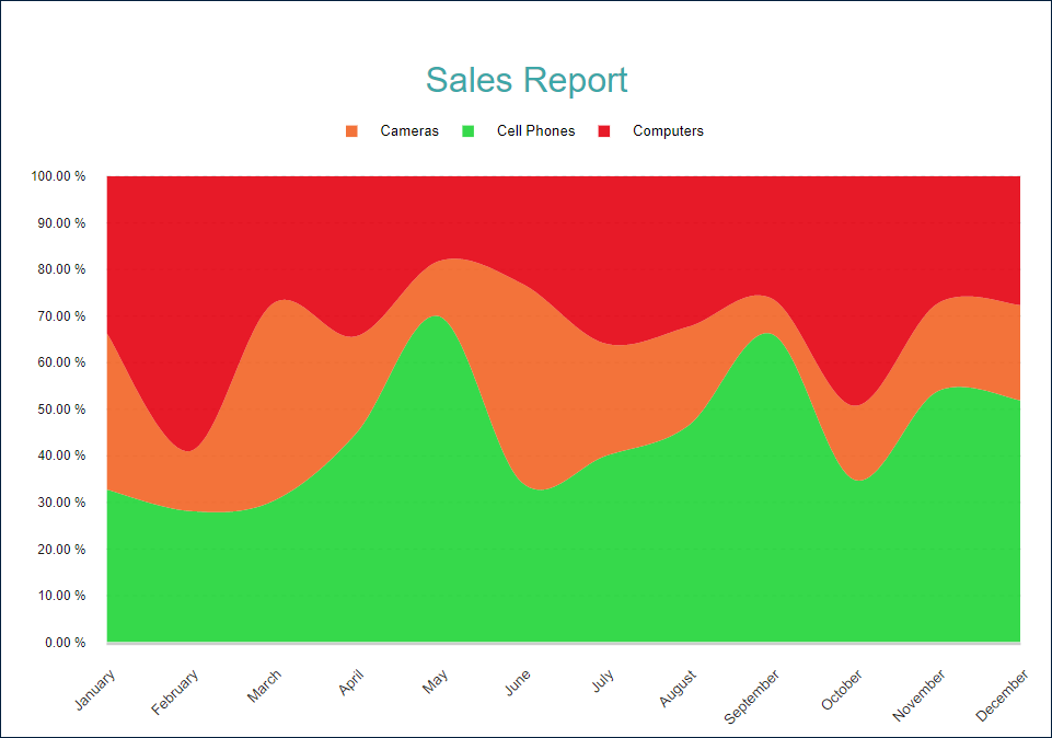
Range Area Plot
A Range Area Plot visualizes the range or difference between two sets of values across a continuous variable, such as time. It is particularly useful for displaying uncertainty, confidence intervals, or variations within a dataset.For example, the Range Area Demo illustrates sales forecast confidence intervals over the course of a year, showing the potential variation in projected sales.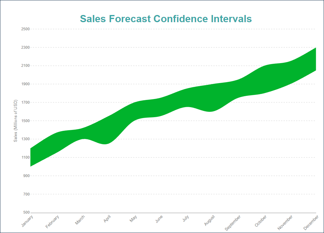
Range Area Plots can also display multiple ranges per category, such as comparing forecasts for different products within the same plot. However, stacking Range Area Plots is not recommended, as they do not represent part-to-whole relationships. Instead, they emphasize the variability between two data points within each category, making stacked visualizations less meaningful.
Single Value Radar Area Plot
A Single Value Radar Area Plot is used to visualize measurements of a single variable across multiple categories. The area enclosed by the plotted points represents the magnitude of the data values within the radial layout.For example, the Single Value Radar Area Demo illustrates the average movie budget across different genres, providing a clear visual comparison of how financial resources are distributed among them.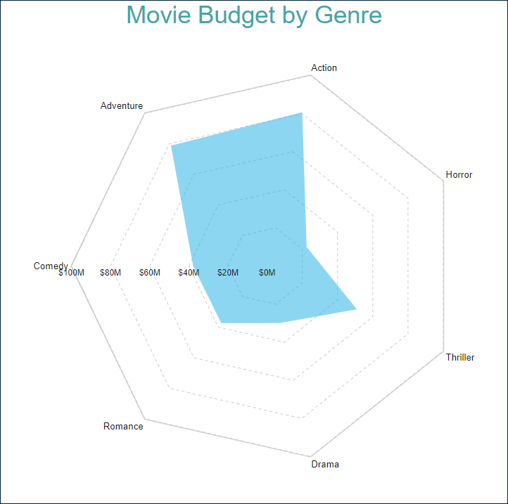
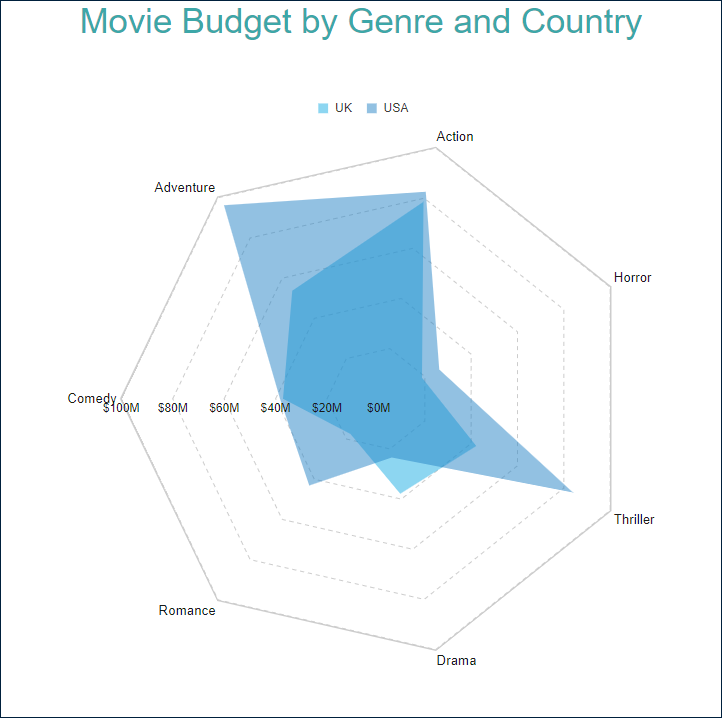
Radar Area Plot with Multiple Areas
A Multiple-Area Radar Plot enables the visualization of subcategories within a dataset, allowing for a more detailed comparison of multiple data series across the same set of categories. Each area represents a different subgroup, making it easier to analyze differences and trends.For example, the Radar Area Plot with Multiple Areas Demo visualizes the average movie budget across multiple genres, comparing data for different countries—in this case, UK and USA. The overlapping areas provide a clear view of how budget allocations vary between regions.
Explore and Configure Plot Properties
You can use the following demos to explore line plot properties. Open a link, toggle the Report explorer, select the Plot - Plot 1 node, and use the Properties panel to modify the configuration.
You can also download the report files below and open them in the Standalone Report Designer:
Next Steps
For more detailed information about Line Plots, refer to the following pages: