
- Getting Started
- Developer Guides
-
Report Author Guides
- Quick Start
- Report Designer Interface
- Report Viewer Interface
- Data Binding
- Report Configuration
- Report Themes
- Report Stylesheets
- Report Layers
- Report Parameters
- Interactive Reports
-
Report Items
- Common Properties
-
Data Regions
- Table
- Banded List
- List
- Tablix
-
Chart
- Plot
- Axes
- Legend
- Overlays
- Sparkline
- Bullet Chart
- Data Visualizers
- Supplemental report items
- Expressions
- Report Parts
- Master Reports
- Tutorials
Creating Line and Area Plots (Standard & Radar)
Introduction
Before creating and configuring Line, Area, Radar Line, or Radar Area Plots, make sure you have added a chart to your report.. For instructions on adding a chart and launching the Chart Wizard, see Adding a Chart. Once the Chart Wizard is open, select the Line, Area, Range Area, Radar Line, or Radar Area Plot type, choose the dataset to visualize, and proceed to the next page.
Plot Settings
The Settings page of the Chart Wizard for Line, Area, Radar Line, and Radar Area Plots structured as shown below:
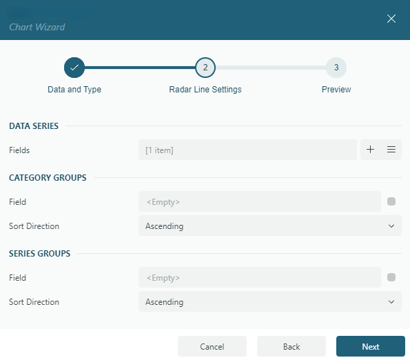
It is divided into three sections:
Data Series
The Fields collection defines the Data Values you want to visualize. These values determine the following visual properties:
the vertical positions of symbols that form a Line Plot.
the vertical positions of the filled area boundary in an Area Plot.
the radial positions of symbols along radial lines extending from the center in a Radar Line Plot.
the radial positions of the filled area boundary in a Radar Area Plot.
Typically, each value is an aggregate expression, such as {Sum(SalesAmount)}. Adding multiple Data Values creates a Multiple Line Plot, as demonstrated in the Multiple Line Plot Demo. To enhance clarity, you can set the Legend Mode property of the Color Legend to Data Values. This option ensures that line colors and area fill colors correspond to their respective data values in the legend. Additionally, you can customize the displayed names using the Caption property for each data value item. For Range Area Plots, data values are defined as pairs of Lower and Upper bounds, specifying the range for each category. A single pre-filled value pair is provided by default, and you can add more pairs if needed. Each pair determines the starting and ending positions of the plot elements. This configuration is useful for visualizing ranges, such as temperature fluctuations or revenue intervals, across categories.
Category Groups
Field: Choose the field, or specify an expression used to group the data into categories. For example, categories could represent months, regions, or product types. Data values are displayed for each distinct category.
Sort Direction: Specify whether categories are sorted in
AscendingorDescendingorder.
Series Groups
Field: Select the field, or specify an expression, that defines subgroups, such as different product types or sales channels, for each category.
Sort Direction: Specify whether series groups are sorted in Ascending or Descending order.
Example: A Multiple Line Plot groups data into separate lines based on a selected field. For example, a sales report may display separate lines for Online Sales and Store Sales over time. You can see a detailed example in the Multiple Line Plot Demo.
Once you have configured the Data Values, Category Groups, and Series Groups, click Next to proceed to the Preview and Final Adjustments page to complete the chart creation.