ComboBox Elements
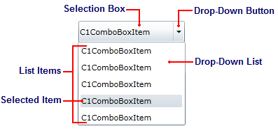
The ComboBox control is a flexible control used to display data in a drop-down list. It is essentially the combination of two controls: a text box that allows users to enter a selection, and a list box that allows users to select from a series of list options. The following image diagrams the C1ComboBox control.

See below for a description of each C1ComboBox element.
Selection Box
The selection box serves two purposes: it allows users to enter the list item they're searching for directly into the text box, and it displays the currently selected item. The content of this box is equal to the content of the C1ComboBox control's selected index item.Drop-Down Button
The drop-down button reveals the drop-down list when clicked.Drop-Down List
The drop-down list consists of a series of list items; it can contain as few or as many list items as you need. If the number of items exceeds the size of the drop-down list, a scrollbar will automatically appear.List Items
Each list item in a drop-down list is represented by the C1ComboBoxItem class. List items can contain text, pictures, and even controls.Selected Item
The selected item in a list can be fixed by the developer or chosen by a user at run-time. The value of a selected list item's IsSelected property is True


