Styling and Appearance
FlexGrid provides built-in visual styles as well as various design time and run time options so that you can style the grid and its elements as per the needs and appearance of your application. The grid also provides style editors to let you customize appearance of your grid without writing a single line of code. For more information about these editors and design time styling, see Editors.
This section discusses the built-in options provided by FlexGrid as well as various other ways to customize the appearance of grid and its elements.
| Topic | Snapshot | Content |
|---|---|---|
| Built-in Options | 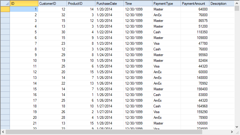 |
Discusses about the available visual styles and built-in collection of styles. |
| Custom Styles | 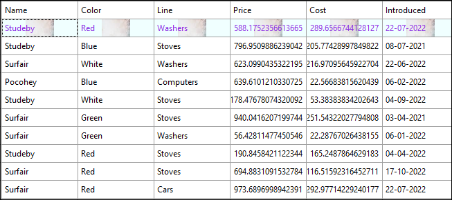 |
Discusses how to create and apply the custom styles. |
| Customize Grid | 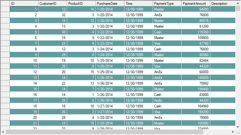 |
Discusses about customization at grid level. |
| Customize Border | 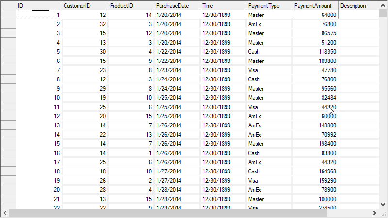 |
Discusses about customization of cell borders at row, column or grid level. |
| Customize Text | 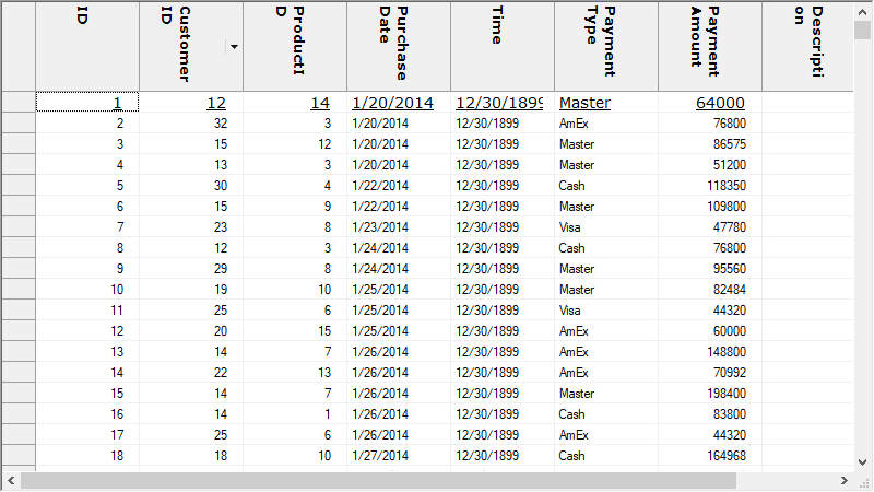 |
Discusses about various aspects of styling the grid text. |
| Custom Glyphs | 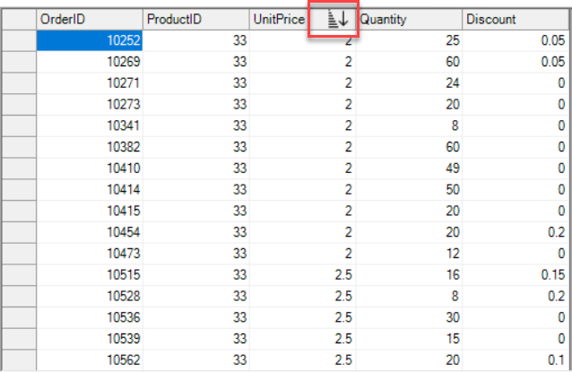 |
Discusses about applying custom glyphs in the grid. |
| Hover Style | 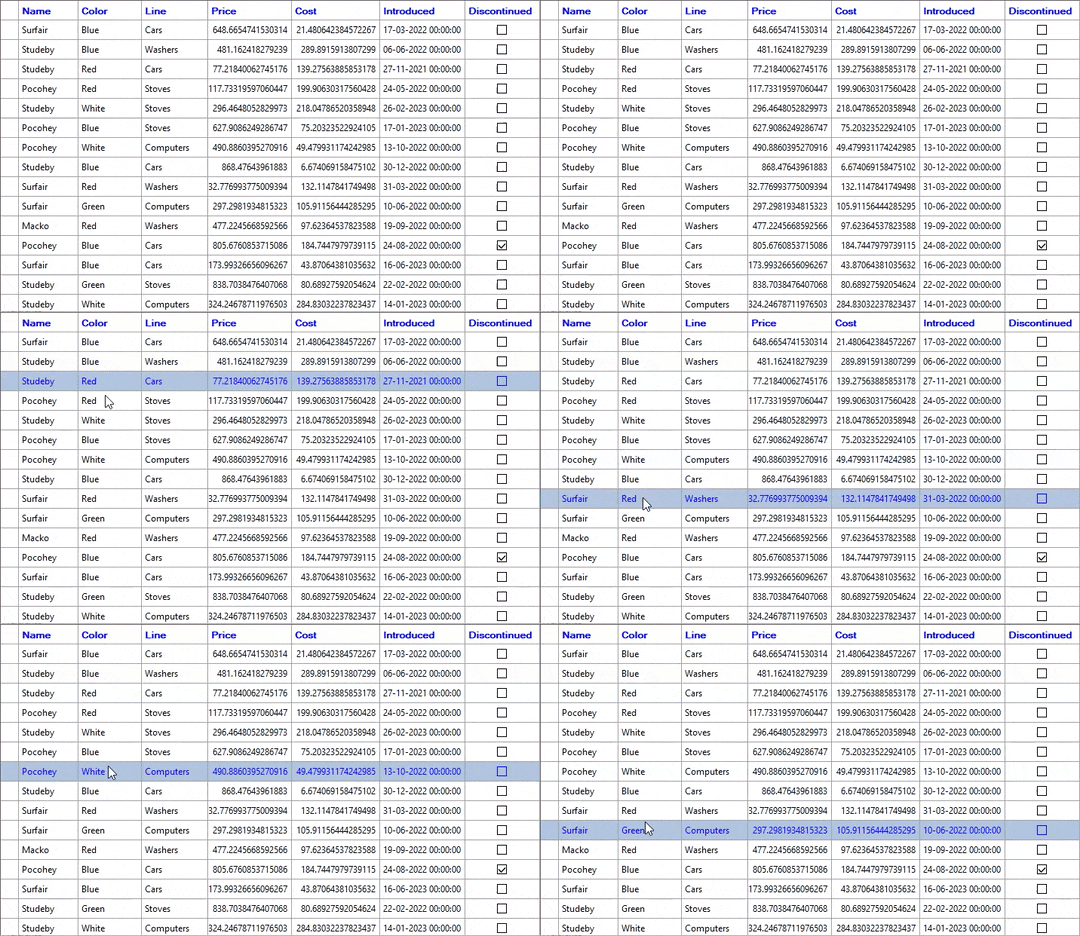 |
Discusses about the styles applied over cells on mouse hover. |


