
Custom Styles
Approach 1: Style an Object
To style a specific row, column or a cell range of the WinForms FlexGrid, you can use StyleNew property of the row, column or cell range object.
// Apply custom style to a specific row
c1FlexGrid1.Rows[1].StyleNew.BackColor = Color.Azure;
c1FlexGrid1.Rows[1].StyleNew.ForeColor = Color.BlueViolet;
' Apply custom style to a specific row
c1FlexGrid1.Rows(1).StyleNew.BackColor = Color.Azure
c1FlexGrid1.Rows(1).StyleNew.ForeColor = Color.BlueViolet This approach is useful for styling a particular object when style is not expected to be reused. To reuse a particular style, you must create a style using the CellStyle object as discussed in the section below.
Approach 2: Create Re-usable Style
In this approach, you can create a custom style as an object of CellStyle class and add it to the Styles collection using the Add method. Then, define its properties and apply it to a row, column or cell range whenever required. As mentioned above, this approach is very useful when you need to repeatedly use a particular style.
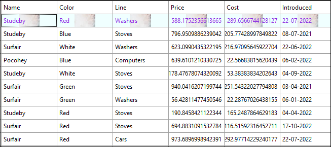
The following image showcases custom styling applied to the first row in FlexGrid.
Use the following code to apply styling to the first row in FlexGrid by creating a reusable custom style. In this example, we create a new custom style and add it to the Styles collection after defining the BackColor, ForeColor, BackgroundImage, and BackgroundImageLayout properties to be set through the new custom style.
// Create new style and add it to the styles collection
CellStyle cs = this.c1FlexGrid1.Styles.Add("Custom");
// Define properties of the new custom style
cs.BackColor = Color.Azure;
cs.ForeColor = Color.BlueViolet;
//set background image in scale layout
cs.BackgroundImage = Image.FromFile("image.png");
cs.BackgroundImageLayout = ImageAlignEnum.Scale;
// Apply custom style to row
c1FlexGrid1.Rows[1].Style = cs;
' Create new style and add it to the styles collection
Dim cs As CellStyle = Me.c1FlexGrid1.Styles.Add("Custom")
' Define properties of the new custom style
cs.BackColor = Color.Azure
cs.ForeColor = Color.BlueViolet
' set background image in scale layout
cs.BackgroundImage = Image.FromFile("image.png")
cs.BackgroundImageLayout = ImageAlignEnum.Scale
' Apply custom style to row
c1FlexGrid1.Rows(1).Style = cs See Also
Blog
Creating Custom Styles for FlexGrid