Customize Tree Grid
FlexGrid allows you to customize Tree Grid by styling as well as by using various elements like checkboxes to expand/collapse nodes or images as node icons. A customized Tree Grid can make the outline tree nodes look more distinctive and structured making it visually appealing and more understandable.
Style Tree Grid
Styling a Tree Grid is similar to styling the FlexGrid control. The Tree property returns a reference to a GridTree object that exposes several methods and properties used to customize the Tree Grid. Following is the list of some commonly used properties.
Column: Gets or sets the index of the column that contains the outline tree. Setting this property to -1 causes the outline tree to be hidden from the users.
Indent: Gets or sets the indent, in pixels, between adjacent node levels. Higher indent levels cause the tree to become wider.
Style: Gets or sets the type of outline tree to display. Use this property to determine whether the tree should include a button bar at the top to allow users to collapse/expand the entire tree, whether lines and/or symbols should be displayed, and whether lines should be displayed connecting the tree to data rows as well as node rows.
LineColor: Gets or sets the color of the connecting lines.
LineStyle: Gets or sets the style of the connecting lines.
For more information on styling the tree grid, see Styling and Appearance topic in FlexGrid documentation.
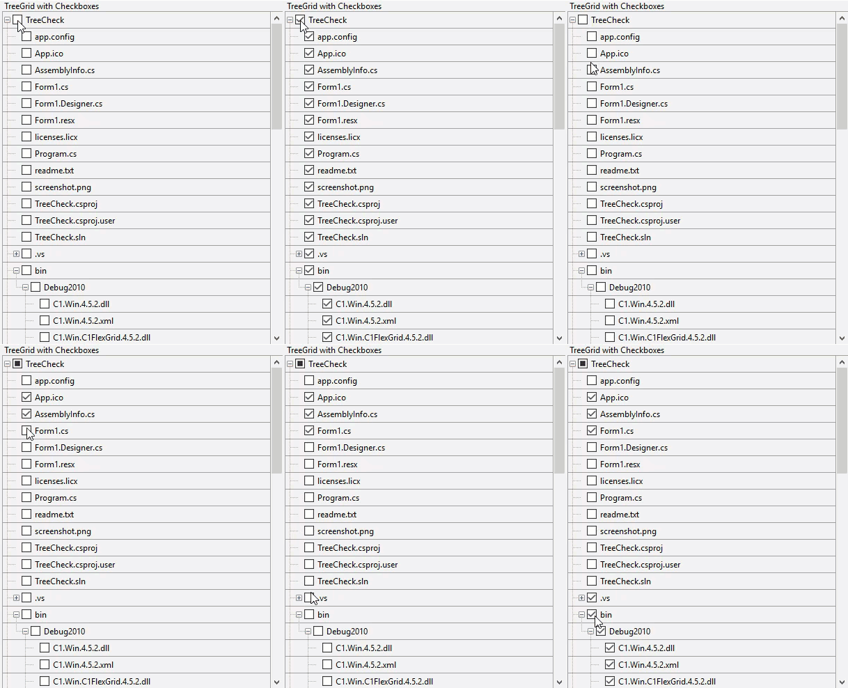
Display Tree with CheckBoxes
To create a custom Tree Grid with checkbox and images, you need to first initialize FlexGrid for creating Tree Grid and then add nodes to the tree by using AddNode method of the RowCollection class.
Now, to implement checkboxes in Tree Grid, you need to maintain the checkboxes in parent and child nodes. This method uses Checked property of the Node class which defines whether to show a checkbox for the node or not.

The code below shows how to display checkboxes on tree nodes of the WinForms Tree Grid.
void c1FlexGrid1_CellChecked(object sender, C1.Win.C1FlexGrid.RowColEventArgs e)
 {
   // Apply check value to all children
   var node = this.c1FlexGrid1.Rows[e.Row].Node;
   UpdateCheckChildren(node);
  // Apply check value to parents
   UpdateCheckParent(node);
 }
void UpdateCheckChildren(C1.Win.C1FlexGrid.Node node)
 {
    var checkState = node.Checked;
    foreach (C1.Win.C1FlexGrid.Node child in node.Nodes)
   {
     child.Checked = checkState;
     UpdateCheckChildren(child);
    }
 }
void UpdateCheckParent(C1.Win.C1FlexGrid.Node node)
{
   // Gets this node's parent
   var parent = node.Parent;
   if (parent != null)
   {
     // Counts checked/unchecked children
     int cntChecked = 0;
     int cntUnchecked = 0;
     int cntGrayed = 0;
     foreach (C1.Win.C1FlexGrid.Node child in parent.Nodes)
    {
      switch (child.Checked)
      {
        case C1.Win.C1FlexGrid.CheckEnum.Checked:
             cntChecked++;
             break;
        case C1.Win.C1FlexGrid.CheckEnum.Unchecked:
             cntUnchecked++;
             break;
        case C1.Win.C1FlexGrid.CheckEnum.Grayed:
             cntGrayed++;
             break;
       }
     }
    // Updates parent's check state
     if (cntGrayed > 0 || (cntChecked > 0 && cntUnchecked > 0))
     {
       parent.Checked = C1.Win.C1FlexGrid.CheckEnum.Grayed;
     }
     else if (cntChecked > 0 && cntUnchecked == 0)
     {
       parent.Checked = C1.Win.C1FlexGrid.CheckEnum.Checked;
     }
     else if (cntUnchecked > 0 && cntChecked == 0)
     {
       parent.Checked = C1.Win.C1FlexGrid.CheckEnum.Unchecked;
     }
     // Updates grandparent as well
       UpdateCheckParent(parent);
     }
 }
Private Sub c1FlexGrid1_CellChecked(ByVal sender As Object, ByVal e As C1.Win.C1FlexGrid.RowColEventArgs)
' Apply check value to all children
Dim node = Me.c1FlexGrid1.Rows(e.Row).Node
UpdateCheckChildren(node)
' Apply check value to parents
UpdateCheckParent(node)
End Sub
Private Sub UpdateCheckChildren(ByVal node As C1.Win.C1FlexGrid.Node)
Dim checkState = node.Checked
For Each child As C1.Win.C1FlexGrid.Node In node.Nodes
child.Checked = checkState
Me.UpdateCheckChildren(child)
Next
End Sub
Private Sub UpdateCheckParent(ByVal node As C1.Win.C1FlexGrid.Node)
' Gets this node's parent
Dim parent = node.Parent
If parent IsNot Nothing Then
' Counts checked/unchecked children
Dim cntChecked As Integer = 0
Dim cntUnchecked As Integer = 0
Dim cntGrayed As Integer = 0
For Each child As C1.Win.C1FlexGrid.Node In parent.Nodes
Select Case child.Checked
Case C1.Win.C1FlexGrid.CheckEnum.Checked
cntChecked += 1
Case C1.Win.C1FlexGrid.CheckEnum.Unchecked
cntUnchecked += 1
Case C1.Win.C1FlexGrid.CheckEnum.Grayed
cntGrayed += 1
End Select
Next
' Updates parent's check state
If cntGrayed > 0 OrElse cntChecked > 0 AndAlso cntUnchecked > 0 Then
parent.Checked = C1.Win.C1FlexGrid.CheckEnum.Grayed
ElseIf cntChecked > 0 AndAlso cntUnchecked = 0 Then
parent.Checked = C1.Win.C1FlexGrid.CheckEnum.Checked
ElseIf cntUnchecked > 0 AndAlso cntChecked = 0 Then
parent.Checked = C1.Win.C1FlexGrid.CheckEnum.Unchecked
End If
' Updates grandparent as well
UpdateCheckParent(parent)
End If
End Sub Display Tree with Images
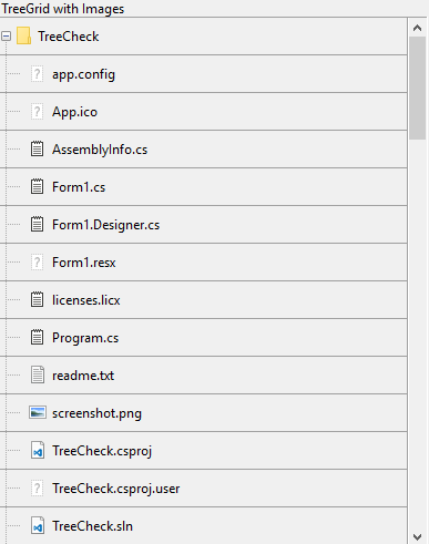
To add the images as your Tree Grid node icons, you can use the AddImageFolder method for creating nodes related to files and assigning images to the nodes.

Use the code below to display images or icons along with nodes of the WinForms Tree Grid.
void AddImageFolder(string path, int level)
{
 int cnt = 0;
 try
 {
   //Loops through all files in the directory
   foreach (string file in Directory.GetFiles(path))
   {
    //Creates node for each file and adds it to FlexGrid
    var node = c1FlexGrid2.Rows.AddNode(level);
    //sets data for the node created
    node.Data = Path.GetFileName(file);
    //Code for assigning image to the node
    ShowImage(node, file);
    //show only 20 files (at max) from each directory
    cnt++;
    if (cnt > 20) break;
    }
  }
    catch { }
    try
    {
      //Loops through all sub-directories for the path
      foreach (string subPath in Directory.GetDirectories(path))
      {
       //Creates node for each file and adds it to FlexGrid
       var node = c1FlexGrid2.Rows.AddNode(level);
       //Sets data for the node created
       node.Data = Path.GetFileName(subPath);
       //Code for assigning image to the node
       ShowImage(node, subPath);
       //Traverse any sub-directory/files for the current directory
       AddImageFolder(subPath, level + 1);
       //Show only 20 files (at max) from each directory
       cnt++;
       if (cnt > 20) break;
       }
     }
      catch { }
}
Private Sub AddImageFolder(ByVal path As String, ByVal level As Integer)
Dim cnt As Integer = 0
Try
'Loops through all files in the directory
For Each file As String In Directory.GetFiles(path)
'Creates node for each file and adds it to FlexGrid
Dim node = c1FlexGrid2.Rows.AddNode(level)
'sets data for the node created
node.Data = Path.GetFileName(file)
'Code for assigning image to the node
ShowImage(node, file)
'show only 20 files (at max) from each directory
cnt += 1
If cnt > 20 Then Exit For
Next
Catch
End Try
Try
'Loops through all sub-directories for the path
For Each subPath As String In Directory.GetDirectories(path)
'Creates node for each file and adds it to FlexGrid
Dim node = c1FlexGrid2.Rows.AddNode(level)
'Sets data for the node created
node.Data = Path.GetFileName(subPath)
'Code for assigning image to the node
ShowImage(node, subPath)
'Traverse any sub-directory/files for the current directory
AddImageFolder(subPath, level + 1)
'Show only 20 files (at max) from each directory
cnt += 1
If cnt > 20 Then Exit For
Next
Catch
End Try
End Sub The above code uses a custom method called ShowImage to set the image for nodes based on its file extensions.
public void ShowImage(C1.Win.C1FlexGrid.Node node , string path)
 {
      //Gets file extension from the path
     string extension = Path.GetExtension(path);
     //If path belongs to a file
      if (extension != "")
      {
        //Sets Image for node based on the file extension
        switch (extension)
        {
          case ".txt":
               node.Image = Properties.Resources.Txt;
               break;
         case ".resx":
               node.Image = Properties.Resources.Txt;
               break;
          case ".licx":
               node.Image = Properties.Resources.Txt;
               break;
          case ".cs":
               node.Image = Properties.Resources.Txt;
               break;
          case ".vb":
               node.Image = Properties.Resources.Txt;
               break;
          case ".exe":
               node.Image = Properties.Resources.Exe;
               break;
          case ".dll":
               node.Image = Properties.Resources.Dll;
               break;
          case ".sln":
               node.Image = Properties.Resources.VS;
               break;
          case ".csproj":
               node.Image = Properties.Resources.VS;
               break;
          case ".bmp":
               node.Image = Properties.Resources.Img;
               break;
          case ".png":
               node.Image = Properties.Resources.Img;
               break;
          case ".gif":
               node.Image = Properties.Resources.Video;
               break;
          case ".accdb":
               node.Image = Properties.Resources.Access;
               break;
          default:
               node.Image = Properties.Resources.Unknown;
               break;
          }
        }
        //Else path belongs to a directory/folder
        else
        {
           node.Image = Properties.Resources.Folder;
        }
 }
Public Sub ShowImage(ByVal node As C1.Win.C1FlexGrid.Node, ByVal path As String)
'Gets file extension from the path
Dim extension As String = Path.GetExtension(path)
'If path belongs to a file
If Not Equals(extension, "") Then
'Sets Image for node based on the file extension
Select Case extension
Case ".txt"
node.Image = Properties.Resources.Txt
Case ".resx"
node.Image = Properties.Resources.Txt
Case ".licx"
node.Image = Properties.Resources.Txt
Case ".cs"
node.Image = Properties.Resources.Txt
Case ".vb"
node.Image = Properties.Resources.Txt
Case ".exe"
node.Image = Properties.Resources.Exe
Case ".dll"
node.Image = Properties.Resources.Dll
Case ".sln"
node.Image = Properties.Resources.VS
Case ".csproj"
node.Image = Properties.Resources.VS
Case ".bmp"
node.Image = Properties.Resources.Img
Case ".png"
node.Image = Properties.Resources.Img
Case ".gif"
node.Image = Properties.Resources.Video
Case ".accdb"
node.Image = Properties.Resources.Access
Case Else
node.Image = Properties.Resources.Unknown
'Else path belongs to a directory/folder
End Select
Else
node.Image = Properties.Resources.Folder
End If
End Sub Similarly, you can show image and checkbox together for the tree nodes of the TreeGrid by setting both the Checked and Image properties of the Node Class.
See Also
Documentation
Blog


