
- SpreadJS Overview
- Getting Started
- JavaScript Frameworks
- Best Practices
-
Features
- Workbook
- Worksheet
- Rows and Columns
- Headers
- Cells
- Data Binding
- Data Manager
- TableSheet
-
GanttSheet
- Create GanttSheet
- Data Manager
- Add Hierarchy Types
- Gantt Chart Components
- Task Properties
- CRUD Operations
- Task Operations
- Non-Working Time
- Table Themes
- Taskbar Styles
- Task Layout
- Gridlines
- Zoom
- Scroll
- Timescale Range and Auto Fit
- Splitter Handle
- Context Menu
- Sort
- Calendar Settings
- GanttSheet IO
- Resource and Assignment
- ReportSheet
- Data Charts
- JSON Schema with SpreadJS
- SpreadJS File Format
- Data Validation
- Conditional Formatting
- Sort
- Group
- Formulas
- What-If Analysis
- Serialization
- Keyboard Actions
- Shapes
- Floating Objects
- Barcodes
- Charts
- Sparklines
- Tables
- Pivot Table
- Slicer
- Theme
- User Management
- Culture
- AI Assistant
- SpreadJS Designer
- SpreadJS Designer VSCode Plugin
- Tutorials
- SpreadJS Designer Component
- SpreadJS Collaboration Server
- Touch Support
- Formula Reference
- Import and Export Reference
- Events
- API Documentation
- Release Notes
Table Themes
GanttSheet supports applying a GC.Spread.Sheets.Tables.TableTheme to control the base appearance of the sheet.
When a theme is applied using applyTableTheme, GanttSheet consumes the theme styles and distributes them across different UI regions.
Theme styles act as base styles. Any explicit GanttSheet configuration (such as TaskBar style rules or Non‑Working Time settings) overrides the applied theme.
Theme Application Scope
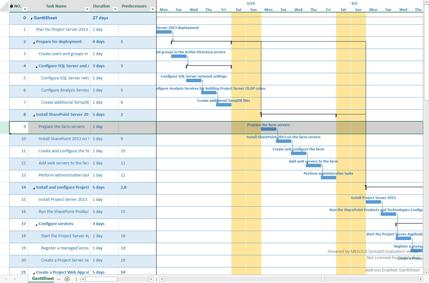
A GanttSheet consists of three visual regions:
Table area (task list)
TimeScale (timeline header)
Gantt chart area (timeline body and task bars)
Each region consumes a different subset of the TableTheme.
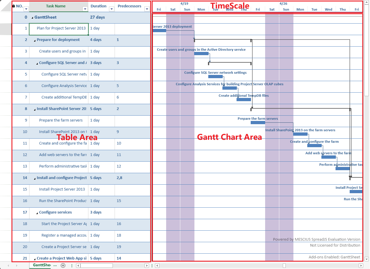
The following sections describe how each region applies the theme.
Table Area
The table area consumes the full set of TableTheme styles.
The following styles are applied:
wholeTableStyleheaderRowStylefirstRowStripStylesecondRowStripStyleBorders
Font and text color
Alternating row styles
Alternating row styles defined in the theme are supported in GanttSheet.
Task Hierarchy Rendering
Font settings from the theme are combined with built‑in hierarchy rules to visually distinguish task types.
Task Type | Font Weight | Font Size |
|---|---|---|
Project Summary | Bold | 12pt |
Summary Task | Bold | 11pt |
Normal Task | Normal | 11pt |
The theme provides:
Font family
Base font color
GanttSheet applies predefined size and weight adjustments to emphasize hierarchy.
This ensures:
Project Summary tasks are most prominent
Summary tasks are visually distinguished
Normal tasks remain neutral
TimeScale
The TimeScale is the header region of the timeline.
Its visual style aligns with the column headers in the table area.
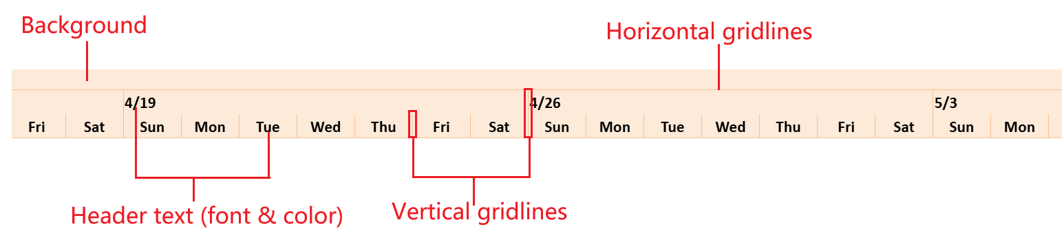
The TimeScale consumes header‑related styles from the theme:
Background color
Header text font
Header text color
Horizontal gridline color
Vertical gridline color
Only border colors are used for rendering gridlines.
Note:
Gridline drawing depends on the GanttSheet gridline configuration.
If no gridline style is defined, no line is rendered even if a theme is applied.
Gantt Chart Area
The Gantt chart area includes:
Timeline background
Gridlines
Taskbars
Link lines
Non‑working time background
Only elements that have corresponding definitions in TableTheme can consume theme styles.
Elements Styled by TableTheme
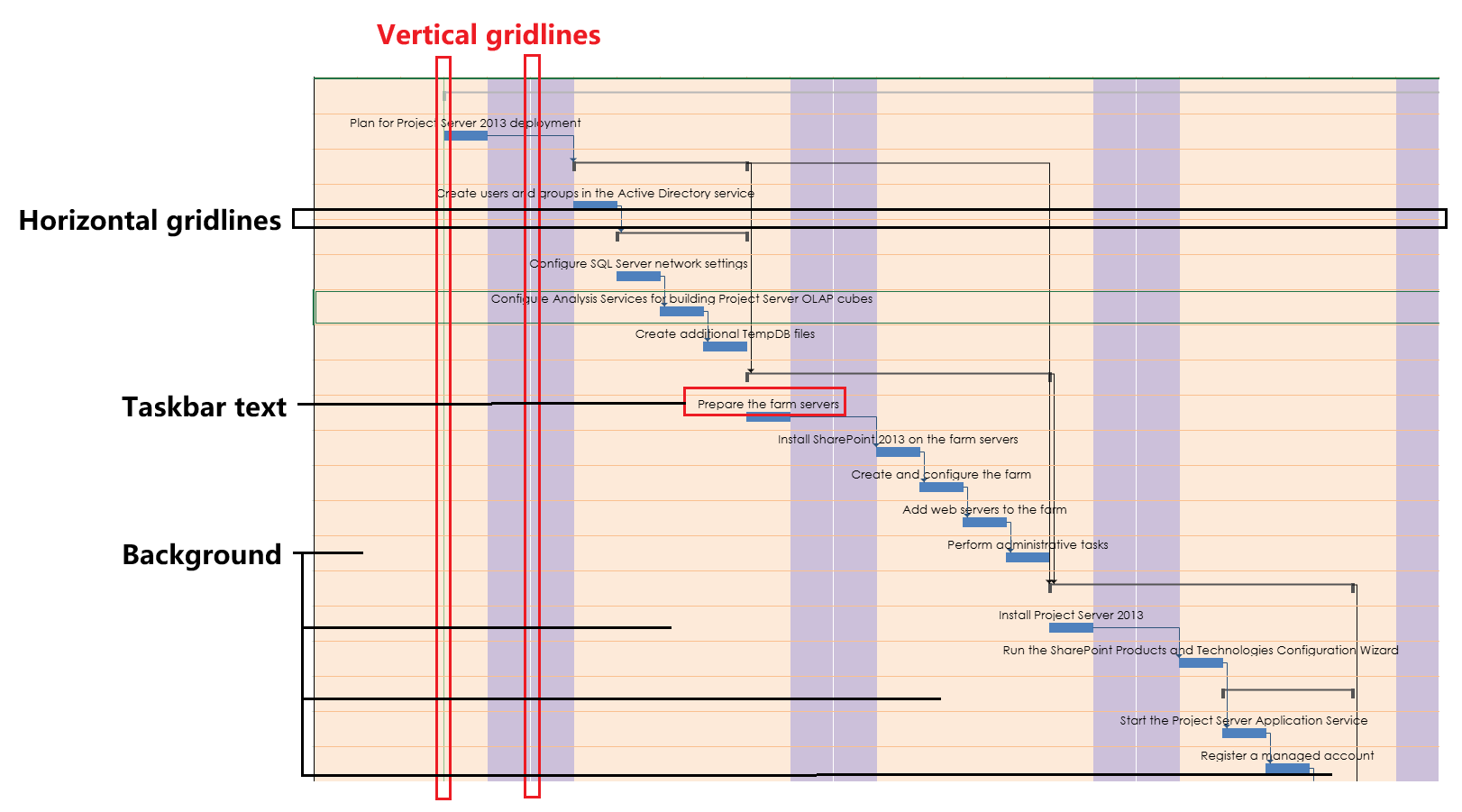
The following elements consume theme styles:
Background color
Horizontal gridline color
Vertical gridline color
Taskbar text font
Taskbar text color
Taskbar text styles are composed with task style rules.
If both define text styles, task style rules take precedence.
Gridline rendering follows these rules:
If a gridline defines a specific color, that color is used.
If a gridline defines a line style but no color, the corresponding theme border color is used.
If no line style is defined, the gridline is not rendered.
Elements Not Controlled by TableTheme
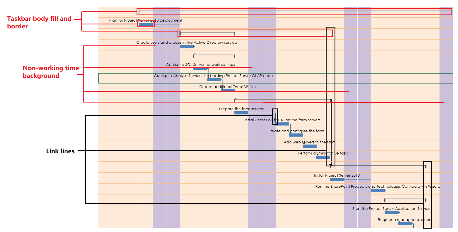
The following elements are not affected by TableTheme:
Taskbar body fill and border
Taskbar link lines
Non‑working time background
Special styling for the last column
Use the corresponding GanttSheet APIs to customize these elements.
Style Precedence
When multiple styling mechanisms are used, the effective priority is:
TaskBar styleRule / Component-level settings
    > GanttSheet-specific APIs
        > TableTheme
The applied TableTheme provides the base layer only.
Examples
Applying a Theme
ganttSheet.applyTableTheme(
    GC.Spread.Sheets.Tables.TableThemes.medium2
);
Applying a TableTheme updates the base appearance of:
The table area
The TimeScale
The Gantt chart background and gridlines
Taskbar text
Apply a Theme and Enable Gridlines
Gridline colors can be derived from the applied theme.
// Apply a theme
ganttSheet.applyTableTheme(
    GC.Spread.Sheets.Tables.TableThemes.medium3
);

// Enable horizontal and vertical gridlines
ganttSheet.options.gridline = {
    horizontal: { lineStyle: 1 },
    vertical: { lineStyle: 1 }
};
If a gridline defines a line style but does not explicitly specify a color, the color is taken from the applied TableTheme.
Get the Current Theme
var theme = ganttSheet.getTableTheme();Use this method to retrieve the currently applied TableTheme instance.
Override Theme Styles
Theme styles act as the base layer.
Component-level configuration overrides the applied theme.
// Apply a built-in table theme
ganttSheet.applyTableTheme(
    GC.Spread.Sheets.Tables.TableThemes.light2
);

// Override taskbar appearance (higher priority than TableTheme)
var rule = ganttSheet.project.taskStyleRules.getRule('task');

rule.style.taskbarStyle.middleColor = 'Accent 1';
rule.style.taskbarStyle.topText = 'name';

var index = ganttSheet.project.taskStyleRules.getIndexByItem(rule);
ganttSheet.project.taskStyleRules.setItemAt(index, rule);
Task style rules take precedence over TableTheme styles.