Collection Editors
Collection Editors are used to add, remove or edit items in a collection at design-time. A Collection Editor can be launched by selecting the Ribbon element on the Form and then clicking the ellipsis next to Items, MenuItems, LeftPaneItems, RightPaneItems, BottomPaneItems or LeftBottomPaneItems properties in their respective Properties window.
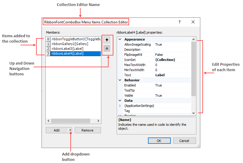
The text label at the top of the Collection Editor Dialog Box displays the name of Collection Editor. The Collection Editor dialog box usually comprises two sections: left and right sections. The Left part of the Collection Editor contains the Add and Remove button that can be used to add and remove items. The added items gets displayed in the Members section of the Collection Editor. You can click on each item added in the Members sections to view the respective item properties on the right pane. The Up and Down arrow buttons are used to navigate up and down the Members.
The image below depicts the RibbonFontComboBox Menu Items Collection Editor.

Types of Collection Editors
Collection editors are grouped into three major types: Items Collection Editors, Menu Items Collection Editors and PaneItems Collection Editors.
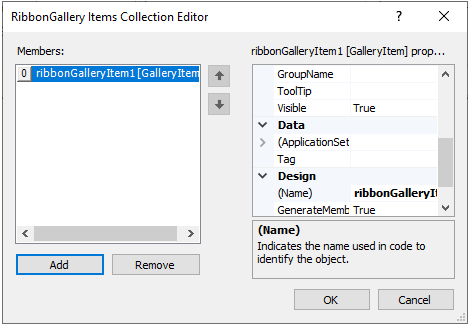
Items Collection Editors: It is used to add items to a particular Ribbon element. The image below depicts an example of the Items Collection Editor.

Let's say a user wants to add and customize item(s) in the Gallery using RibbonGallery Items Collection Editor. Follow these steps to add items to the Items collection editor:
- Click the RibbonGallery element on the Form at design time to activate it.
- In the Properties window, click on the ellipsis next to the Items property. The RibbonGallery Items Collection Editor appears.
- Click the Add button to add gallery item(s) to the Gallery. Click the OK button.
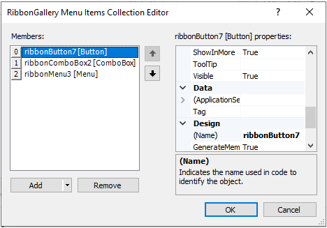
Menu Items Collection Editors: It is used to add menu items to the dropdown portion of a Ribbon Element. For example, menu items can be added to Gallery using the RibbonGallery MenuItems Collection Editor. The image below depicts an example for Menu Items Collection Editor.

Let's say a user wants to add and customize menu item(s) in the Gallery using RibbonGallery MenuItems Collection Editor. Follow the steps below to add items to the collection editor:
- Click the RibbonGallery element on the Form at design time to activate it.
- In the Properties window, click on the ellipsis next to the MenuItems property. The RibbonGallery MenuItems Collection Editor appears.
- Click the Add drop-down button to add menu items to the Gallery.
PaneItems Collection Editors: Certain Ribbon Elements contain left, right, bottom or left bottom panes. Few examples are Application Menu, Backstage View and StatusBar. Items can also be added to panes at design time using PaneItems Collection Editors.
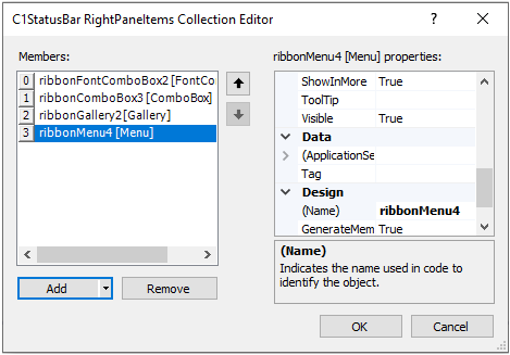
The Application Menu contains Left Pane, Right Pane and Bottom Pane, while the Backstage View tab contains Left Bottom Pane and Left Pane. Likewise, the C1StatusBar contains Left Pane and Right Pane. The image below depicts an example for PaneItems Collection Editor.
Let's say a user wants to add and customize item(s) in the right pane of the StatusBar using C1StatusBar RightPaneItems Collection Editor. Follow these steps to add items to the collection editor:- Select the C1StatusBar on the Form at design time.
- In the Properties window, click on the ellipsis next to the RightPaneItems. The RibbonGallery MenuItems Collection Editor appears.
- Click the Add drop-down button to add items to the Right Pane of the C1StatusBar.
Refer the table below to get an in-depth idea about the Collection Editors associated with different elements in the C1Ribbon control.
| Elements | Collection Editors | Collection Editor Types |
|---|---|---|
| C1Ribbon | | C1Ribbon has 13 types of Collection Editors:
|
| Application Menu | | Application Menu has 3 types of Collection Editors:
|
| Backstage View | | BackStage View has 2 types of Collection Editors:
|
| Configuration Toolbar | | RibbonConfigToolBar Items Collection Editor |
| Contextual Tab Group | | RibbonTab Collection Editor |
| Quick Access Toolbar | | The QAT has 2 types of Collection Editors:
|
| Ribbon Group | | RibbonGroup Items Collection Editor |
| Ribbon Tab | | RibbonGroup Collection Editor |
| StatusBar | | StatusBar has 2 types of Collection Editors:
|
| Button | | |
| CheckBox | | |
| ColorPicker | | |
| ComboBox | | ComboBox has 2 types of Collection Editors:
|
| ControlHost | | |
| Date Picker | | |
| Font ComboBox | | RibbonFontComboBox Menu Items Collection Editor |
| Gallery | | Gallery has 2 types of Collection Editors:
|
| Label | | |
| Menu | | RibbonMenu Items Collection Editor |
| NumericBox | | |
| ProgressBar | | |
| Separator | | |
| SplitButton | | RibbonSplitButton Items Collection Editor |
| TextBox | | |
| Time Picker | | |
| Toggle Button | | |
| ToolBar | | RibbonToolBar Items Collection Editor |
| TrackBar | |


