- Ribbon Overview
- Key Features
- Using ComponentOne Templates
- Quick Start
- Elements
- Design-Time Support
- Work with Ribbon
- Run-Time Interaction
- Apply Localization
- Appearance
- C1Ribbon Sample
Color Picker
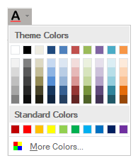
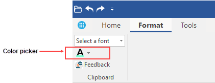
A color picker is a button which when clicked displays a drop-down color palette. The user can select a specific color from the preset palette by clicking the color picker's drop-down arrow.

Adding ColorPicker at Design-Time
The Ribbon ColorPicker can be added at design-time using the Ribbon Group Floating Toolbar or RibbonGroup Items Collection Editor. Also, you can customize the look of the Ribbon ColorPicker by using ColorPicker's Floating ToolBar or editing properties in the Properties Window. Refer this topic for detailed information on floating toolbars.
This image below shows the floating toolbar of ColorPicker.

Adding ColorPicker via Code
A ColorPicker can also be added to the C1Ribbon control through the code using the RibbonColorPicker class. This is depicted in the code below:
Dim pathIcon = New C1PathIcon With {
    .AllowSmoothing = False,
    .Data = "M-2.7755575615628892e-17,18.89795939167988 h24 v5.142857098579968 h-24 z",
    .Size = New Size(16, 16),
    .Stroke = Color.Empty,
    .Color = Color.Red
}
Dim compositeIcon = New C1CompositeIcon()
compositeIcon.Icons.Add(New C1BitmapIcon("FontColor", New Size(16, 16), Color.Transparent, "Preset_SmallImages", -1))
compositeIcon.Icons.Add(pathIcon)
compositeIcon.Size = New Size(16, 16)
Dim colorPicker As RibbonColorPicker = New RibbonColorPicker()
colorPicker.IconSet.Add(compositeIcon)
colorPicker.ToolTip = "Color Picker"
ribbonGroup.Items.Add(colorPicker)
var pathIcon = new C1PathIcon
{
AllowSmoothing = false,
Data = "M-2.7755575615628892e-17,18.89795939167988 h24 v5.142857098579968 h-24 z",
Size = new Size(16, 16),
Stroke = Color.Empty,
Color = Color.Red
};
var compositeIcon = new C1CompositeIcon();
compositeIcon.Icons.Add(new C1BitmapIcon("FontColor", new Size(16, 16), Color.Transparent, "Preset_SmallImages", -1));
compositeIcon.Icons.Add(pathIcon);
compositeIcon.Size = new Size(16, 16);
RibbonColorPicker colorPicker = new RibbonColorPicker();
colorPicker.IconSet.Add(compositeIcon);
colorPicker.ToolTip = "Color Picker";
ribbonGroup.Items.Add(colorPicker);The following code shows how you can add a custom colorpicker icon.
Dim pathIcon = New C1PathIcon With {
    .AllowSmoothing = False,
    .Data = "M-2.7755575615628892e-17,18.89795939167988 h24 v5.142857098579968 h-24 z",
    .Size = New Size(16, 16),
    .Stroke = Color.Empty,
    .Color = Color.Red
}
Dim compositeIcon = New C1CompositeIcon()
compositeIcon.Icons.Add(New C1BitmapIcon("FontColor", New Size(16, 16), Color.Transparent, Image.FromFile("images\fontcolor.png")))
compositeIcon.Icons.Add(pathIcon)
compositeIcon.Size = New Size(16, 16)
Dim colorPicker As RibbonColorPicker = New RibbonColorPicker()
colorPicker.IconSet.Add(compositeIcon)
colorPicker.ToolTip = "Color Picker"
ribbonGroup.Items.Add(colorPicker)
//Add custom RibbonColorPicker to the RibbonForm
var pathIcon = new C1PathIcon
{
AllowSmoothing = false,
Data = "M-2.7755575615628892e-17,18.89795939167988 h24 v5.142857098579968 h-24 z",
Size = new Size(16, 16),
Stroke = Color.Empty,
Color = Color.Red
};
var compositeIcon = new C1CompositeIcon();
compositeIcon.Icons.Add(new C1BitmapIcon("FontColor", new Size(16, 16), Color.Transparent, Image.FromFile(@"images\fontcolor.png")));
compositeIcon.Icons.Add(pathIcon);
compositeIcon.Size = new Size(16, 16);
RibbonColorPicker colorPicker = new RibbonColorPicker();
colorPicker.IconSet.Add(compositeIcon);
colorPicker.ToolTip = "Color Picker";
ribbonGroup.Items.Add(colorPicker);You can also change the default color of the Ribbon ColorPicker:
' Set the color of the colorpicker
colorPicker.DefaultColor = Color.Aquamarine
colorPicker.DefaultColor = Color.Aquamarine;Note how the appearance of the color picker has changed:

Changing ColorPicker Theme Colors
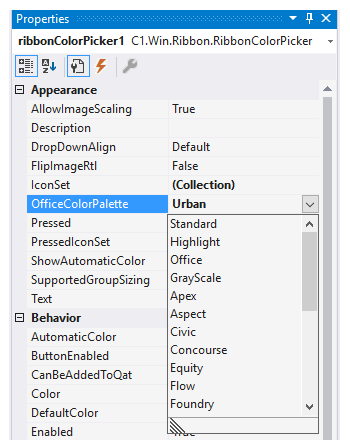
The RibbonColorPicker item has two sections the Theme Colors and Standard Colors. Note that by default, the Color Picker uses the 'Office' theme for the Theme Color section, while the Standard Color section remains the same. But the user can change the Theme Colors by modifying the OfficeColorPalette property in the Properties window at design-time.

You can also change the theme programmatically using the OfficeColorPalette property of RibbonColorPicker class.
' Set the theme color for the color picker
colorPicker.OfficeColorPalette = OfficeColorPalette.Urban
// Set the theme color for the color picker
colorPicker.OfficeColorPalette = OfficeColorPalette.Urban;

