Contextual Tab Group
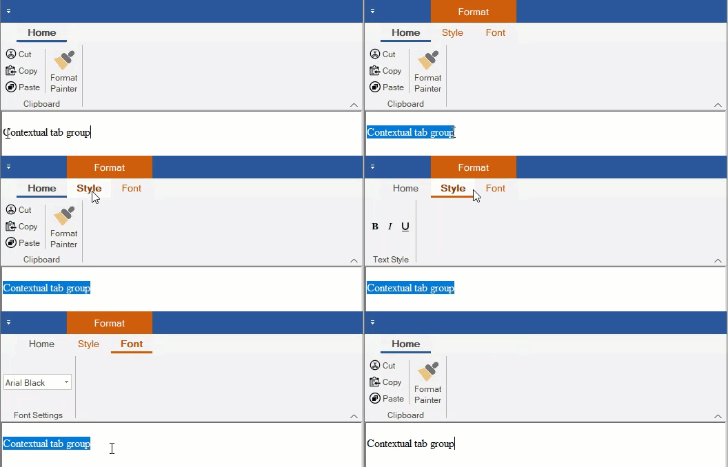
The Ribbon control has a contextual tab group, which is a hidden tab of groups that appears only when texts or images are selected in your application. By default, the tab group header is displayed at the top of the tab group with an orange background. However, you can easily hide this header by setting ShowContextualGroupsHeaders property of the C1Ribbon class to False.
The following GIF depicts the appearance of the contextual tab when a selection of text is being made.

Adding contextual Tab Group at Design-Time
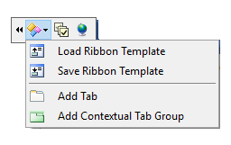
A user can add a Contextual Tab Group using the floating toolbar of C1Ribbon.

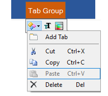
You can add Tabs to Contextual Tab Group using the floating toolbar menu. For more info on floating toolbar, refer this topic.

You can also add a Contextual Tab Group using the RibbonContextualTabGroup Collection Editor from the ContextualTabGroups property of C1Ribbon control in the Properties Window. You can add tabs to the Contextual Tab Group using the RibbonTab Collection Editor from the Tabs property of Contextual Tab Group in the Properties window. For more info on collection editors, refer this topic.
Configuring Contextual Tab Group via Code
This section discusses the implementation of contextual tab groups via code in a Ribbon control using the RibbonContextualTabGroup class.
In the following example, we create a contextual tab group and add ribbon groups to it using the Add method. Then, add ribbon items to the ribbon groups, change the color of contextual tab group by setting its tab header color, and add this contextual tab group to the Ribbon. Also, demonstrated a way to hide or show the contextual tab based on text selection.
RibbonContextualTabGroup selectionSettings;
private void Form1_Load(object sender, EventArgs e)
{
    //Disable input focus on ribbon
    c1Ribbon1.Selectable = false;
    //Initialize ContextualTabGroup
    selectionSettings = new RibbonContextualTabGroup("Format");
    //Hide the contextual tab group on initial rendering
    selectionSettings.Visible = false;
    //Create tabs for ContextualTabGroup
    RibbonTab styleSettings = new RibbonTab("Style");
    RibbonTab fontSettings = new RibbonTab("Font");
    selectionSettings.Tabs.Add(styleSettings);
    selectionSettings.Tabs.Add(fontSettings);
    //Create a group for Style tab
    RibbonGroup styleGroup = new RibbonGroup("Text Style");
    styleSettings.Groups.Add(styleGroup);
    //Add RibbonItems to the Text Style group
    RibbonToolBar ribbonToolBar = new RibbonToolBar();
    RibbonToggleButton boldButton = new RibbonToggleButton(Image.FromFile(@"images\bold.png"));
    RibbonToggleButton italicButton = new RibbonToggleButton(Image.FromFile(@"images\italic.png"));
    RibbonToggleButton underlineButton = new RibbonToggleButton(Image.FromFile(@"images\underline.png"));
    ribbonToolBar.Items.Add(boldButton);
    ribbonToolBar.Items.Add(italicButton);
    ribbonToolBar.Items.Add(underlineButton);
    styleGroup.Items.Add(ribbonToolBar);
    //Create a font group for Format tab
    RibbonGroup fontGroup = new RibbonGroup("Font Settings");
    fontSettings.Groups.Add(fontGroup);
    //Create and Add RibbonItems to Font group
    RibbonFontComboBox fontComboBox = new RibbonFontComboBox();
    fontComboBox.Text = "Select a font";
    fontGroup.Items.Add(fontComboBox);
    //set color of tab group
    selectionSettings.Color = ContextualTabColor.Cyan;
    //Add ContextualTabGroup to C1Ribbon control
    c1Ribbon1.ContextualTabGroups.Add(selectionSettings);
}
//Hide/Show the contextual tab based on text selection
private void richTextBox1_SelectionChanged(object sender, EventArgs e)
{
    if (richTextBox1.SelectedText.Length > 0)
        selectionSettings.Visible = true;
    else
        selectionSettings.Visible = false;
}
'Create a ContextualTabGroup
Dim selectionSettings As RibbonContextualTabGroup
Private Sub Form1_Load(sender As Object, e As EventArgs)
'Disable input focus on ribbon
C1Ribbon1.Selectable = False
'Initialize ContextualTabGroup
selectionSettings = New RibbonContextualTabGroup("Format")
'Hide the contextual tab group on initial rendering
selectionSettings.Visible = False
'Create tabs for ContextualTabGroup
Dim styleSettings As New RibbonTab("Style")
Dim fontSettings As New RibbonTab("Font")
selectionSettings.Tabs.Add(styleSettings)
selectionSettings.Tabs.Add(fontSettings)
'Create a group for Style tab
Dim styleGroup As New RibbonGroup("Text Style")
styleSettings.Groups.Add(styleGroup)
'Add RibbonItems to the Text Style group
Dim ribbonToolBar As New RibbonToolBar()
Dim boldButton As New RibbonToggleButton(Image.FromFile("images\bold.png"))
Dim italicButton As New RibbonToggleButton(Image.FromFile("images\italic.png"))
Dim underlineButton As New RibbonToggleButton(Image.FromFile("images\underline.png"))
ribbonToolBar.Items.Add(boldButton)
ribbonToolBar.Items.Add(italicButton)
ribbonToolBar.Items.Add(underlineButton)
styleGroup.Items.Add(ribbonToolBar)
'Create a font group for Format tab
Dim fontGroup As New RibbonGroup("Font Settings")
fontSettings.Groups.Add(fontGroup)
'Create and Add RibbonItems to Font group
Dim fontComboBox As New RibbonFontComboBox()
fontComboBox.Text = "Select a font"
fontGroup.Items.Add(fontComboBox)
'set color of tab group
selectionSettings.Color = ContextualTabColor.Cyan
'Add ContextualTabGroup to C1Ribbon control
C1Ribbon1.ContextualTabGroups.Add(selectionSettings)
End Sub
'Hide/Show the contextual tab based on text selection
Private Sub RichTextBox1_SelectionChanged(ByVal sender As Object, ByVal e As EventArgs)
If RichTextBox1.SelectedText.Length > 0 Then
selectionSettings.Visible = True
Else
selectionSettings.Visible = False
End If
End Sub

