
- SpreadJS Overview
- Getting Started
- JavaScript Frameworks
- Best Practices
-
Features
- Workbook
- Worksheet
- Rows and Columns
- Headers
-
Cells
- Work with Cells
- Cell Types
- Cell Format
- Cell States
- Cell Range
- Get Dirty Status
- Cell Buttons
- Cell Dropdowns
- Cell Comments
- Cell Threaded Comments
- Hyperlink
- Auto Merge Cells
- AutoFit
- Auto Fill Data
- Mask Input
- Shrink to Fit
- Cell Overflow
- Ellipsis or Tips for Cell Overflow
- Cell Alignment and Indentation
- Cell Padding and Label Styles
- Cell Span
- Cell Tags
- Styles
- Cell Decoration
- Cell Colors
- Cell Background Image
- Borders, Gridlines and Diagonal Lines
- Quote Prefix
- Insert Cut or Copied Cells
- Rotate Text In Cells
- Text Direction
- Text Decoration
- Rich Text
- Image Rich Data
- Wrap Text
- Drag and Drop
- Drag and Merge
- Editing
- Watermark
- Display Zero as Blank
- IME Mode
- Pattern Fill and Gradient Fill
- Paste Options
- Data Binding
- Data Manager
- TableSheet
- GanttSheet
- ReportSheet
- Data Charts
- JSON Schema with SpreadJS
- SpreadJS File Format
- Data Validation
- Conditional Formatting
- Sort
- Group
- Formulas
- What-If Analysis
- Serialization
- Keyboard Actions
- Shapes
- Floating Objects
- Barcodes
- Charts
- Sparklines
- Tables
- Pivot Table
- Slicer
- Theme
- User Management
- Culture
- AI Assistant
- SpreadJS Designer
- SpreadJS Designer VSCode Plugin
- Tutorials
- SpreadJS Designer Component
- SpreadJS Collaboration Server
- Touch Support
- Formula Reference
- Import and Export Reference
- Events
- API Documentation
- Release Notes
Check Box Cell
The SpreadJS CheckBox CellType is an interactive, cell-embedded control that enables users to toggle binary states or tri-state modes within a worksheet.
It provides an Excel-compatible modern mode while preserving the legacy checkbox mode for backward compatibility.
checkbox– classic square checkbox (default)modern– Excel-compatible rounded styletoggle– switch-style toggle button
It also supports:
Configurable interaction behavior
Text wrapping and alignment control
Excel import and export compatibility
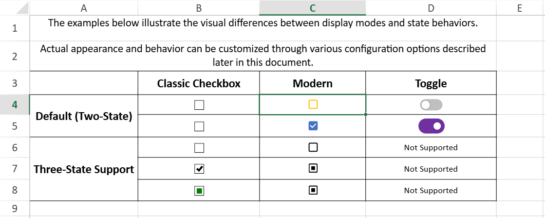
Display Modes
The mode property defines how the checkbox is rendered and behaves visually.
cellType.mode(value);Mode Comparison
Classic Checkbox Mode | Modern Mode | Toggle Mode | |
|---|---|---|---|
|
|
|
|
Border | 1px black, right angles | 2px, follows cell font color | Switch-style track |
Corner Style | Right angle | Rounded | Rounded track |
Color Behavior | Fixed black | Follows cell font color | Configurable via |
Default Size (auto) | 8px(native size) | 15px (scaled with font size) | Controlled by |
Background | White | Transparent (uses cell background color) | Track background |
Indeterminate State | Green solid square | Follows font color (default black) | Not supported |
| Supported | Supported | Not supported |
| Supported | Supported | Not supported |
| Supported | Supported | Not supported |
Hover Cursor | Default | Pointer | Button interaction |
Double-click Edit | Supported | Supported | Not supported |
State Change Area | Controlled by | Controlled by | Toggle button only |
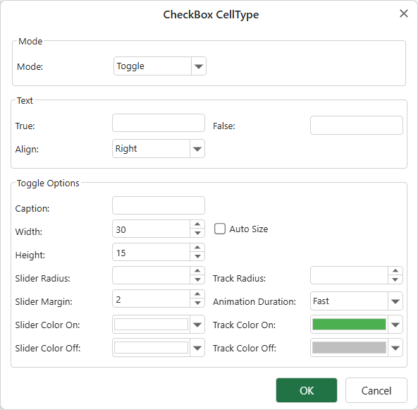
Toggle Mode Configuration
Toggle mode provides additional appearance configuration through toggleOptions:
width/heightautoSizesliderColorOn,sliderColorOfftrackColorOn,trackColorOffanimationDurationsliderMargintrackRadius
When autoSize: false and textAlign: inside, autoFitWidth and autoFitHeight ignore text overflow and only consider the toggle button dimensions.
Usage Examples
Classic Checkbox Mode (Default)
var cellType = new GC.Spread.Sheets.CellTypes.CheckBox();
cellType.caption("caption");
cellType.textTrue("True");
cellType.textFalse("False");
cellType.textIndeterminate("Indeterminate");
cellType.textAlign(GC.Spread.Sheets.CellTypes.CheckBoxTextAlign.bottom);
cellType.isThreeState(true);
cellType.boxSize(20);

activeSheet.getCell(1, 1).cellType(cellType);
Modern Mode
var cellType = new GC.Spread.Sheets.CellTypes.CheckBox();
cellType.caption("Modern Checkbox");
cellType.mode("modern");
activeSheet.getCell(2, 1).cellType(cellType);
Toggle Mode
const spread = new GC.Spread.Sheets.Workbook();
const sheet = spread.getActiveSheet();
const cellType = new GC.Spread.Sheets.CellTypes.CheckBox();

cellType.textTrue('ON');
cellType.textFalse('OFF');
cellType.mode('toggle');
cellType.textAlign(GC.Spread.Sheets.CellTypes.CheckBoxTextAlign.inside);

cellType.toggleOptions({
  width: 65,
  height: 30,
  sliderMargin: 2,
  trackColorOn: '#8cbae8',
  trackColorOff: '#9e9e9e',
  sliderColorOn: '#1565c0',
  sliderColorOff: '#ffffff',
});

sheet.setCellType(0, 0, cellType);
Interaction Model
Hit Testing (hitTestMode)
Specifies which area of the cell responds to mouse clicks.
Applies to checkbox and modern modes.
"cell"(default) — the entire cell area responds to clicks"checkbox"— only the checkbox icon responds to clicks (Excel-compatible behavior)
The default value is
"cell"for bothcheckboxandmodernmodes to preserve backward compatibility.
Use "checkbox" when you need behavior consistent with Microsoft Excel.
var cellType = new GC.Spread.Sheets.CellTypes.CheckBox();
cellType.textTrue("Yes");
cellType.textFalse("No");
cellType.hitTestMode("checkbox");
activeSheet.getCell(1, 1).cellType(cellType);
Text Editing (textEditable)
Determines whether the checkbox can enter text editing mode (double-click or F2).
Applies to checkbox and modern modes.
true(default) — text can be editedfalse— text editing is disabled
When set to false, the checkbox cannot enter edit mode.
var cellType = new GC.Spread.Sheets.CellTypes.CheckBox();
cellType.textTrue("Yes");
cellType.textFalse("No");
cellType.textEditable(false);
activeSheet.getCell(1, 1).cellType(cellType);
In
checkboxmode, edit mode uses the browser’s native checkbox rendering.In
modernmode, the checkbox keeps the modern visual style during editing.
State Model
Three-State Behavior
The checkbox can represent three states: checked, unchecked, and indeterminate.
To enable the indeterminate state, set:
cellType.isThreeState(true);Three-state behavior is supported in checkbox and modern modes.
It is not supported in toggle mode.
Value Mapping
The checkbox state is determined by the cell value:
Cell Value | State |
|---|---|
| Indeterminate |
| Unchecked |
| Checked |
Use the value method to programmatically control the state.
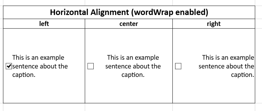
Layout and Text Wrapping
wordWrap
If the caption text is longer than the available cell space, enable text wrapping on the cell.
The default value of wordWrap is false.
cellType.caption("This is a very very long long text");

activeSheet.getCell(1, 1).cellType(cellType);
activeSheet.setRowHeight(1, 120);
activeSheet.setColumnWidth(1, 110);

// Enable wrapping
activeSheet.getCell(1, 1).wordWrap(true);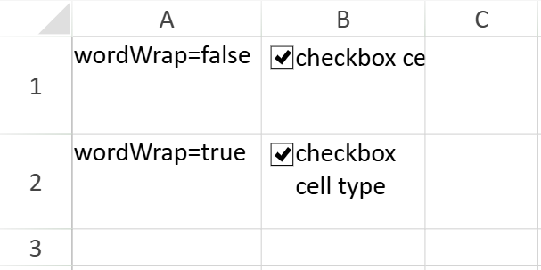
Line Break Rule
When wrapping is enabled:
Text is first broken at word boundaries.
If necessary, words are further split to fit the available width.
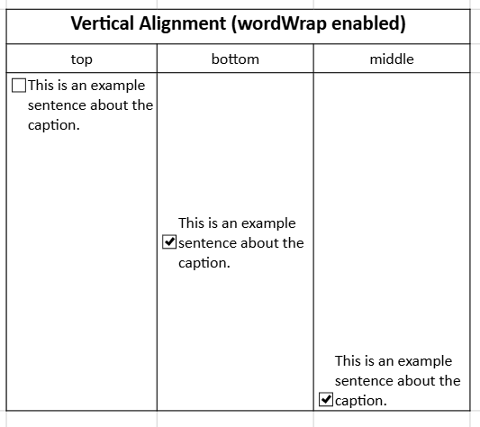
Vertical Alignment
When wordWrap is enabled, the checkbox and caption follow the cell’s vertical alignment:
Horizontal Alignment
The caption text follows the cell’s horizontal alignment. Only the caption text alignment changes.
Excel Import and Export
The CheckBox CellType supports importing and exporting Excel files.
Import Behavior
When importing from Excel:
If cell data is not
null,undefined,true, orfalse, no checkbox is added.If cell data is
nullorundefined, the checkbox is set to three-state.Imported checkboxes use default size
"auto".If horizontal alignment is not
left,center, orright, it is set tocenter.If vertical alignment is not
top,center, orbottom, it is set tobottom.The checkbox
modeis automatically set to"modern".If a table column style contains a checkbox, the mode is automatically set to
"modern"after import.
Export Behavior
When exporting to Excel:
All checkboxes can be exported.
If the checkbox is in an indeterminate state, it is exported as unchecked.
Caption and other data are not exported; only the checkbox state is described.
Due to cell data, the exported Excel file may not display as a checkbox (for example, when the cell data is
"Spread"), but the cell remains a checkbox-type cell.If horizontal alignment is not
left,center, orright, it is exported asleft.If vertical alignment is not
top,center, orbottom, it is exported astop.
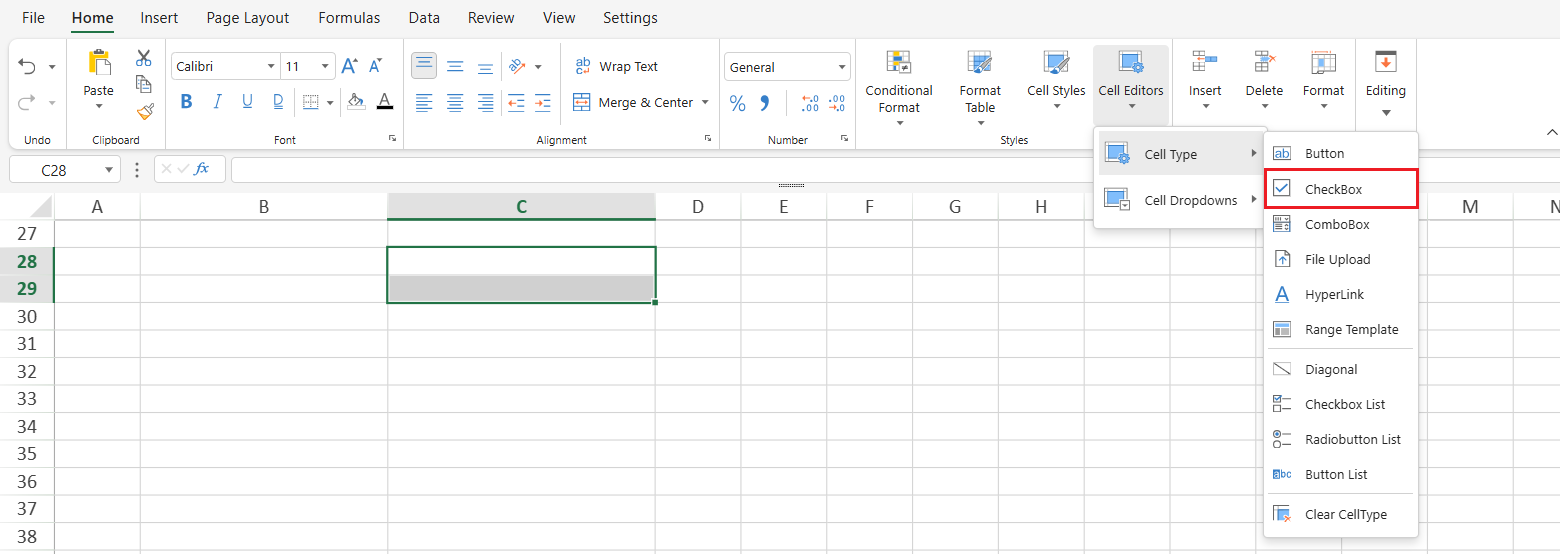
Using CheckBox in Designer
In Designer, a CheckBox can be inserted in two ways:
Set Cell Type to CheckBox
Use the CheckBox command from the Ribbon
Both methods assign the CheckBox CellType to the selected cell, but they initialize the checkbox with different default settings.
Insertion Methods
Set Cell Type to CheckBox
Home → Styles → Cell Editors → Cell Type → CheckBox
This method sets the selected cell’s type to checkBox.
Insert from Ribbon Command
Insert → Controls → CheckBox
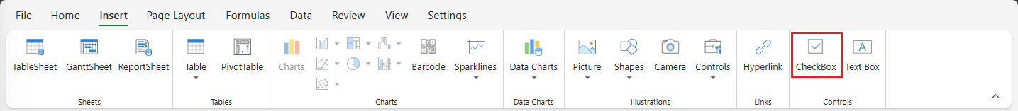
This command directly inserts a CheckBox into the selected cell.
Default Differences
Checkboxes inserted using the two methods have the following differences:
Set Cell Type | Insert Command | |
|---|---|---|
|
|
|
Position | Vertically top-aligned, horizontally left-aligned | Vertically top-aligned, horizontally centered |
Size | 12px × 12px |
|
Hit Test | Entire cell | Checkbox icon only |
Text Editing | Can enter edit mode | Cannot enter edit mode |
Notes:
Both methods create a CheckBox CellType.
The difference lies in the default mode and interaction settings applied during insertion.
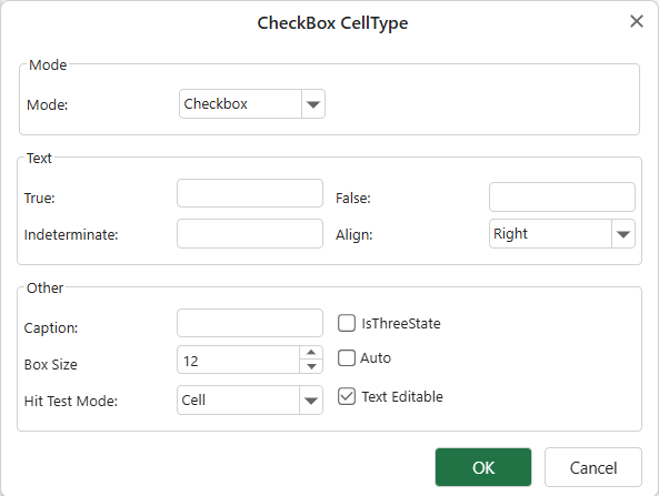
Configuring CheckBox Properties
After a cell is set to the CheckBox CellType, you can configure its properties through the CheckBox CellType dialog.
Right-click the cell and select Edit CellType…
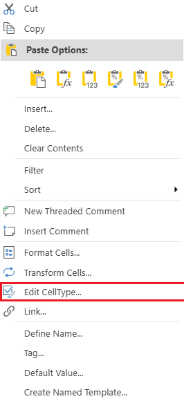
This opens the CheckBox configuration dialog.
When the mode is set to toggle, a different dialog is displayed.