


Ribbon KeyTips
Ribbon KeyTips provide keyboard access to the Ribbon and File Menu in the SpreadJS Designer Component. Users can press an activation key, such as Alt or F10, to display KeyTip labels, and then type the displayed labels to open tabs, run commands, or move into related UI controls.
KeyTips help users access Designer commands without using the pointer.

Enable Ribbon KeyTips
Ribbon KeyTips are enabled by default when focus is inside the Designer area. The default activation keys are plain Alt and plain F10.
You can enable or disable Ribbon KeyTips in the Designer configuration.
const config = {
  keyboard: {
    keyTips: {
      enabled: true,
    },
  },
};
To customize the activation keys, set keyboard.keyTips.activationKeys.
const config = {
  keyboard: {
    keyTips: {
      enabled: true,
      activationKeys: [
        { key: 'Alt' },
        { key: 'F10' },
      ],
    },
  },
};
When activationKeys is specified, only the configured key combinations activate KeyTips. If activationKeys is not specified, Designer uses the default activation keys: Alt and F10.
You can also disable KeyTips after Designer is initialized.
designer.setConfig({
  ...config,
  keyboard: {
    keyTips: {
      enabled: false,
    },
  },
});
Use Ribbon KeyTips
When users press an activation key, Designer displays the first KeyTip layer. This layer includes KeyTips for:
The File Menu
The currently visible Ribbon tabs
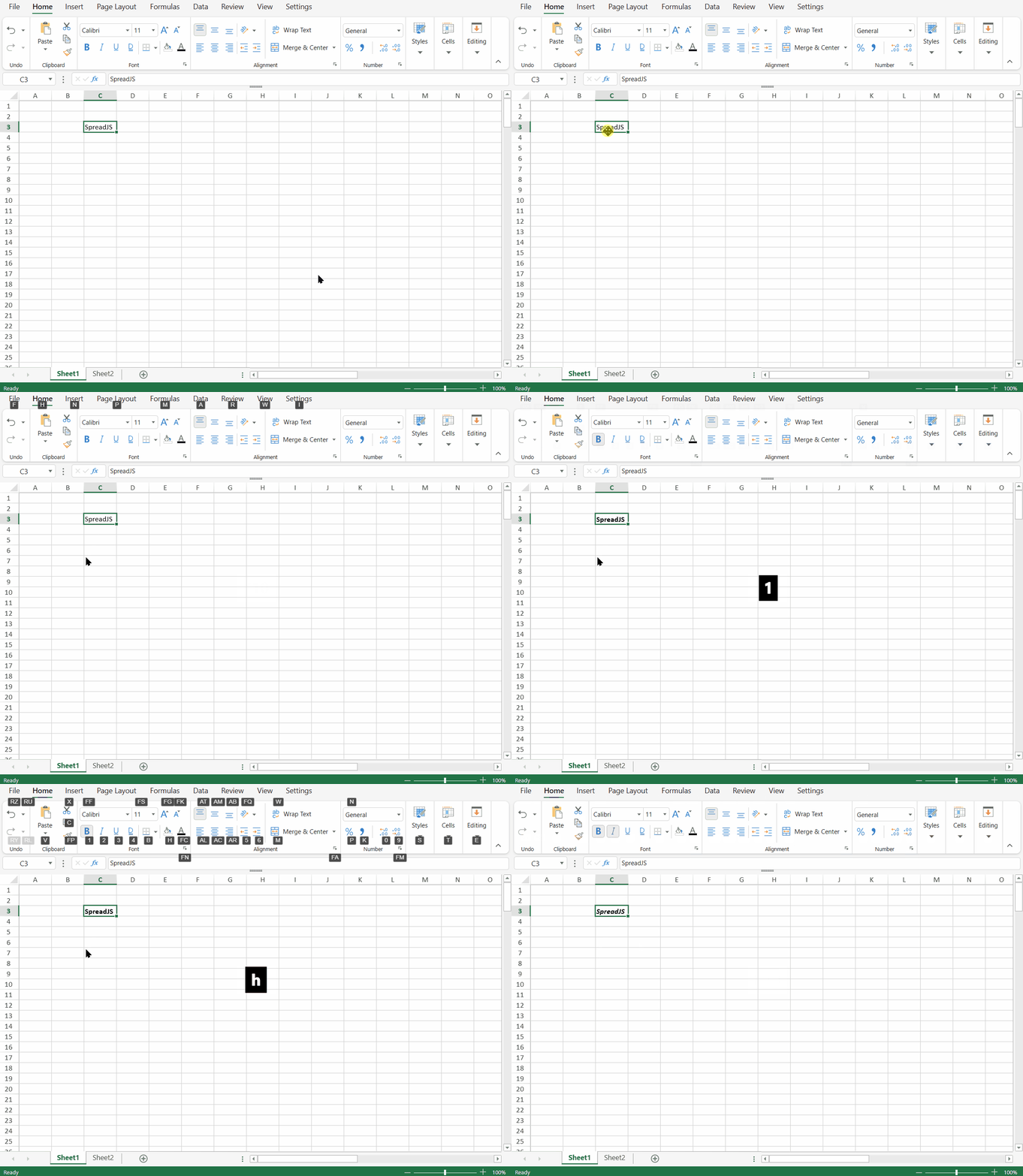
Designer does not show command KeyTips immediately when KeyTips are activated. Users first choose a Ribbon tab KeyTip. Designer then opens that tab and displays KeyTips for the available commands in that tab.
For example, a typical flow is:
Press Alt or F10 -> type a tab KeyTip -> type a command KeyTipIf the selected KeyTip runs a command, Designer executes the command and exits KeyTips mode.
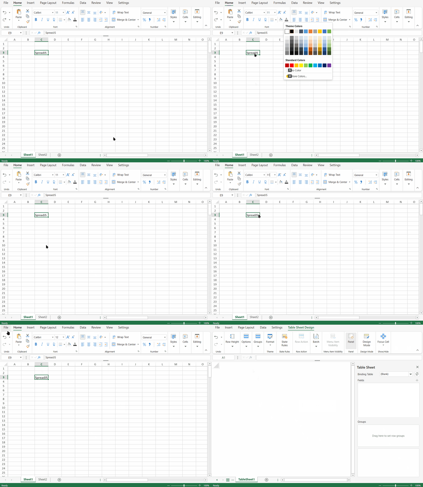
If the selected KeyTip opens another UI surface, such as a dropdown, popup, menu, input, combo box, color picker, or dialog, Designer opens that surface and lets it handle the next keyboard interaction.
Notes:
KeyTip matching is case-insensitive. For multi-character KeyTips, users type each character in order.
If a cell is currently in edit mode, the activation key cannot be used to trigger KeyTips.
KeyTips are resolved within the current visible layer. Different layers can reuse the same KeyTip. Within the same layer, Designer assigns KeyTips so that a complete KeyTip is not also the prefix of another KeyTip. When the typed input matches a complete KeyTip, Designer applies it immediately.
Pressing a configured activation key again exits KeyTips mode.
Access Ribbon Tabs Directly
Top-level Ribbon tabs can be accessed directly with an activation key and the tab KeyTip when Designer can receive the shortcut.
For example, if the Home tab displays the KeyTip H, users can open the Home tab directly with:
Alt+H
F10, H
This is equivalent to pressing the activation key first and then typing H.
Use KeyTips in the File Menu
When users activate the File Menu KeyTip, Designer opens the File Menu and displays KeyTips for the currently visible File Menu content.
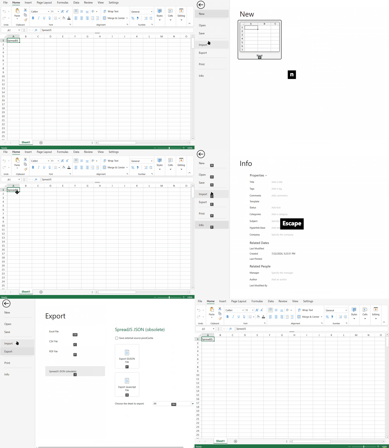
The File Menu is template-driven, so its KeyTips are based on the visible File Menu page and the visible interactive items in that page. If a KeyTip changes the visible File Menu page or content, Designer keeps KeyTips active when applicable and refreshes the visible KeyTips for the new content.
Template items can define a keyTip value to provide stable KeyTips.
const templates = [
  {
    name: 'Blank Workbook',
    keyTip: 'B',
  },
  {
    name: 'Expense Budget',
    data: '/app/templates/expense-budget.ssjson',
    thumbnail: '/app/templates/expense-budget.png',
    keyTip: 'EB',
  },
];
If a template item does not define keyTip, Designer may assign a KeyTip automatically where possible.
Customize Ribbon KeyTips
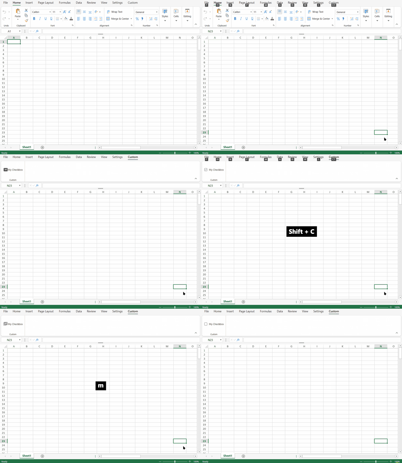
You can customize KeyTips in the Ribbon configuration by setting keyTip on the specific Ribbon placement where the label should appear.
KeyTips are defined at the placement level. If the same command appears in multiple places, each placement can use a different KeyTip.
const config = {
  ribbon: [
    {
      id: 'customTab',
      text: 'Custom',
      keyTip: 'CT',
      buttonGroups: [
        {
          label: 'Custom',
          commandGroup: {
            children: [
              {
                direction: "vertical",
                commands: [
                     "MyCheckbox"
                 ],
                keyTip: 'M',
              },
            ],
          },
        },
      ],
    },
  ],
};
In this example, the custom tab uses CT, and the command placement uses M.
Custom KeyTips follow these rules:
Supported characters are
A-Zand0-9.KeyTip values are trimmed and normalized to uppercase.
Multi-character KeyTips are supported.
Matching is case-insensitive.
KeyTips are resolved independently within the active layer. The same KeyTip can be reused in different layers.
Within the same layer, duplicate KeyTips and prefix conflicts are not allowed.
If a placement does not define
keyTip, Designer assigns a KeyTip automatically where possible.If a custom KeyTip is invalid or conflicts with another KeyTip in the same layer, Designer uses a non-conflicting alternate KeyTip where possible.
Automatically assigned KeyTips can change when Ribbon items are added, removed, or shown in a different layer. To keep a stable label, define
keyTipexplicitly.
Keyboard Behavior After Opening Controls
KeyTips are used to reach commands and entry points. After a KeyTip opens a control that has its own keyboard behavior, that control handles the next keyboard interaction.
For example:
A dropdown or popup follows its own keyboard behavior.
A menu or submenu may continue to show KeyTips for command-like items.
An input or combo box receives focus and handles typed characters.
A color picker receives focus and handles color selection behavior.
A dialog receives focus according to the dialog behavior.
Supported dropdowns, menus, galleries, color pickers, and similar surfaces can provide focus navigation after they are opened through KeyTips. In those surfaces:
TabandShift+Tabmove focus forward or backward through enabled interactive items.Up ArrowandDown Arrowmove focus vertically. In a menu or one-dimensional list, they move to the previous or next enabled item.Left ArrowandRight Arrowmove focus horizontally in a grid or gallery. In nested menus,Right Arrowopens the submenu and focuses its first item, andLeft Arrowcloses the submenu and restores focus to the parent item.EnterandSpaceactivate the focused item. If the item owns a submenu or dropdown, the surface opens and focus moves into it.Esccloses the current popup or submenu and restores focus and KeyTips to the parent layer when possible.
This focus navigation applies to supported surfaces opened through KeyTips. It does not define full Ribbon focus navigation.
Behavior Notes
Ribbon KeyTips follow these general behavior rules:
Pure visual items do not show KeyTips.
Disabled targets cannot be executed. They may still reserve their allocated KeyTip.
Some hidden, clipped, or off-screen targets may reserve a KeyTip even when no badge is displayed.
Split button KeyTips open the dropdown instead of running the primary action.
Pointer interaction exits KeyTips mode.
Pressing a configured activation key again exits KeyTips mode.
Escreturns to the previous KeyTip layer when possible. Otherwise, it exits KeyTips mode.KeyTip labels follow Excel-style KeyTips where applicable, such as
Hfor the Home tab.