- Extended Library for WPF and Silverlight Overview
- Accordion
- Book
- ColorPicker
- CoverFlow (Silverlight Only)
- Expander
- HtmlHost (Silverlight Only)
- PropertyGrid
- Rating (WPF Only)
- Reflector (Silverlight Only)
Step 4 of 4: Running the Application
Now that you've created a WPF application and customized the application's appearance and behavior, the only thing left to do is run your application. To run your application and observe ColorPicker for WPF's run-time behavior, complete the following steps:
- From the Debug menu, select Start Debugging to view how your application will appear at run time.
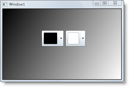
The application will appear similar to the following:

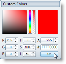
Click the drop-down arrow in the left color picker. Notice that the window opens above the drop-down box and that only the advanced mode is visible – this reflects the changes you made to the control. In advanced mode, users can specify any color and can use multiple methods of selecting a color.
Choose a color, for example Red, and click OK:

Notice that the control's selected color and the rectangle's gradient changes to reflect your color choice.
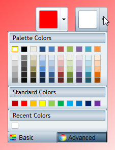
- Click the drop-down arrow in the right color picker.

Notice that the Basic tab is visible (default). This tab displays Palette Colors, Standard Colors, and Recent Colors. You can pick any color and can also switch to the Advanced tab to pick a custom color. Note that the currently selected color is highlighted with a red border.
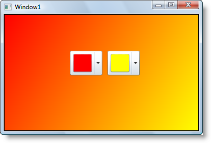
- Pick a color, for example Yellow. The selected color will change and the background gradient of the rectangle will change to match your selection:

Congratulations! You've completed the ColorPicker for WPF quick start and created a simple WPF application, added and customized ColorPicker for WPF controls, and viewed some of the run-time capabilities of the controls.


