- Extended Library for WPF and Silverlight Overview
- Accordion
- Book
- ColorPicker
- CoverFlow (Silverlight Only)
- Expander
- HtmlHost (Silverlight Only)
- PropertyGrid
- Rating (WPF Only)
- Reflector (Silverlight Only)
Basic ColorPicker Mode
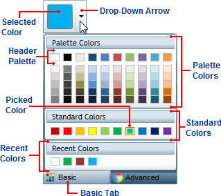
By default, the C1ColorPicker control will open with the Basic tab open when the control's drop-down arrow is clicked. The Basic tab appears similar to the following image:

The Basic tab includes the following options/sections:
Drop-Down Arrow: Click the drop-down arrow to open the C1ColorPicker control's window. See Drop-Down Direction for information about setting where the drop-down window appears.
Basic Tab: Click the Basic tab to access pre-selected colors at run time. Click the Advanced tab to choose a custom color. The C1ColorPicker.Mode property must be set to Basic or Both for the Basic tab to be visible.
Selected Color: The currently selected color will appear in the color picker's window.
Picked Color: The currently picked color will appear with a red border in the list of colors.
Palette Colors: Palette colors reflect the currently selected color palette. You can choose a palette by setting the C1ColorPicker.Palette property.
Header Palette: These colors are the basic colors of the palette – the expanded list of palette colors are typically variations of these basic colors.
Standard Colors: Lists ten standard colors. These colors include a dark brick red, red, orange, yellow, light green, green, sky blue, blue, navy blue, and purple.
Recent Colors: Lists up to ten recently selected colors. By default this section is visible, but you can choose to hide recent colors by setting the C1ColorPicker.ShowRecentColors property to False. See Recent Colors for more information.


