- Extended Library for WPF and Silverlight Overview
- Accordion
- Book
- ColorPicker
- CoverFlow (Silverlight Only)
- Expander
- HtmlHost (Silverlight Only)
- PropertyGrid
- Rating (WPF Only)
- Reflector (Silverlight Only)
ColorPicker Features
ColorPicker for WPF and Silverlight allows you to create customized, rich applications. Make the most of C1ColorPicker by taking advantage of the following key features:
Select from 20+ Predefined Professionally Designed Palettes
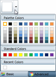
ColorPicker contains over 20 predefined color palettes that match the themes used in Microsoft Office. The colors in each palette go well together and can be used to create applications with a polished, professional appearance.

Built-in Color Editor for Custom Colors
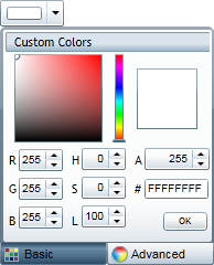
ColorPicker includes a color editor. This editor allows end-users to create colors that are not on the current palette using the RGB or HLS color models and including support for transparency.

Different Views
C1ColorPicker supports both simple and advanced views for color selection.
Composable Parts
Each of the parts of the control can be used independently of the C1ColorPicker to create your custom controls. The C1SpectrumColorPicker control allows access to just the advanced color picking functionality of the C1ColorPicker control, the C1HexColorBox control provides data validation for hexadecimal code entries, and the C1CheckeredBorder provides a simple way to display colors with transparencies.
Create Your Own Custom Palette
If the available color palettes do not work for your application, you can create your own custom color palette. At run time, users can even be limited to selecting colors only from your chosen color palette.


