
- Input Overview
- Key Features
- Quick Start
- Input Controls
- Placeholder
- Button Types
- Text Alignment
- Dropdown Alignment
- Data Formatting
- Data Parsing
- Data Validation
- Input Masking
- Handling Errors
- Handling Null and Empty Values
- Culture Settings
- Keyboard Navigation
- Appearance and Styling
- Themes
- Command Binding
SplitButton
Input provides various properties for customizing the appearance and styling the Input control, so that you can generate the SplitButton control as per your requirement and change the look and feel of the application you are creating.
Appearance
You can change the forecolor, and add background image and layout to a SpitButton.
The code snippet below depicts adding appearance-related properties to SplitButton:
c1SplitButton1.BackgroundImage = Image.FromFile(@"resources/OIP (3).jpg");
c1SplitButton1.Cursor = System.Windows.Forms.Cursors.Hand;
c1SplitButton1.ForeColor = System.Drawing.Color.Red;
SplitButtonItem splitButtonItem1 = new SplitButtonItem();
SplitButtonItem splitButtonItem2 = new SplitButtonItem();
SplitButtonItem splitButtonItem3 = new SplitButtonItem();
this.c1SplitButton1.Items.Add(splitButtonItem1);
this.c1SplitButton1.Items.Add(splitButtonItem2);
this.c1SplitButton1.Items.Add(splitButtonItem3);
splitButtonItem1.CheckOnClick = true;
splitButtonItem1.Icon = new C1.Framework.C1BitmapIcon(null, new System.Drawing.Size(16, 16), System.Drawing.Color.Transparent, Image.FromFile(@"resources\OIP (2).jpg"));
splitButtonItem1.Text = "Option1";
splitButtonItem2.CheckOnClick = true;
splitButtonItem2.Icon = new C1.Framework.C1BitmapIcon(null, new System.Drawing.Size(16, 16), System.Drawing.Color.Transparent, Image.FromFile(@"resources\OIP (2).jpg"));
splitButtonItem2.Text = "Option2";
splitButtonItem3.CheckOnClick = true;
splitButtonItem3.Icon = new C1.Framework.C1BitmapIcon(null, new System.Drawing.Size(16, 16), System.Drawing.Color.Transparent, Image.FromFile(@"resources\OIP (2).jpg"));
splitButtonItem3.Text = "Option3";
Styling
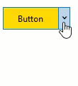
The C1SplitButton class provides the provides the BackColor and ForeColor properties to set the background and foreground colors, respectively. Besides these, it also provides the Styles property to apply styling to different states of button such as Default, Disabled, Hot, HotPressed, and Pressed. Additionally, the SplitButtonItemStyle class provides the display attributes that determine the appearance of the drop down item and the DropDownStyle class provides display attributes for styling the drop-down form.
The following image showcases styling applied to the SplitButton control
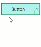
The following code snippet depicts adding styling attributes to SplitButton. Here, we apply styling to the SplitButton control and its elements by setting background color, foreground color, and borders.
//Style SplitButton control
this.c1SplitButton1.BackColor = System.Drawing.Color.PaleTurquoise;
this.c1SplitButton1.ForeColor = System.Drawing.SystemColors.ActiveCaptionText;
this.c1SplitButton1.Styles.Hot.BackColor = System.Drawing.Color.Gold;
//Style borders
this.c1SplitButton1.Styles.Border = new C1.Framework.Thickness(2, 2, 2, 2);
this.c1SplitButton1.Styles.Default.BorderColor = System.Drawing.Color.SeaGreen;
this.c1SplitButton1.Styles.Font = new System.Drawing.Font("Segoe UI", 11F, System.Drawing.FontStyle.Regular, System.Drawing.GraphicsUnit.Point);
//Style SplitButton elements
this.c1SplitButton1.Styles.DropDown.BackColor = System.Drawing.Color.LightCyan;
this.c1SplitButton1.Styles.DropDown.BorderColor = System.Drawing.Color.DodgerBlue;