
- Input Overview
- Key Features
- Quick Start
- Input Controls
- Placeholder
- Button Types
- Text Alignment
- Dropdown Alignment
- Data Formatting
- Data Parsing
- Data Validation
- Input Masking
- Handling Errors
- Handling Null and Empty Values
- Culture Settings
- Keyboard Navigation
- Appearance and Styling
- Themes
- Command Binding
Themes
You can use the C1ThemeController to apply other themes to the Input controls. To customize the appearance of an Input control using Themes, add the C1ThemeController control to your component tray and set the Themes property.
The following table lists all the Input controls when the themes set by the ThemeController is Office2016Green:
| Input controls | Snapshots with applied theme |
|---|---|
| Button |  |
| CheckBox | 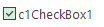 |
| ColorPicker | 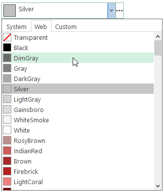 |
| ComboBox | 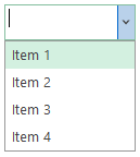 |
| DbNavigator | 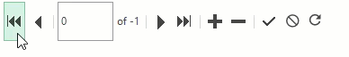 |
| DropDown | 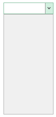 |
| MaskedTextBox |  |
| NumericEdit | 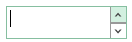 |
| RadioButton |  |
| RangeSlider |  |
| SplitButton | 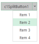 |
| TextBox |  |
Refer the code snippet below to observe how a ComboBox control has been used to populate themes using C1ThemeController using the Form_Load and ComboBox_SelectedValueChanged events.
private void Form_Load(object sender, EventArgs e)
   {
        comboBox.Items.AddRange(C1ThemeController.GetThemes());
   }
private void comboBox_SelectedValueChanged(object sender, EventArgs e)
   {
        c1ThemeController.Theme = comboBox.SelectedItem.ToString();
   }